 Back
BackDescribing Data Using Tables, Graphs, and Charts
Study Guide - Smart Notes
 Tailored notes based on your materials, expanded with key definitions, examples, and context.
Chapter 2: Describing Data Using Tables, Graphs, and Charts
Introduction
Descriptive statistics involve summarizing and presenting data in a way that is easily interpretable and useful for decision-making. Tables, graphs, and charts are essential tools for transforming raw data into meaningful information, allowing both producers and consumers of data to gain insights efficiently.
Why Use Graphs and Tables?
The Importance of Visual Data Representation
Clarity: Visuals make complex data more accessible and understandable.
Insight: Patterns, trends, and outliers are easier to identify in graphical form.
Communication: High-quality graphs and tables enhance reports and presentations, making them more persuasive and professional.
Throughout your academic and professional career, you will both create and interpret these descriptive statistical tools, gaining a competitive advantage in data-driven environments.
Frequency Distributions and Histograms
Understanding Frequency Distributions
A frequency distribution is a summary that displays the number of observations within each distinct category or class of a dataset. This is particularly useful for discrete data, which can take on a countable number of possible values.
Discrete Data: Data that can only take specific, separate values (e.g., number of trainings attended).
Frequency Table: A tabular summary showing the frequency (count) of each value or group of values.
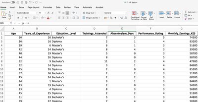
Example: Consider a dataset of employees with variables such as Age, Years of Experience, Education Level, Trainings Attended, Absenteeism Days, Performance Rating, and Monthly Earnings.
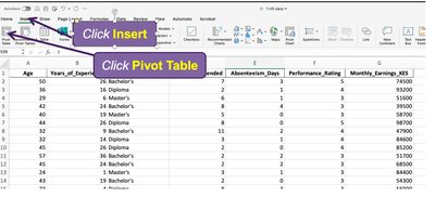
Constructing a Frequency Distribution in Excel Using Pivot Tables
Excel's Pivot Table feature allows for efficient creation of frequency distributions. The following steps outline the process:
Insert a Pivot Table: Select your data range and choose to insert a Pivot Table from the Insert menu.
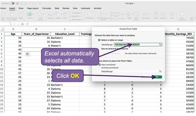
Confirm Data Selection: Excel will automatically select the data range. Click OK to proceed.
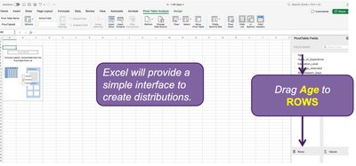
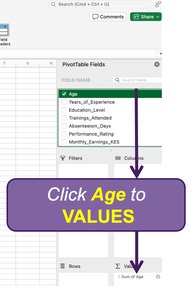
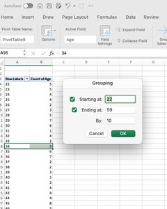
Drag Variable to Rows: In the Pivot Table Fields pane, drag the variable of interest (e.g., Age) to the Rows area.
Drag Variable to Values: Drag the same variable to the Values area. By default, Excel will sum the values.
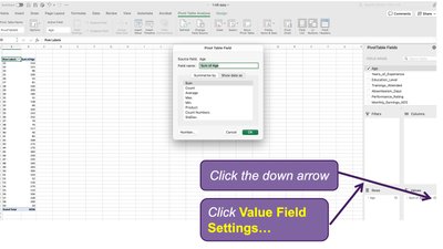
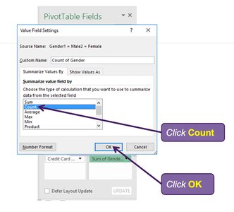
Change Value Field Settings: Change the calculation from Sum to Count to display the frequency of each value.
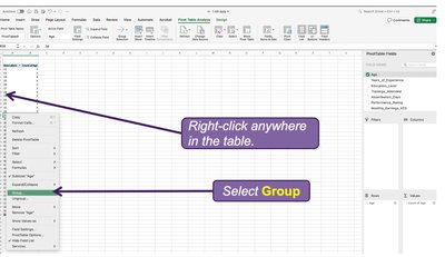
Group Data: For continuous variables like Age, group the data into intervals (e.g., 22-29, 30-39, etc.) for better presentation.
Constructing and Interpreting Bar Charts and Histograms
Once the frequency distribution is created, you can visualize the data using bar charts and histograms:
Bar Chart: Represents the frequency of each category or group with rectangular bars. Useful for comparing discrete or categorical data.
Histogram: Similar to a bar chart but used for continuous data, where bars touch each other to indicate the data is grouped into intervals.
Steps to Create a Bar Chart or Histogram in Excel:
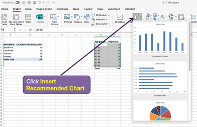
Copy and paste the frequency table values.
Use the 'Insert Recommended Chart' feature to select a bar chart or histogram.
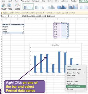
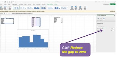
To convert a bar chart to a histogram, right-click on a bar, select 'Format Data Series,' and reduce the gap width to zero.
Interpreting Graphs
Graphs and charts allow for quick identification of trends, patterns, and outliers in the data. For example, a histogram of employee ages can reveal the most common age group, while a bar chart can show the distribution of education levels or performance ratings.
Summary Table: Types of Graphical Data Summaries
Type | Best For | Key Features |
|---|---|---|
Frequency Table | All data types | Tabular summary of counts |
Bar Chart | Discrete/categorical data | Bars represent frequency or proportion |
Histogram | Continuous data | Binned intervals, bars touch |
Pie Chart | Proportional data | Slices represent parts of a whole |
Line Chart | Trends over time | Points connected by lines |
Key Formulas
Relative Frequency: The proportion of observations in a category:
Percentage Frequency: The percentage of observations in a category:
Conclusion
Describing data using tables, graphs, and charts is a foundational skill in statistics. Mastery of these techniques enables effective data analysis, communication, and informed decision-making in both academic and professional settings.
