 Back
BackDescribing Data with Tables and Graphs: Frequency Tables, Histograms, and Data Distributions
Study Guide - Smart Notes
 Tailored notes based on your materials, expanded with key definitions, examples, and context.
Describing Data with Tables and Graphs
Frequency Tables
Frequency tables are a foundational tool in statistics for organizing and summarizing data. They group observations into classes (or bins) and count the number of observations in each class.
Class: A range of values into which data are grouped (e.g., ages 16-25, 26-35).
Frequency: The number of observations in each class.
Relative Frequency: The proportion or percentage of observations in each class, calculated as where is the total number of observations.
Cumulative Frequency: The running total of frequencies through the classes.
Relative Cumulative Frequency: The running total of relative frequencies.
Each class in a frequency table is mutually exclusive; an observation can only belong to one class. The sum of all relative frequencies should be 100% (or very close, due to rounding).
Example: Frequency Table for College Credits
Credits | Frequency | Relative Frequency (%) |
|---|---|---|
0-15 | 20 | 20% |
16-30 | 30 | 30% |
31-45 | 25 | 25% |
46-60 | 25 | 25% |
Total | 100 | 100% |
Additional info: Table values are inferred for illustration.
Class Boundaries and Binning
Each bin (class) has a lower and upper limit. For example, in the class 16-25, 16 is the lower limit and 25 is the upper limit. Boundaries between bins are set halfway between the upper limit of one class and the lower limit of the next (e.g., 25.5 between 16-25 and 26-35).
Cumulative and Relative Frequency Tables
Cumulative frequency tables show the total number of observations up to each class. Relative frequency tables show the proportion of observations in each class. These can be combined for deeper analysis.
Hourly Wage ($) | Frequency | Cumulative Frequency | Relative Frequency | Relative Cumulative Frequency |
|---|---|---|---|---|
8-10 | 8 | 8 | 0.31 | 0.31 |
11-13 | 8 | 16 | 0.31 | 0.62 |
14-16 | 4 | 20 | 0.15 | 0.77 |
17-19 | 3 | 23 | 0.12 | 0.89 |
20-22 | 3 | 26 | 0.12 | 1.00 |
Additional info: Table values are inferred for illustration.
Graphical Representations of Data
Histograms
Histograms are graphical representations of frequency tables. They display the distribution of quantitative data by showing the number (or proportion) of observations within each bin as bars. The width of each bar corresponds to the class interval, and the height represents the frequency or relative frequency.
Histograms can show counts (frequency) or percents (relative frequency).
They help visualize the shape, center, and spread of data.
Gaps in histograms indicate bins with no data.


Stem-and-Leaf Plots
Stem-and-leaf plots are a quasi-histogram that display actual data values while showing the distribution. Each data value is split into a "stem" (all but the final digit) and a "leaf" (the final digit).
Each row represents a class (stem), and each value in the row (leaf) is an observation.
Turning a stem-and-leaf plot sideways resembles a histogram.

Dotplots
Dotplots are another quasi-histogram where each data point is represented as a dot above its value on a number line. Multiple dots at the same value indicate repeated observations.
Dotplots are useful for small datasets and for visualizing clusters and gaps.

Describing Distributions
Distribution Shapes
The shape of a distribution provides insight into the nature of the data. Common shapes include:
Symmetric: The left and right sides of the distribution are mirror images.
Uniform: All classes have similar frequencies; the distribution is flat.
Skewed: The distribution has a longer tail on one side (right/positive or left/negative).
Unimodal/Bimodal: One (uni) or two (bi) peaks (modes) in the distribution.
Outliers: Data points that are far from the rest of the data.
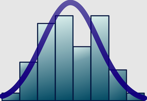
Normal Distribution (Bell Curve)
The normal distribution is a symmetric, bell-shaped distribution that is fundamental in statistics. Most data cluster around the mean, with frequencies tapering off symmetrically on both sides.
Many natural phenomena follow a normal distribution.
The mean, median, and mode are all equal in a perfectly normal distribution.
Percentiles
A percentile indicates the percentage of data values below a particular value. For example, being in the 86th percentile means a value is greater than 86% of the data.
Percentiles are useful for comparing individual scores to a population.
Misleading and Less Informative Graphs
Misleading Graphs
Graphs can be misleading if axes are manipulated or if the visual representation exaggerates or minimizes differences. For example, starting the y-axis at a value other than zero can distort the perceived differences between groups.
Always check axis scales and labels for accuracy.
Pie Charts and Pareto Charts
Pie charts show proportions as slices of a circle but can be difficult to interpret accurately. Pareto charts, which are bar graphs ordered by frequency, often provide clearer comparisons.
Pareto charts are generally preferred for displaying categorical data.
Summary Table: Types of Graphical Displays
Type | Best For | Key Features |
|---|---|---|
Frequency Table | All data types | Organizes data into classes, shows counts |
Histogram | Quantitative data | Shows distribution shape, frequency or percent |
Stem-and-Leaf | Small datasets | Shows actual values and distribution |
Dotplot | Small datasets | Shows clusters, gaps, and outliers |
Pareto Chart | Categorical data | Bars ordered by frequency |
Pie Chart | Categorical data | Shows proportions, less precise |
