 Back
BackDescribing Quantitative Variables: Graphs and Numerical Summaries
Study Guide - Smart Notes
 Tailored notes based on your materials, expanded with key definitions, examples, and context.
Describing Quantitative Variables
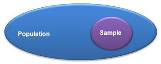
Population and Sample
In statistics, it is essential to distinguish between the population and the sample. The population refers to the entire group of individuals or cases of interest, while the sample is a subset of the population for which data is actually collected.
Population: All individuals/observations/cases of interest.
Sample: A subset of the population for which we have data.
Overview of Statistics
Statistics involves two main tasks: describing data and making conclusions about data. Descriptive statistics summarize and visualize data, while inferential statistics allow us to make generalizations about the population based on the sample.
Describe: Use graphs and numerical summaries to characterize data.
Make conclusions about: Use inferential methods to draw conclusions about the population.
Displaying Quantitative Variables (Section 2.2)
Bar Graphs vs. Histograms
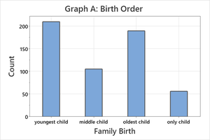
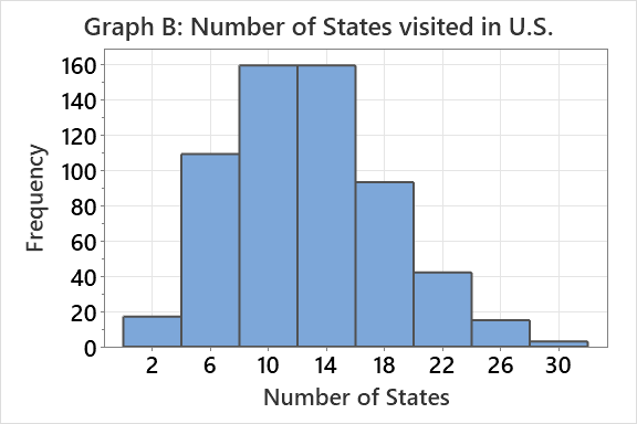
Bar graphs and histograms are both used to visualize data, but they serve different purposes and are used for different types of variables. Bar graphs are used for categorical data, while histograms are used for quantitative data.
Bar Graph: Displays counts for categories (e.g., birth order).
Histogram: Displays frequency distribution for quantitative variables (e.g., number of states visited).
Comparing Bar Graphs and Histograms
Bar graphs and histograms differ in their axes and the type of data they represent. The horizontal axis in a bar graph shows categories, while in a histogram it shows numerical intervals.
Bar Graph: Horizontal axis = categories; vertical axis = count.
Histogram: Horizontal axis = numerical intervals; vertical axis = frequency.


Histograms for Quantitative Data
Histograms are useful for visualizing the distribution of quantitative data. However, they have limitations, such as difficulty handling large numbers of observations and sensitivity to the choice of bin width.
Limitation: Cannot handle a large number of observations easily.
Limitation: The default number of bins may not always be appropriate.
Interpreting Graphs
Graphs allow us to observe patterns, shapes, and anomalies in data that may not be apparent from numerical summaries alone. As John Tukey noted, the greatest value of a picture is in revealing unexpected insights.
Histogram Shapes
Histograms can take on different shapes, which provide information about the distribution of the data.
Symmetric: The left and right sides of the histogram are approximately mirror images.
Right-skewed: The tail on the right side is longer.
Left-skewed: The tail on the left side is longer.
Bimodal/Multimodal: The histogram has two or more peaks.
Histogram Modes
The mode of a histogram refers to the peak(s) in the distribution. Multiple modes may indicate the presence of subgroups or important variables not accounted for.
Unimodal: One clear peak.
Bimodal: Two clear peaks.
Multimodal: More than two peaks.
Measures of Center (Section 2.4)
Mean and Median
The center of a distribution can be described using the mean or the median. Each measure has its own properties and is affected differently by the shape of the data.
Mean: The arithmetic average; uses all observations. Sensitive to outliers and skewed data. Symbol:
Median: The middle value in an ordered data set; uses only the central observations. Resistant to outliers and skewed data.
Formulas:
Mean:
Median: No standard formula; found by ordering the data and selecting the middle value.
Mean vs. Median in Different Distributions
The relationship between the mean and median provides insight into the shape of the distribution.
Symmetric: Mean ≈ Median
Right-skewed: Mean > Median
Left-skewed: Mean < Median
Percentiles and Five Number Summary
Percentiles
A percentile indicates the position in the data set where a certain percentage of observations lie below it. For example, the 95th percentile is the value below which 95% of the observations fall.
Percentile: The value below which a given percentage of observations lie.
Five Number Summary
The five number summary provides a concise description of the distribution using resistant statistics.
Minimum: Smallest value
First Quartile (Q1): 25th percentile
Median: 50th percentile
Third Quartile (Q3): 75th percentile
Maximum: Largest value
These statistics are resistant to outliers and provide a robust summary of the data.
Measures of Variation (Variability)
Interquartile Range (IQR)
The interquartile range (IQR) measures the spread of the middle 50% of the data and is resistant to outliers.
IQR:
Interpretation: Represents the variation in the middle 50% of the data.
Standard Deviation (s)
The standard deviation measures the average distance of each observation from the mean. It is sensitive to outliers and skewed data.
Standard Deviation:
Interpretation: Nonresistant measure; inflated by skewed or unusual data.
Summary: Choosing Numerical Summaries
Depending on the shape of the distribution, different numerical summaries are appropriate:
Symmetric distributions: Use mean and standard deviation.
Skewed distributions: Use median and IQR.
These statistics are less helpful for bimodal or multimodal data, where the shape is more complex.
Key Learning Objectives
Understand and apply the attributes for statistics: mean and median.
Identify the shape and use the shape of the histogram to make statements about patterns in the data.
Understand and apply the attributes for the standard deviation and IQR.
