 Back
BackDescribing the Relation Between Two Variables: Scatter Diagrams, Correlation, and Regression
Study Guide - Smart Notes
 Tailored notes based on your materials, expanded with key definitions, examples, and context.
Describing the Relation Between Two Variables
Scatter Diagrams and Types of Association
Scatter diagrams are essential tools in statistics for visualizing the relationship between two quantitative variables measured on the same individuals. The predictor (independent) variable is plotted on the horizontal axis, while the response (dependent) variable is plotted on the vertical axis. Each point represents an individual observation.
Positively Associated Variables: When increases in the predictor variable are associated with increases in the response variable.
Negatively Associated Variables: When increases in the predictor variable are associated with decreases in the response variable.
No Association: When there is no discernible pattern between the variables.
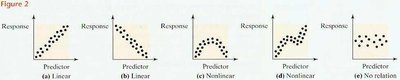
Interpretation: Scatter diagrams help identify whether the relationship is linear, nonlinear, or if no relationship exists. Linear relationships can be positive or negative, while nonlinear relationships may show curves or clusters.
Correlation Coefficient
The correlation coefficient quantifies the strength and direction of a linear relationship between two quantitative variables. The population correlation coefficient is denoted by (rho), and the sample correlation coefficient by .
Formula for the Sample Correlation Coefficient:
Alternatively,
Properties of r:
-1 ≤ r ≤ 1
r = +1: Perfect positive linear relation
r = -1: Perfect negative linear relation
r close to 0: No linear relation
r is unitless
Example: For the productivity-experience data, r = 0.96 indicates a strong positive linear relationship.
Application: Software such as Excel can be used to compute the correlation coefficient efficiently.
Least-Squares Regression
Regression analysis estimates the relationship between a response variable and a predictor variable by fitting a line that best represents the data. The least-squares regression line minimizes the sum of squared vertical distances (errors) between observed and predicted values.
Population Model:
Sample Model:
Least-Squares Regression Equation:
Formulas for Coefficients:
Alternatively,
Interpretation: The slope represents the change in the response variable for each unit increase in the predictor variable. The intercept is the predicted value of y when x = 0 (if meaningful within the data range).
Prediction and Scope of the Model
The regression equation can be used to predict the response variable for given values of the predictor variable, but only within the range of observed data. Predictions outside this range (extrapolation) are unreliable.
Prediction Equation:
Residual (Error):
Example: For a worker with 7 years of experience, predicted productivity is .
Measuring the Fit: Coefficient of Determination (R2)
The coefficient of determination, , measures the proportion of total variation in the response variable explained by the regression line.
for simple linear regression
Interpretation: An of 0.92 means 92% of the variation in productivity is explained by experience.
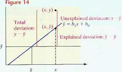
Deviations:
Total deviation:
Explained deviation:
Unexplained deviation:
Standard Error of the Estimate
The standard error of the estimate, , measures the typical distance that the observed values fall from the regression line.
Smaller indicates a better fit; means all points lie exactly on the regression line.
Hypothesis Testing for the Slope Coefficient
Hypothesis testing determines whether there is a statistically significant linear relationship between the predictor and response variables.
Null Hypothesis: (no linear relation)
Alternative Hypothesis: (two-tailed), (left-tailed), (right-tailed)
Test Statistic: , where
Degrees of freedom:
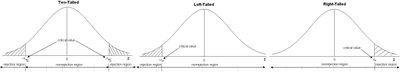
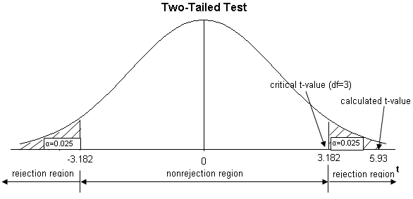
Decision Rule: Reject if the calculated t-value falls in the rejection region determined by the significance level .
Example: For the productivity-experience data, exceeds the critical value , so we reject and conclude a significant positive relationship exists.
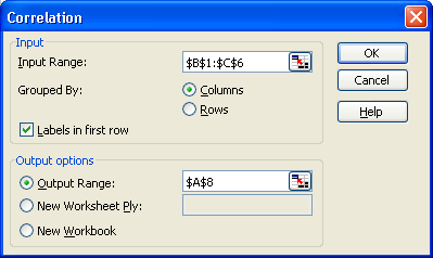
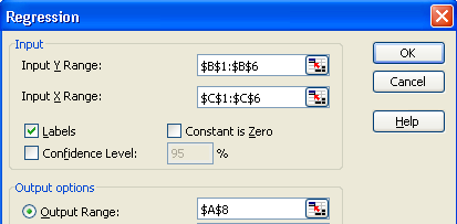
Using Excel for Correlation and Regression Analysis
Excel provides tools for calculating correlation coefficients and fitting regression models.
Correlation: Use the Data Analysis Toolpak, select 'Correlation', input the data range, and specify output options.
Regression: Use the Data Analysis Toolpak, select 'Regression', input the Y and X ranges, and specify output options.
Summary Table: Key Formulas and Concepts
Concept | Formula/Definition |
|---|---|
Correlation Coefficient (r) | |
Regression Line | |
Slope (b1) | |
Intercept (b0) | |
Coefficient of Determination (R2) | |
Standard Error of Estimate (se) | |
Test Statistic for Slope |
