 Back
BackDescribing the Relation Between Two Variables: Scatter Diagrams, Correlation, and Regression
Study Guide - Smart Notes
 Tailored notes based on your materials, expanded with key definitions, examples, and context.
Describing the Relation Between Two Variables
Scatter Diagrams and Correlation
Understanding the relationship between two quantitative variables is fundamental in statistics. This section introduces scatter diagrams, correlation, and the basics of regression analysis.
Response and Explanatory Variables
Response Variable: The variable whose value is explained or predicted by another variable.
Explanatory (Predictor) Variable: The variable used to explain or predict the response variable.
Scatter Diagrams
A scatter diagram is a graph that displays the relationship between two quantitative variables measured on the same individuals.
The explanatory variable is plotted on the horizontal axis, and the response variable is plotted on the vertical axis.
Scatter diagrams help identify the type of relationship: linear, nonlinear, or no relation.
Example: A golf pro investigates the relationship between club-head speed (mph) and the distance a golf ball travels (yards). By controlling other variables, the pro collects data and plots a scatter diagram, observing that as club-head speed increases, so does the distance.
Types of Association
Positive Association: As one variable increases, the other also increases.
Negative Association: As one variable increases, the other decreases.
Linear Correlation Coefficient (Pearson's r)
The linear correlation coefficient (r) measures the strength and direction of the linear relationship between two quantitative variables.
Properties:
r is always between -1 and 1, inclusive.
r = +1: Perfect positive linear relation; r = -1: Perfect negative linear relation.
r close to 0: Little or no linear relation.
r is unitless and not resistant to outliers.
Formula for Sample Correlation Coefficient:
Where and are the individual sample values, and are the sample means, and are the sample standard deviations, and n is the sample size.
Testing for a Linear Relation
Calculate the absolute value of r.
Find the critical value for the given sample size.
If is greater than the critical value, a linear relation exists.
Correlation vs. Causation
Correlation does not imply causation, especially in observational studies.
A lurking variable is an unmeasured variable that influences both the explanatory and response variables, potentially confounding results.
Least-Squares Regression
Finding and Using the Least-Squares Regression Line
The least-squares regression line is used to model the linear relationship between two variables and make predictions.
Equation of the Least-Squares Regression Line
(slope):
(y-intercept):
Where is the predicted value of y for a given x.
Interpreting the Slope and Intercept
Slope (): The average change in the response variable for each one-unit increase in the explanatory variable.
Y-intercept (): The predicted value of the response variable when the explanatory variable is zero (interpret only if x = 0 is meaningful and within the data range).
Residuals and the Least-Squares Criterion
Residual: The difference between the observed value and the predicted value ().
The least-squares regression line minimizes the sum of squared residuals: .
Example: Regression Output from Statistical Software
The table below shows regression output from Excel, StatCrunch, and R for the relationship between club-head speed and distance:
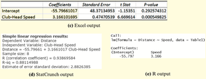
The slope (Club-Head Speed) is approximately 3.166, indicating that for each 1 mph increase in club-head speed, the distance increases by about 3.166 yards, on average.
The intercept is approximately -55.80, but since a club-head speed of 0 mph is not meaningful, the intercept should not be interpreted in this context.
The R-squared value (coefficient of determination) is about 0.881, meaning 88.1% of the variation in distance is explained by club-head speed.
Diagnostics on the Least-Squares Regression Line
Coefficient of Determination ()
measures the proportion of total variation in the response variable explained by the regression line.
ranges from 0 to 1. Higher values indicate a better fit.
For simple linear regression, .
Residual Analysis
Residual plots help assess the appropriateness of the linear model.
If residuals display no pattern and have constant variance, the linear model is appropriate.
Outliers and influential observations can be detected using residual plots and boxplots.
Influential Observations
An influential observation significantly affects the regression line's slope, intercept, or correlation coefficient.
Influence depends on the observation's leverage (distance from the mean of x) and residual size.
Influential points should only be removed with justification; otherwise, consider collecting more data or using robust methods.
Contingency Tables and Association
Contingency Tables
A contingency table (two-way table) displays the frequency distribution of variables that are categorical.
Marginal distribution: The totals for each row or column, representing the distribution of one variable regardless of the other.
Conditional distribution: The distribution of one variable for a fixed value of the other variable.
Simpson’s Paradox
Simpson’s Paradox occurs when an association between two variables reverses or disappears when a third variable is considered.
Always consider potential lurking variables when interpreting associations in contingency tables.
Summary: Understanding the relationship between two variables involves graphical (scatter diagrams), numerical (correlation, regression), and tabular (contingency tables) methods. Proper interpretation requires attention to causation, lurking variables, and the appropriateness of the statistical model.
