 Back
BackDescribing the Relation Between Two Variables: Correlation, Regression, and Contingency Tables
Study Guide - Smart Notes
 Tailored notes based on your materials, expanded with key definitions, examples, and context.
Describing the Relation Between Two Variables
Scatter Diagrams and Correlation
Understanding the relationship between two quantitative variables is fundamental in statistics. Scatter diagrams and correlation coefficients are essential tools for visualizing and quantifying these relationships.
Scatter Diagrams
Definition: A scatter diagram is a graph that displays the relationship between two quantitative variables measured on the same individuals. Each point represents an individual’s values for the two variables.
Axes: The explanatory (predictor) variable is plotted on the horizontal axis, and the response variable is plotted on the vertical axis.
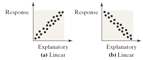
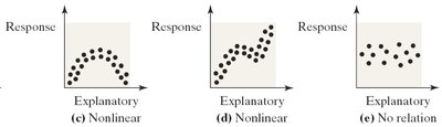
Interpretation: Patterns in the scatter diagram indicate the type and strength of the relationship (linear, nonlinear, or no relation).
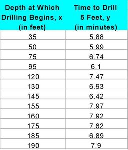
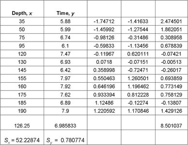
Example: The table below shows data for drilling rock, where the depth at which drilling begins (x) is the explanatory variable, and the time to drill five feet (y) is the response variable.
Types of Relations: Scatter diagrams can reveal different types of relationships:
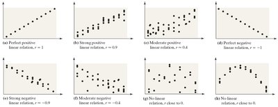
Strength and Direction of Linear Relationships
Perfect Positive Linear Relation: All points lie on a line with positive slope (r = 1).
Perfect Negative Linear Relation: All points lie on a line with negative slope (r = -1).
No Linear Relation: Points are scattered with no discernible pattern (r ≈ 0).
Intermediate Cases: The closer r is to ±1, the stronger the linear relationship.
Linear Correlation Coefficient (Pearson's r)
The linear correlation coefficient, denoted as r for a sample, measures the strength and direction of the linear relationship between two quantitative variables.
Formula:
Where and are the sample means, and are the sample standard deviations, and n is the sample size.
Properties:
-1 ≤ r ≤ 1
r = 1: Perfect positive linear relation
r = -1: Perfect negative linear relation
r ≈ 0: No linear relation
r is unitless and not resistant to outliers

Determining the Existence of a Linear Relation
Compare the absolute value of r to a critical value from a table based on sample size (n).
If |r| > critical value, a linear relation exists.
Correlation vs. Causation
Correlation does not imply causation. A high correlation between two variables does not mean that changes in one variable cause changes in the other. Correlation may be due to:
Coincidence
Lurking variables (variables related to both explanatory and response variables)
Trends over time (time series data)
Example: Ice cream sales and crime rates may both increase with temperature, but one does not cause the other.
Least-Squares Regression
Finding and Using the Least-Squares Regression Line
The least-squares regression line is the line that minimizes the sum of the squared residuals (vertical distances between observed and predicted values).
Equation:
Slope:
Intercept:
Example: For the drilling data, the regression line is .
Making Predictions
To predict y for a given x, substitute x into the regression equation.
Example: For x = 130 feet, minutes.
Interpreting Slope and Intercept
Slope: The average change in y for each unit increase in x.
Intercept: The predicted value of y when x = 0 (interpretation depends on whether x = 0 is meaningful in context).
Scope of the Model
Predictions should only be made within the range of observed x-values. Extrapolation beyond this range is unreliable.

Residuals and Sum of Squared Residuals
Residual: The difference between the observed value and the predicted value ().
Sum of Squared Residuals: measures the total error in prediction.
Diagnostics on the Least-Squares Regression Line
Coefficient of Determination ()
Definition: measures the proportion of the variance in the response variable explained by the regression model.
Calculation: (for simple linear regression)
Interpretation: means 59.75% of the variability in drilling time is explained by the regression line.

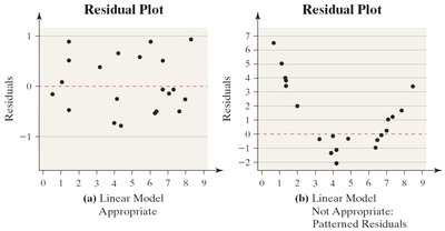
Residual Analysis
Plotting residuals helps assess the adequacy of the linear model.
If residuals show a pattern, the linear model may not be appropriate.
Constant error variance (homoscedasticity) is required for valid inference.
Outliers can be detected in residual plots.
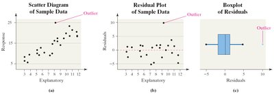
Influential Observations
An influential observation significantly affects the regression line or correlation coefficient.
Such points are often outliers in the explanatory variable.
Influential observations should only be removed with justification; otherwise, collect more data or use robust methods.
Contingency Tables and Association
Contingency Tables (Two-Way Tables)
Contingency tables summarize the relationship between two categorical variables. Each cell shows the frequency for a combination of categories.
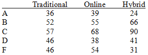
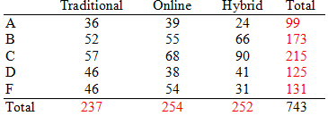
Example: The table below shows the distribution of grades by course delivery method.
Traditional | Online | Hybrid | |
|---|---|---|---|
A | 36 | 39 | 24 |
B | 52 | 55 | 66 |
C | 57 | 68 | 90 |
D | 46 | 38 | 41 |
F | 46 | 54 | 31 |

Marginal Distributions
Definition: The marginal distribution is the frequency or relative frequency of a single variable, summing over the categories of the other variable.
Example: Marginal totals for grades and delivery methods are shown below.
Traditional | Online | Hybrid | Total | |
|---|---|---|---|---|
A | 36 | 39 | 24 | 99 |
B | 52 | 55 | 66 | 173 |
C | 57 | 68 | 90 | 215 |
D | 46 | 38 | 41 | 125 |
F | 46 | 54 | 31 | 131 |
Total | 237 | 254 | 252 | 743 |
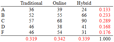
Relative Frequency Marginal Distributions
Relative frequencies are obtained by dividing each cell count by the total number of observations.
Traditional | Online | Hybrid | Total | |
|---|---|---|---|---|
A | 0.133 | 0.133 | 0.095 | 0.133 |
B | 0.233 | 0.217 | 0.262 | 0.233 |
C | 0.289 | 0.268 | 0.357 | 0.289 |
D | 0.168 | 0.150 | 0.163 | 0.168 |
F | 0.176 | 0.213 | 0.123 | 0.176 |
Total | 0.319 | 0.342 | 0.339 | 1.000 |

Conditional Distributions and Association
Conditional Distribution: The relative frequency of each category of the response variable, given a specific value of the explanatory variable.
Example: The table below shows the conditional distribution of grades by delivery method.
Traditional | Online | Hybrid | |
|---|---|---|---|
A | 0.152 | 0.154 | 0.095 |
B | 0.219 | 0.217 | 0.262 |
C | 0.241 | 0.268 | 0.357 |
D | 0.194 | 0.150 | 0.163 |
F | 0.194 | 0.213 | 0.123 |
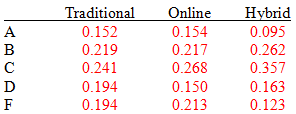

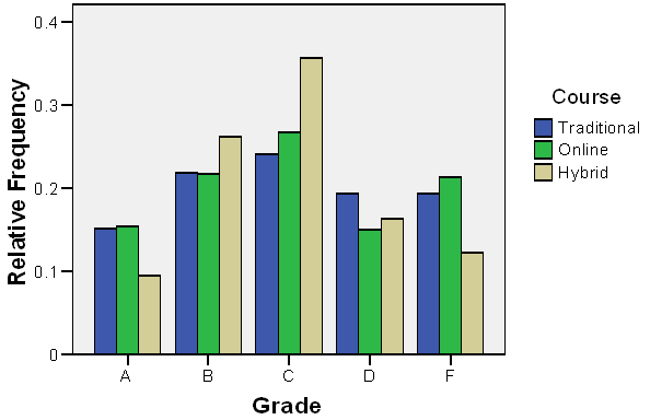
Interpretation: Students in the hybrid course are more likely to pass (A, B, or C) than those in the other two methods.
Graphical Representation
Bar graphs can be used to visually compare conditional distributions across groups.
Additional info: These notes cover the core concepts of correlation, regression, and categorical data analysis, providing definitions, formulas, examples, and visual aids for comprehensive understanding.
