 Back
BackDescribing the Relation Between Two Variables: Scatter Diagrams, Correlation, Regression, and Association
Study Guide - Smart Notes
 Tailored notes based on your materials, expanded with key definitions, examples, and context.
Chapter 4: Describing the Relation Between Two Variables
Scatter Diagrams and Correlation
When analyzing data involving two quantitative variables measured on the same individual, it is essential to understand their relationship. This section introduces graphical and numerical methods for describing such bivariate data.
Drawing and Interpreting Scatter Diagrams
A scatter diagram is a graph that displays the relationship between two quantitative variables. Each point represents an individual, with the explanatory variable (independent variable) on the horizontal axis and the response variable (dependent variable) on the vertical axis.
Purpose: To visually assess the type of relationship (linear, nonlinear, or no relation) between variables.
Interpretation: Patterns in the scatter diagram indicate the nature of association.
Example: Predicting home sale prices using Zestimate values, or analyzing drilling time versus depth.
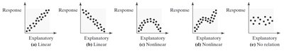
Types of Relationships:
Linear: Points form a straight-line pattern (positive or negative association).
Nonlinear: Points form a curved pattern.
No relation: Points are scattered randomly.
Properties of the Linear Correlation Coefficient
The linear correlation coefficient (Pearson's r) measures the strength and direction of the linear relationship between two quantitative variables.
Population correlation coefficient: (rho)
Sample correlation coefficient:
Formula for sample correlation coefficient:
= ith observation of explanatory variable
= sample mean of explanatory variable
= sample standard deviation of explanatory variable
= ith observation of response variable
= sample mean of response variable
= sample standard deviation of response variable
= number of individuals in the sample
Interpreting the Linear Correlation Coefficient
The value of ranges from -1 to +1:
r = +1: Perfect positive linear relation
r = -1: Perfect negative linear relation
r close to 0: Little or no evidence of a linear relation
r is unitless: Units of measurement do not affect interpretation
r is not resistant: Outliers can significantly affect its value
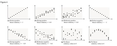
Examples:
Perfect positive: All points lie on a line with positive slope ()
Strong positive: Points closely follow a line with positive slope ()
Moderate positive: Points loosely follow a line with positive slope ()
Perfect negative: All points lie on a line with negative slope ()
Strong negative: Points closely follow a line with negative slope ()
Moderate negative: Points loosely follow a line with negative slope ()
No linear relation: Points are scattered ()
No linear relation but possible nonlinear pattern: Points form a curve ()
Computing and Interpreting the Linear Correlation Coefficient
To compute , use the formula above with the observed data. Interpretation depends on the value and sign of $r$.
Example: For drilling data, calculate to assess the relationship between depth and drilling time.
Using technology: Software like StatCrunch can compute efficiently.
Determining Whether a Linear Relation Exists
To test for a linear relation:
Calculate the absolute value of .
Find the critical value for the sample size (from statistical tables).
If is greater than the critical value, a linear relation exists.
Correlation vs. Causation
Correlation does not imply causation. High correlation may result from both variables changing over time or due to a lurking variable.
Lurking variable: A variable related to both explanatory and response variables, causing apparent association.
Example: Ice cream sales and crime rates are correlated due to temperature, not causality.
Observational data: Cannot establish causality; only designed experiments can.
Least-Squares Regression
The least-squares regression line is the line that best fits the data by minimizing the sum of squared residuals (errors).
Finding the Least-Squares Regression Line and Making Predictions
Regression equation:
Slope:
Y-intercept:
Residual: Difference between observed and predicted value:
Least-squares criterion: Minimizes
Interpreting the Slope and Y-Intercept
Slope: Represents the average change in the response variable for each unit increase in the explanatory variable.
Y-intercept: Represents the predicted value of the response variable when the explanatory variable is zero (if zero is reasonable).
Caution: Do not use the regression line to predict values outside the observed range (scope of the model).
Computing the Sum of Squared Residuals
The least-squares regression line minimizes the sum of squared residuals compared to any other line.
Example: For drilling data, sum of squared residuals is 2.70119.
The Coefficient of Determination
The coefficient of determination () measures the proportion of total variation in the response variable explained by the regression line.
:
No explanatory value
:
Regression line explains all variation
Calculation: For linear regression,
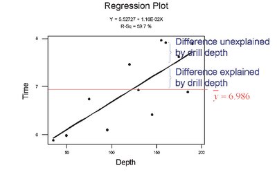
Interpretation: The closer the observed values are to the regression line, the higher .
Total deviation:
Explained deviation:
Unexplained deviation:
Formula:
Contingency Tables and Association
Contingency tables (two-way tables) relate two categorical variables, allowing analysis of association between them.
Computing Marginal Distributions
Marginal distribution: Frequency or relative frequency distribution of either row or column variable.
Example: Distribution of grades or delivery methods in a course.
Conditional Distributions and Association
Conditional distribution: Relative frequency of each category of the response variable, given a specific value of the explanatory variable.
Example: Grade distribution by method of delivery.
Bar graph: Visualizes conditional distributions to identify associations.
Simpson’s Paradox
Simpson’s Paradox occurs when an association between two variables reverses or disappears upon introduction of a third variable.
Example: Survival rates for diabetes types appear different until age is considered, revealing the effect of a lurking variable.
Implication: Always consider potential lurking variables before drawing conclusions about associations.
Type | Survived | Died | Total |
|---|---|---|---|
Type 1 | 253 | 105 | 358 |
Type 2 | 326 | 218 | 544 |
Total | 579 | 323 | 902 |
Additional info: When stratified by age, the apparent association between diabetes type and mortality changes, illustrating Simpson's Paradox.
