 Back
BackDescriptive Statistics: Frequency Distributions and Graphs
Study Guide - Smart Notes
 Tailored notes based on your materials, expanded with key definitions, examples, and context.
Chapter 2: Descriptive Statistics
Section 2.1: Frequency Distributions and Their Graphs
Descriptive statistics involves organizing and summarizing data to make it easier to interpret and analyze. One of the fundamental ways to organize data is through frequency distributions and their graphical representations. This section covers the construction and interpretation of frequency tables, histograms, frequency polygons, and ogives.
Frequency Distribution Tables
A frequency distribution table is a tabular summary that shows classes (intervals) of data along with the count (frequency) of data entries in each class. This helps to identify patterns and trends in the data.
Class: A range of values grouped together (e.g., 1–5, 6–10).
Frequency (f): The number of data entries in each class.
Class Limits: Lower class limit is the smallest value in the class; upper class limit is the largest value in the class.
Class Width: The difference between the lower limit of one class and the lower limit of the next class. Calculated as:
Example Table:
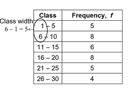
Application: Frequency tables are used to summarize large data sets, making it easier to see the distribution and frequency of values.
Constructing a Frequency Distribution
To construct a frequency distribution, follow these steps:
Determine the minimum and maximum values in the data set.
Choose the number of classes (typically between 5 and 20).
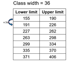
Calculate the class width using: Always round up the class width to ensure all data is included.
Set the class limits for each class.
Tally the data entries for each class and record the frequency.
Example: Cell phone screen times for 30 adults, grouped into 7 classes with a class width of 36.
Application: This method is used to organize raw data into meaningful intervals for further analysis.
Midpoints, Relative Frequency, and Cumulative Frequency
After constructing a frequency distribution, additional measures can be calculated:
Midpoint: The value halfway between the lower and upper class limits.
Relative Frequency: The proportion or percentage of data in each class.
Cumulative Frequency: The sum of the frequency for a class and all previous classes.
Example: Calculating midpoints, relative frequencies, and cumulative frequencies helps describe patterns in the data, such as the proportion of adults with screen times above a certain threshold.
Class Boundaries
Class boundaries are used to ensure that consecutive bars in a histogram touch. They are the values that separate classes without forming gaps between them.
Class boundaries are calculated by averaging the upper limit of one class and the lower limit of the next class.
Application: Class boundaries are essential for accurate graphical representation of data in histograms.
Graphing Quantitative Data
Quantitative data can be visualized using several types of graphs:
Histogram: A bar graph representing the frequency distribution. The horizontal axis is quantitative, and the vertical axis shows frequencies. Bars must touch.
Relative Frequency Histogram: Similar to a histogram, but the vertical axis shows relative frequencies.
Frequency Polygon: A line graph that emphasizes the continuous change in frequencies. Uses class midpoints for the horizontal axis.
Ogive (Cumulative Frequency Graph): A line graph displaying cumulative frequencies at each upper class boundary.
Example: Histograms and ogives for cell phone screen times reveal patterns such as the proportion of adults exceeding certain screen time thresholds.
Constructing Graphs
For histograms, use class boundaries or midpoints for the horizontal axis.
For frequency polygons, plot points at class midpoints and connect them with lines.
For ogives, plot cumulative frequencies at upper class boundaries and connect the points.
Application: These graphs are used in business, quality control, and environmental science to visualize cumulative sales, defect rates, or environmental data distributions.
Summary Table: Types of Frequency Distributions and Graphs
Type | Description | Axis |
|---|---|---|
Frequency Table | Tabular summary of classes and frequencies | None |
Histogram | Bar graph of frequencies | Quantitative (horizontal), Frequency (vertical) |
Relative Frequency Histogram | Bar graph of relative frequencies | Quantitative (horizontal), Relative Frequency (vertical) |
Frequency Polygon | Line graph of frequencies | Class Midpoints (horizontal), Frequency (vertical) |
Ogive | Line graph of cumulative frequencies | Upper Class Boundaries (horizontal), Cumulative Frequency (vertical) |
Additional info: These notes expand on brief points by providing definitions, formulas, and examples to ensure completeness and academic quality for exam preparation.
