 Back
BackDescriptive Statistics: Graphical Displays of Data
Study Guide - Smart Notes
 Tailored notes based on your materials, expanded with key definitions, examples, and context.
Descriptive Statistics
Section 2.2: More Graphs and Displays
This section explores various graphical methods for displaying both quantitative and qualitative data. Understanding these visualizations is essential for summarizing, interpreting, and communicating statistical information effectively.
Graphing Quantitative Data Sets
Stem-and-Leaf Plots
Stem-and-leaf plots are a method for organizing small sets of quantitative data. Each data value is split into a "stem" (all but the last digit) and a "leaf" (the last digit). This plot retains the original data values and provides a quick way to sort and visualize the distribution.
Stem: All digits except the last one (e.g., for 124, stem is 12).
Leaf: The last digit (e.g., for 124, leaf is 4).
Useful for small data sets; impractical for large data sets.
Helps identify patterns such as clustering, gaps, or outliers.
Example: For the data set 21, 25, 25, 26, 27, 28, 30, 36, 36, 45, the stem-and-leaf plot would organize the numbers by their tens (stems) and units (leaves).
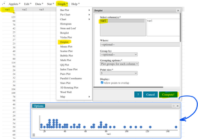
Dot Plots
A dot plot displays each data value as a dot above a number line. It is especially useful for small to moderate-sized data sets and allows for easy identification of clusters, gaps, and outliers.
Each dot represents one observation.
Multiple identical values are stacked vertically.
Best for visualizing the frequency of individual data points.
Example: The data set 21, 25, 25, 26, 27, 28, 30, 36, 36, 45 can be represented as a dot plot, showing the distribution and frequency of each value.
Graphing Qualitative Data Sets
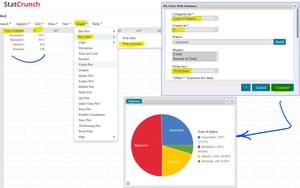
Pie Charts
Pie charts are circular graphs divided into sectors, each representing a category's proportion of the whole. They are ideal for displaying the relative frequencies or percentages of qualitative data.
Each sector's angle and area are proportional to the category's frequency.
Useful for showing how a whole is divided among categories.
Best for data with a limited number of categories.
Example: The number of earned degrees conferred in 2019 (Associate's, Bachelor's, Master's, Doctoral) can be visualized in a pie chart to compare the proportions of each degree type.
Bar Graphs
A bar graph uses bars to represent the frequency or relative frequency of categories. Bars can be arranged in any order (random, alphabetical, or by category), and there is always space between the bars to emphasize the categorical nature of the data.
X-axis: Categories (qualitative data)
Y-axis: Frequency or relative frequency
Bars are separated to highlight distinct categories
Purpose: To compare the sizes of different categories.
Pareto Charts
A Pareto chart is a special type of bar graph where categories are ordered from largest to smallest frequency. This helps to quickly identify the most significant categories.
Bars are arranged in descending order of frequency.
Often used in quality control and business to highlight the most important factors.
Example: Leading causes of death in the United States in 2019 can be displayed in a Pareto chart to show which causes are most significant.
Summary Table: Graph Types and Their Uses
Graph Type | Data Type | Main Purpose |
|---|---|---|
Stem-and-leaf plot | Quantitative | Display original data values, show distribution |
Dot plot | Quantitative | Show frequency of individual values |
Pie chart | Qualitative | Show relative proportions of categories |
Bar graph | Qualitative | Compare category frequencies |
Pareto chart | Qualitative | Highlight most significant categories |
Key Takeaways
Choose the appropriate graph based on data type (quantitative vs. qualitative).
Stem-and-leaf and dot plots are best for small quantitative data sets.
Pie charts and bar graphs are ideal for summarizing qualitative data.
Pareto charts help prioritize categories by frequency.
