 Back
BackDescriptive Statistics: Graphical Representation of Data
Study Guide - Smart Notes
 Tailored notes based on your materials, expanded with key definitions, examples, and context.
Descriptive Statistics
Section 2.2: More Graphs and Displays
This section explores various graphical methods for representing both quantitative and qualitative data. Understanding these visualizations is essential for interpreting data distributions, identifying patterns, and making informed decisions in statistics.
Graphing Quantitative Data Sets
Stem-and-Leaf Plot: A method that separates each data value into a "stem" (all but the final digit) and a "leaf" (the final digit). This plot is similar to a histogram but retains the original data values, making it useful for sorting and identifying patterns.
Dot Plot: Each data entry is represented by a dot above a horizontal axis. Dot plots display the distribution, allow identification of specific values, and help spot unusual data entries (outliers).
Example: For a data set of text messages sent per day, a stem-and-leaf plot can reveal that most users send between 20 and 50 messages, while a dot plot can highlight outliers such as a user sending 148 messages.
Variations of Stem-and-Leaf Plots
Using two rows per stem (e.g., one for leaves 0–4, another for 5–9) provides a more detailed view of the data distribution.
This method can reveal finer patterns, such as clustering within certain ranges.
Example: Organizing text message data with two rows per stem shows most adults sent between 20 and 80 messages.
Graphing Qualitative Data Sets
Pie Chart: Represents categorical data as sectors of a circle, where each sector's area is proportional to the category's frequency or percentage. Useful for visualizing parts of a whole.
Pareto Chart: A vertical bar graph where bars are ordered from tallest to shortest, representing frequencies or relative frequencies. Highlights the most significant categories.
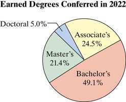
Example: A pie chart of degrees conferred in 2022 shows that nearly half were bachelor's degrees, with associate's, master's, and doctoral degrees making up the remainder.
Example: A Pareto chart of causes of death in the U.S. (2022) reveals heart disease as the leading cause, followed by cancer, with the remaining causes contributing less significantly.
Graphing Paired Data Sets
Scatter Plot: Used for paired quantitative data, plotting ordered pairs as points on a coordinate plane. Useful for identifying relationships or correlations between two variables.
Time Series Chart: Plots quantitative data collected at regular intervals over time, connecting data points with line segments to show trends.
Example: Fisher's Iris data set uses a scatter plot to show that as petal length increases, petal width also tends to increase, indicating a positive relationship.
Example: A time series chart of electric vehicle (EV) sales from 2013 to 2023 shows periods of increase, a dip, and subsequent growth, illustrating trends over time.
Summary Table: Graph Types and Their Uses
Graph Type | Data Type | Main Purpose |
|---|---|---|
Stem-and-Leaf Plot | Quantitative | Displays distribution and retains original values |
Dot Plot | Quantitative | Shows distribution and identifies outliers |
Pie Chart | Qualitative | Shows parts of a whole as percentages |
Pareto Chart | Qualitative | Highlights most significant categories |
Scatter Plot | Paired Quantitative | Shows relationships between two variables |
Time Series Chart | Quantitative over Time | Displays trends over time |
Key Formulas
Central Angle for Pie Chart:
Relative Frequency:
Additional info: These graphical methods are foundational for exploratory data analysis, allowing statisticians to summarize, visualize, and interpret data efficiently before applying more advanced statistical techniques.
