 Back
BackDescriptive Statistics: Measures of Position and Variation
Study Guide - Smart Notes
 Tailored notes based on your materials, expanded with key definitions, examples, and context.
Measures of Position
Quartiles and Fractiles
Quartiles and other fractiles are statistical measures that divide an ordered data set into equal parts, providing insight into the distribution of values. Quartiles specifically split the data into four equal sections, while fractiles can refer to any division, such as percentiles.
Quartiles: The three quartiles (Q1, Q2, Q3) divide the data set into four equal parts.
Q1 (First Quartile): About 25% of the data falls on or below Q1.
Q2 (Second Quartile): Also known as the median; about 50% of the data falls on or below Q2.
Q3 (Third Quartile): About 75% of the data falls on or below Q3.
Fractiles: Numbers that partition an ordered data set into equal parts (e.g., quartiles, percentiles).
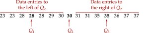
Example: For a data set of fuel wasted by commuters in urban areas, Q1 = 28, Q2 = 30, Q3 = 35. This means 25% of areas waste 28 gallons or less, 50% waste 30 gallons or less, and 75% waste 35 gallons or less.
Interquartile Range (IQR)
The interquartile range (IQR) is a measure of variation that describes the spread of the middle 50% of the data. It is calculated as the difference between the third and first quartiles:
Formula:
Purpose: IQR is used to identify outliers and understand the variability of the central portion of the data.
Identifying Outliers:
Multiply IQR by 1.5.
Subtract 1.5 × IQR from Q1; any value less than this is an outlier.
Add 1.5 × IQR to Q3; any value greater than this is an outlier.
Example: If Q1 = 55, Q3 = 68.5, then . Outliers are values less than or greater than . In the example, 32 is an outlier.
Box-and-Whisker Plot
A box-and-whisker plot is a graphical tool for exploratory data analysis that highlights important features of a data set. It is constructed using the five-number summary:
Minimum
First Quartile (Q1)
Median (Q2)
Third Quartile (Q3)
Maximum
Steps to Draw:
Find the five-number summary.
Construct a horizontal scale spanning the data range.
Plot the five numbers above the scale.
Draw a box from Q1 to Q3 with a vertical line at the median.
Draw whiskers from the box to the minimum and maximum values.
Interpretation: The box represents the middle 50% of the data. Whiskers represent the lower and upper 25%. Outliers may be indicated by unusually long whiskers or marked points.
Percentiles and Other Fractiles
Percentiles
Percentiles divide a data set into 100 equal parts. The nth percentile is the value below which n% of the data falls.
Interpretation: The 70th percentile corresponds to a value below which 70% of the data lies.
Example: If the 70th percentile SAT score is 1150, then 70% of students scored 1150 or less.
Finding the Percentile for a Data Entry
To find the percentile corresponding to a specific data entry x:
Formula:
Round to the nearest whole number.
Example: For a tuition cost of Percentile = \frac{19}{25} \times 100 = 76 $ (76th percentile).
Standard Score (z-score)
Definition and Interpretation
The standard score or z-score measures how many standard deviations a data entry x is from the mean. It is useful for comparing values from different distributions and identifying unusual values.
Formula:
Interpretation:
z < 0: x is less than the mean
z > 0: x is greater than the mean
z = 0: x equals the mean
Empirical Rule: z-scores less than -2 or greater than 2 are unusual; less than -3 or greater than 3 are very unusual.
Examples
Example 1: For vehicle speeds with mean 56 mph and standard deviation 4 mph:
62 mph: (above mean)
47 mph: (below mean, unusually slow)
56 mph: (equal to mean)
Example 2: Comparing heights:
6-foot-tall man (mean 69.9 in, std dev 2.8 in): (typical)
6-foot-tall woman (mean 64.3 in, std dev 2.5 in): (very unusual)
Application: z-scores allow comparison of values across different distributions and identification of outliers.
