 Back
BackDescriptive Statistics: Measures of Position, Variation, and Standard Scores
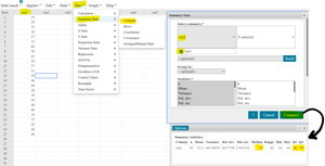
Study Guide - Smart Notes
 Tailored notes based on your materials, expanded with key definitions, examples, and context.
Measures of Position in Descriptive Statistics
Fractiles and Quartiles
Measures of position, also known as fractiles, are statistical tools that divide ordered data into equal parts based on their relative position. These measures help describe the distribution of data, especially when the data is not symmetrical.
Quartiles: Divide data into four equal parts. The first quartile (Q1) marks the 25th percentile, the second quartile (Q2 or median) marks the 50th percentile, and the third quartile (Q3) marks the 75th percentile.
Percentiles: Divide data into 100 equal parts, indicating the percentage of data below a certain value.
Application: Quartiles and percentiles are used to summarize and interpret data distributions, especially for skewed data.
Example: Tuition costs for 25 colleges can be analyzed using quartiles to understand the spread and central tendency of the data.
Interquartile Range (IQR)
The interquartile range (IQR) is a measure of variation that represents the range of the middle 50% of the data. It is calculated as the difference between the third and first quartiles:
Formula:
Purpose: The IQR is used to identify outliers and to describe the spread of the central portion of the data, excluding extreme values.
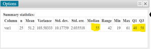
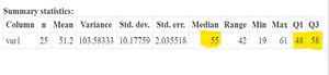
Example: For tuition costs, if Q1 = 48 and Q3 = 58, then .
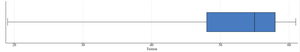
Box-and-Whisker Plots
Five-Number Summary and Construction
A box-and-whisker plot is an exploratory data analysis tool that visually displays the distribution of a data set using the five-number summary:
Minimum
First Quartile (Q1)
Median (Q2)
Third Quartile (Q3)
Maximum
To construct a box plot:
Find the five-number summary.
Draw a horizontal scale spanning the data range.
Plot the five numbers above the scale.
Draw a box from Q1 to Q3, with a vertical line at the median.
Draw whiskers from the box to the minimum and maximum values.

Interpretation of Box-and-Whisker Plots
Box plots highlight the spread and skewness of data. The length of the whiskers and the position of the box can indicate outliers and asymmetry in the distribution.
Longer whiskers suggest greater spread or potential outliers.
If the box is not centered, the data may be skewed.
Example: In tuition costs, a longer left whisker indicates a possible outlier to the left.
Percentiles and Their Calculation
Definition and Application
Percentiles indicate the relative standing of a value within a data set. The nth percentile is the value below which n% of the data falls.
Formula for Percentile:
Example: If 15 out of 25 tuition costs are less than \text{Percentile} = \frac{15}{25} \times 100 = 60$.
Interpretation: A tuition cost of $57,000 is greater than 60% of the other tuition costs.
Center and Spread: Choosing the Right Measures
Normal vs. Skewed Data
The choice of measures for center and spread depends on the shape of the data distribution:
Normal (Symmetrical & Unimodal) Data: Use the mean for center and standard deviation for spread.
Skewed Data: Use the median for center and interquartile range (IQR) for spread.
Example: Heights of adults are usually normal; home prices are often skewed.
The Standard Score (Z-score)
Definition and Purpose
A z-score measures how many standard deviations a data value is from the mean. It standardizes values, allowing comparison across different distributions and units.
Formula:
Applications: Identifying unusual values, comparing performance across groups, and standardizing data.
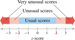
Interpretation: Z-scores near 0 are typical; scores above 2 or below -2 are unusual.
Example: Finding Z-Scores
Given a mean speed of 56 mph and a standard deviation of 4 mph, the z-score for a car traveling at 62 mph is:
Interpretation: The car's speed is 1.5 standard deviations above the mean.

Comparing Z-Scores Across Data Sets
Z-scores allow comparison of values from different groups. For example, a 6-foot-tall man and a 5-foot-8-inch woman can be compared relative to their respective populations using z-scores.
The woman has a higher z-score, indicating she is taller relative to her group than the man is to his.
Summary Table: Measures of Center and Spread
Distribution Type | Center | Spread |
|---|---|---|
Normal (Symmetrical & Unimodal) | Mean | Standard Deviation |
Skewed | Median | Interquartile Range (IQR) |
