 Back
BackDescriptive Statistics: Summarizing and Visualizing Data
Study Guide - Smart Notes
 Tailored notes based on your materials, expanded with key definitions, examples, and context.
Descriptive Statistics
Introduction to Descriptive Statistics
Descriptive statistics are methods for summarizing, organizing, and visualizing data. They provide essential tools for understanding the main features of a dataset, including its central tendency, variability, and distribution shape. Data are typically stored in datasets, where each row represents an observation and each column represents a variable.
Observation: A single data point or case in the dataset.
Variable: A characteristic or property measured for each observation.
Types of Variables
Variables can be classified based on their nature and the type of values they take:
Numeric (Quantitative): Variables that represent numbers and measurements. Arithmetic operations are meaningful.
Discrete: Take on distinct, separate values (e.g., number of siblings).
Continuous: Can take any value within an interval (e.g., salary).
Categorical (Qualitative): Variables that represent categories or groups. Arithmetic operations are not meaningful.
Nominal: Categories with no inherent order (e.g., subject area).
Ordinal: Categories with a meaningful order (e.g., degree level).
Displaying and Describing Data
Visualizing Categorical Data
Categorical data are often visualized using bar charts, which display the frequency of each category.
Bar Chart: Each bar represents the count of observations in a category.
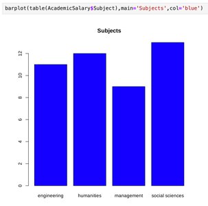
Tabular Representation
Subject | Count |
|---|---|
Engineering | 11 |
Humanities | 12 |
Management | 9 |
Social Sciences | 13 |
Visualizing Numeric Data
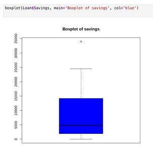
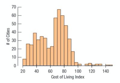
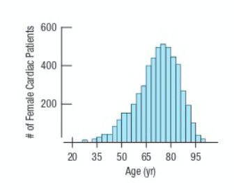
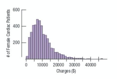
Numeric data are commonly visualized using histograms and boxplots.
Histogram: Shows the distribution of a numeric variable by grouping data into bins and displaying the frequency of observations in each bin.
Boxplot: Summarizes the distribution using the median, quartiles, and potential outliers.
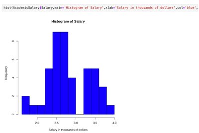
Distribution Shapes
The shape of a distribution provides insight into the nature of the data.
Unimodal: One peak in the distribution.
Bimodal: Two peaks in the distribution.
Uniform: All values are equally likely; no peaks.
Symmetric: Left and right sides are mirror images.
Skewed Right: Tail extends to the right (positive skew).
Skewed Left: Tail extends to the left (negative skew).
Summarizing Data Numerically
Measures of Center
Measures of center describe the typical value in a dataset.
Mean (Arithmetic Average): Sum of all observations divided by the number of observations. Formula:
Median: The middle value when data are ordered. If the number of observations is even, the median is the average of the two middle values.
Measures of Spread
Measures of spread describe the variability or dispersion in the data.
Variance: Average squared deviation from the mean. Formula:
Standard Deviation: Square root of the variance. Formula:
Interquartile Range (IQR): Difference between the third quartile (Q3) and the first quartile (Q1). Formula:
Boxplots and Outliers
Boxplots visually summarize the distribution of a numeric variable, highlighting the median, quartiles, and potential outliers. Outliers are values that fall outside the typical range of the data and can significantly affect measures like the mean and standard deviation.
Outlier: An observation that lies an abnormal distance from other values in a dataset.
Robust Statistics: Median and IQR are robust to outliers, while mean and standard deviation are sensitive to them.
Comparing Values: Z-Scores
Definition and Interpretation
A z-score measures how many standard deviations an observation is from the mean. It is a unitless measure that allows comparison across different distributions.
Z-score Formula:
Interpretation: A z-score of 0 means the value is at the mean; positive values are above the mean, negative values are below.
Visualizing Relationships Between Variables
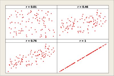
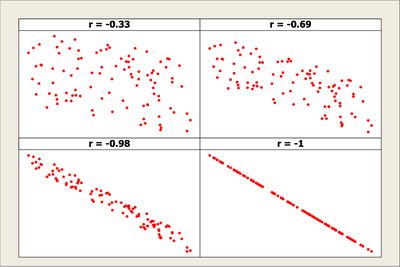
Scatterplots
Scatterplots are used to visualize the relationship between two numeric variables. They help identify patterns, trends, and potential associations.
Direction: Positive or negative association.
Form: Linear or nonlinear relationship.
Strength: How closely the data follow a pattern.
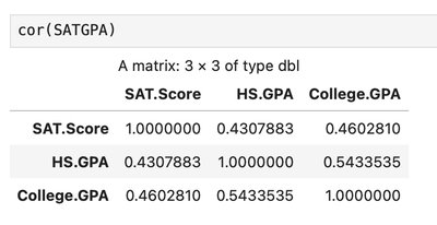
Correlation
Correlation quantifies the strength and direction of a linear relationship between two numeric variables.
Pearson Correlation Coefficient (r): Ranges from -1 to 1.
r = 1: Perfect positive linear association
r = -1: Perfect negative linear association
r = 0: No linear association
Formula:
Effect of Outliers: Outliers can greatly influence the correlation coefficient.
Limitation: Correlation measures only linear relationships and does not imply causation.
Correlation and Causation
A strong correlation between two variables does not imply that one causes the other. There may be lurking variables or confounding factors.
Association is not causation: Always consider the context and possible external influences.
Summary Table: Types of Variables and Visualizations
Variable Type | Examples | Common Visualizations | Summary Statistics |
|---|---|---|---|
Numeric (Continuous) | Salary, Age | Histogram, Boxplot | Mean, Median, SD, IQR |
Numeric (Discrete) | Number of Siblings | Bar Chart, Histogram | Mean, Median, SD |
Categorical (Nominal) | Subject, Gender | Bar Chart | Mode, Frequency Table |
Categorical (Ordinal) | Degree Level | Bar Chart | Median, Frequency Table |
Recap
Variables can be numeric (continuous/discrete) or categorical (ordinal/nominal).
Visualize numeric variables with histograms and boxplots; categorical variables with bar charts.
Summarize numeric variables using measures of center (mean, median) and spread (standard deviation, IQR).
Summarize categorical variables using contingency tables.
Outliers affect mean and standard deviation but not median and IQR.
Z-scores allow comparison of values from different distributions.
Scatterplots and correlation measure and visualize relationships between numeric variables, but correlation does not imply causation.
