 Back
BackDescriptive Statistics: Types, Graphs, Measures of Center and Variability
Study Guide - Smart Notes
 Tailored notes based on your materials, expanded with key definitions, examples, and context.
Descriptive Statistics
Types of Data
In statistics, a variable is any characteristic observed in a study. Variables are classified as either categorical or quantitative.
Categorical (Qualitative) Variable: Each observation belongs to one of a set of distinct categories. Examples: Gender, Type of shoes, Color preference, Belief in Miracle.
Quantitative (Numerical) Variable: Observations take numerical values representing different magnitudes. Examples: IQ, Number of pets, SAT score, GPA.
Discrete Quantitative Variable: Possible values form a set of separate numbers (no decimals). Examples: Number of shoes, Number of people in a family.
Continuous Quantitative Variable: Possible values form an interval and can take decimal values. Examples: Height, Weight, Age, Time to complete an exam.
Describing Data with Tables and Graphs
Data can be summarized using tables and graphs to reveal patterns and distributions.
Frequency Table: Lists categories and shows the number of observations in each. Relative frequency is the proportion or percentage in each category.
Bar Graph: Rectangular bars represent frequencies or relative frequencies for each category. Bars are separated to emphasize categorical nature.
Pareto Chart: Bar graph with categories ordered by frequency, from tallest to shortest bar.
Pie Chart: Circle divided into slices for each category, with slice size representing percentage of observations.
Graphs for Quantitative Data
Histogram: Graph of a frequency distribution for a quantitative variable. Each interval has a bar whose height represents the number of observations.
Stem-and-Leaf Plot: Represents each observation by its leading digit(s) (stem) and final digit (leaf). Useful for small data sets.
Dot Plot: Shows a dot for each observation placed above its value on a real number line. Useful for small data sets.
Time Plot: Used for time series data, plotting each observation against the time it was measured.
Measures of Central Tendency
The Mean
The mean (average), denoted by , is the sum of the observations divided by the number of observations.
Formula:
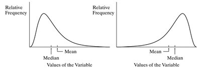
The mean is sensitive to outliers and is pulled in the direction of the longer tail in a skewed distribution.
The Median
The median is the middle value in an ordered sample. If the sample size is even, it is the average of the two middle values.
The median is resistant to outliers and is not affected by extreme values.
For symmetric distributions, the mean and median are identical.
For skewed distributions, the mean lies toward the longer tail relative to the median.
The Mode
The mode is the value that occurs most frequently in the data. It is appropriate for all types of data.
For unimodal, symmetric distributions, mean, median, and mode are identical.
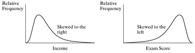
Skewed Distributions
Distributions can be symmetric or skewed. The direction of the longer tail indicates the skew.
Right-skewed: Tail extends to the right; mean is greater than median.
Left-skewed: Tail extends to the left; mean is less than median.
Measures of Variability
Range
The range is the difference between the largest and smallest observations.
Range is not resistant to outliers.
Standard Deviation and Variance
The standard deviation () measures the typical distance of an observation from the mean. The variance () is the square of the standard deviation.
Formula for standard deviation:
Standard deviation is not resistant to outliers.
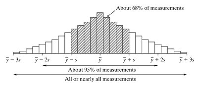
The Empirical Rule
If the histogram is approximately bell-shaped:
About 68% of observations fall within one standard deviation of the mean ().
About 95% fall within two standard deviations ().
About 99.7% fall within three standard deviations ().
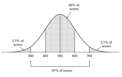
Example: SAT Scores and Empirical Rule
The SAT mathematics scores are approximately bell-shaped with mean 500 and standard deviation 100.
68% of scores fall between 400 and 600.
95% fall between 300 and 700.
99.7% fall between 200 and 800.
Measures of Position
Percentiles and Quartiles
The pth percentile is the point such that p% of observations fall below or at that point. The 25th percentile is the lower quartile (Q1), the 75th percentile is the upper quartile (Q3), and the median is the 50th percentile (Q2).
Arrange data in order to find quartiles.
Q1 is the median of the lower half; Q3 is the median of the upper half.
Interquartile Range (IQR)
The interquartile range is the difference between the upper and lower quartiles: .
IQR describes the spread of the middle half of the observations and is resistant to outliers.
Box Plots
A box plot graphically displays the five-number summary: minimum, Q1, median, Q3, maximum. The box contains the central 50% of the distribution, and whiskers extend to the minimum and maximum, except for outliers.
An observation is an outlier if it falls more than 1.5(IQR) above Q3 or below Q1.
Z-Score
The z-score measures the number of standard deviations an observation falls from the mean:
Formula:
For bell-shaped distributions, observations with z-scores greater than 3 (in absolute value) are considered unusual.
Summary
Descriptive statistics provide tools for summarizing and understanding data using tables, graphs, and numerical measures. Key concepts include types of data, graphical representations, measures of center (mean, median, mode), measures of variability (range, standard deviation, IQR), and measures of position (percentiles, quartiles, z-scores).
