 Back
BackDisplaying and Summarizing Quantitative Data
Study Guide - Smart Notes
 Tailored notes based on your materials, expanded with key definitions, examples, and context.
W2 Displaying and Summarizing Quantitative Data
Introduction
Quantitative data analysis is a foundational aspect of statistics, enabling us to understand, summarize, and communicate the characteristics of numerical datasets. This section covers the main graphical and numerical methods for displaying and summarizing quantitative data, including histograms, stem-and-leaf plots, dotplots, measures of center and spread, the five-number summary, and boxplots.
Displaying Quantitative Data
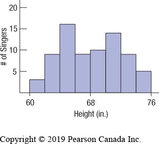
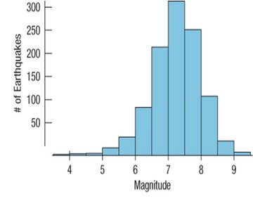
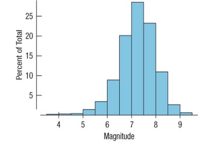
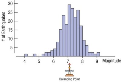
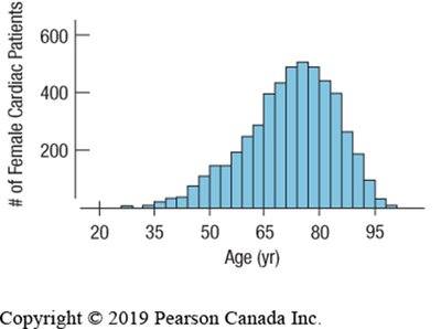
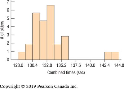
Histograms
Histograms are graphical representations that display the distribution of a quantitative variable by grouping data into bins of equal width and plotting the frequency or relative frequency of observations in each bin. Unlike bar charts, which are used for categorical data, histograms are used for quantitative data and the bars touch each other to indicate the continuity of the data.
Key Features: Bins (intervals), frequency or relative frequency on the y-axis, no gaps between bars unless a bin is empty.
Purpose: To visualize the shape, center, and spread of a distribution.
Steps to Construct:
Choose data boundaries and bin size.
Build a frequency table (frequency, relative frequency, cumulative frequency).
Plot bins on the x-axis and frequencies on the y-axis.
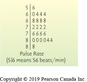
Stem-and-Leaf Plots
Stem-and-leaf plots display quantitative data while preserving individual data values. Each value is split into a "stem" (all but the final digit) and a "leaf" (the final digit). This method provides a quick way to visualize the distribution and retains the original data.
Construction: Separate each value into stem and leaf, list stems in order, and align leaves accordingly.
Advantage: Retains all original data values and shows distribution shape.
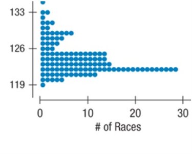
Dotplots
Dotplots are simple displays where each data value is represented by a dot placed along a number line. Dotplots are useful for small to moderate-sized datasets and allow for easy identification of clusters, gaps, and outliers.
Key Features: Each dot represents one observation; can be displayed horizontally or vertically.
Describing Distributions
Shape, Center, and Spread
When describing a distribution, always address three main aspects: shape, center, and spread.
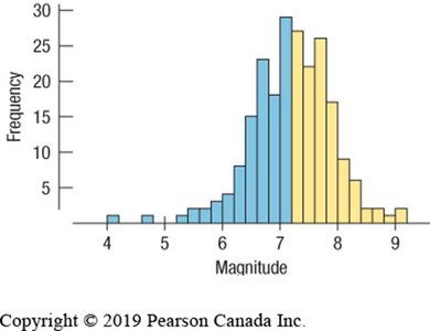
Shape: Modality (number of peaks), symmetry, skewness, and presence of outliers or gaps.
Center: Mode, median, or mean.
Spread: Range, interquartile range (IQR), variance, and standard deviation.
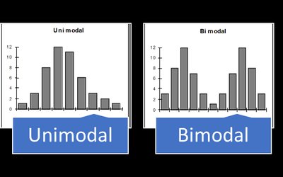
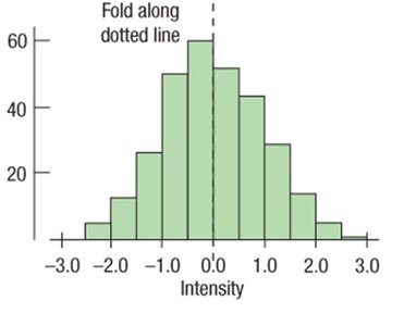
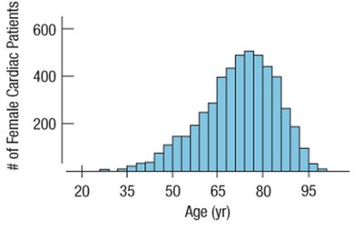
Shape: Modality and Symmetry
Unimodal: One peak.
Bimodal: Two peaks.
Multimodal: More than two peaks.
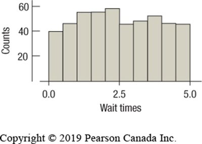
Uniform: All bars approximately the same height.
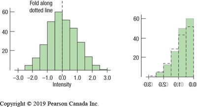
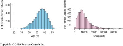
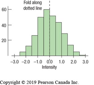
Symmetric: Both sides of the distribution are mirror images.
Skewed: One tail is longer than the other (skewed left or right).


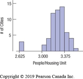
Outliers and Gaps
Outliers: Data points that fall far from the main body of the distribution.
Gaps: Intervals with no data, possibly indicating multiple groups.
Measures of Center
Mode: Most common value.
Median: Middle value when data are ordered; divides data into two equal halves.
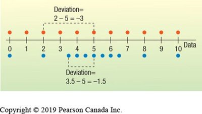
Mean (Average): Sum of all values divided by the number of values. For a dataset :

Choosing Mean or Median
If the distribution is symmetric, mean and median are similar; either can be used.
If the distribution is skewed or has outliers, the median is preferred as it is less affected by extreme values.
Measures of Spread
Range: Difference between the maximum and minimum values. Range = Highest Value − Lowest Value
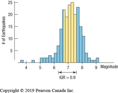
Interquartile Range (IQR): Difference between the upper quartile (Q3, 75th percentile) and lower quartile (Q1, 25th percentile). IQR = Q3 − Q1
Variance: Average of the squared deviations from the mean (for sample variance):
Standard Deviation: Square root of the variance; measures average distance from the mean:


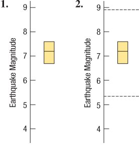
The Five-Number Summary
The five-number summary consists of the minimum, first quartile (Q1), median, third quartile (Q3), and maximum. It provides a concise summary of the distribution and is the basis for constructing boxplots.
Statistic | Description |
|---|---|
Minimum | Smallest value (0th percentile) |
Q1 | Lower quartile (25th percentile) |
Median | Middle value (50th percentile) |
Q3 | Upper quartile (75th percentile) |
Maximum | Largest value (100th percentile) |
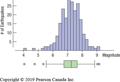
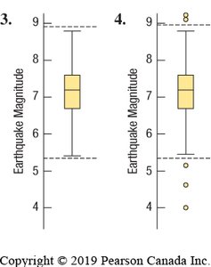
Boxplots
Boxplots are graphical displays of the five-number summary. They are especially useful for comparing distributions between groups and identifying outliers.
Box spans from Q1 to Q3, with a line at the median.
Whiskers extend to the most extreme values within 1.5 IQRs of the quartiles.
Outliers are plotted individually beyond the whiskers.
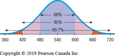
Standard Deviation and the Empirical Rule
Standard Deviation in Symmetric Distributions
For unimodal and symmetric distributions, the standard deviation is the most informative measure of spread. The Empirical Rule states:
About 68% of data lie within ±1 standard deviation from the mean.
About 95% within ±2 standard deviations.
About 99.7% within ±3 standard deviations.
Choosing Appropriate Measures
If the distribution is symmetric, use mean and standard deviation or variance.
If the distribution is skewed or has outliers, use median and IQR.
Summary Table: Measures of Center and Spread
Distribution Type | Center | Spread |
|---|---|---|
Symmetric | Mean or Median | Standard Deviation, Variance, IQR, Range |
Skewed/Outliers | Median | IQR, Range |
Common Mistakes
Do not use histograms for categorical data.
Do not describe shape, center, and spread using bar charts.
Choose appropriate bin widths for histograms.
Use the correct units and scales for your data.
Key Takeaways
Make and interpret histograms, stem-and-leaf plots, and dotplots.
Describe the shape, center, and spread of a distribution.
Calculate the standard deviation and IQR.
Use the five-number summary to construct a boxplot and identify outliers.
