 Back
BackLesson 4
Study Guide - Smart Notes
 Tailored notes based on your materials, expanded with key definitions, examples, and context.
Chapter 2: Exploring Data with Graphs and Numerical Summaries
Introduction
Descriptive statistics provide essential tools for summarizing and understanding data. Graphical summaries offer visual insights into the distribution and shape of data, while numerical summaries quantify central tendency and variability. This chapter covers methods for describing data using graphs and numerical measures, focusing on quantitative data.
Describing the Center of Quantitative Data
Mean
The mean is the arithmetic average of a set of observations and represents the center of mass of the data.
Definition: The mean is calculated as the sum of all observations divided by the number of observations.
Formula:
Application: The mean is sensitive to extreme values (outliers).
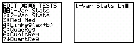
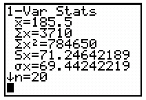
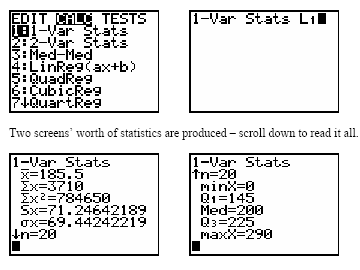
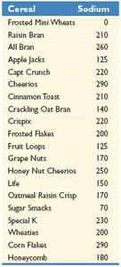
Example: Using a calculator, enter data into L1 and use 1-Var Stats to compute the mean.
Median
The median is the midpoint of the ordered data, dividing the dataset into two equal halves.
Definition: The median is the value at the center when data are ordered from smallest to largest.
Odd n: Median is the middle observation.
Even n: Median is the average of the two middle observations.
Example: For n = 10, median = (99+101)/2 = 100; for n = 9, median = 99.
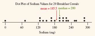
Comparing Mean and Median
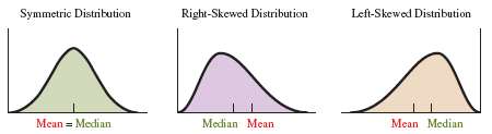
The mean and median are both measures of central tendency, but their values and appropriateness depend on the shape of the distribution.
Symmetric Distribution: Mean and median are close together; mean is preferred.
Skewed Distribution: Mean is pulled toward the tail; median is preferred as it is less affected by outliers.
Resistant Measures
A resistant measure is not significantly influenced by extreme values or outliers.
Median: Resistant to outliers.
Mean: Not resistant; can be greatly affected by outliers.
Mode
The mode is the value that occurs most frequently in a dataset.
Definition: Mode is the highest bar in a histogram or the most common value.
Usage: Most often used with categorical data.
Describing the Spread of Quantitative Data
Range
The range measures the spread by calculating the difference between the largest and smallest values.
Formula:
Property: Strongly affected by outliers.
Standard Deviation
The standard deviation quantifies the average distance of each observation from the mean.
Definition: Standard deviation is the square root of the variance.
Formula:
Calculation Steps:
Find the mean.
Compute deviations from the mean.
Square the deviations.
Sum the squared deviations.
Divide by n-1 and take the square root.
Properties: s = 0 only if all values are identical; s increases as spread increases; s is not resistant to outliers.

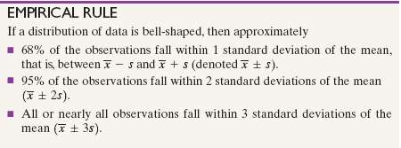
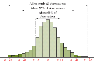
Empirical Rule
The Empirical Rule applies to bell-shaped (normal) distributions and describes the spread of data in terms of standard deviations.
Approximately 68% of observations fall within 1 standard deviation of the mean ().
Approximately 95% fall within 2 standard deviations ().
Nearly all fall within 3 standard deviations ().
Measures of Position and Spread
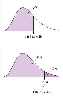
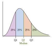
Percentiles and Quartiles
Percentiles and quartiles describe the position of values within a dataset.
Percentile: The pth percentile is the value below which p% of observations fall.
Quartiles: Divide data into four equal parts: Q1 (25%), Q2 (median, 50%), Q3 (75%).
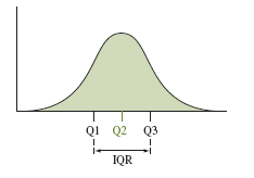
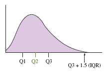
Interquartile Range (IQR) and Outliers
The interquartile range (IQR) measures the spread of the middle 50% of data and is used to detect outliers.
Formula:
Outlier Criteria: An observation is a potential outlier if it falls below or above .
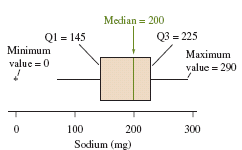
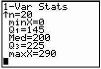
Five-Number Summary
The five-number summary consists of the minimum, Q1, median, Q3, and maximum values.
Purpose: Provides a concise summary of the distribution.
Application: Useful for skewed distributions and identifying outliers.

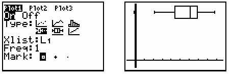
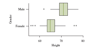
Boxplots
Boxplots graphically display the five-number summary and highlight potential outliers.
Structure: Box from Q1 to Q3, line at median, whiskers to min and max (excluding outliers), outliers shown separately.
Use: Effective for comparing distributions.
Comparing Distributions
Boxplots are useful for comparing two or more distributions, especially for visualizing differences in spread and center.
Z-Score
The z-score measures how many standard deviations an observation is from the mean.
Formula:
Interpretation: Observations with z-scores less than -3 or greater than +3 are potential outliers in a bell-shaped distribution.
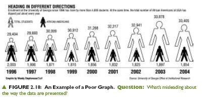
Guidelines for Constructing Effective Graphs
Graph Construction
Effective graphs should accurately represent data and avoid misleading visualizations.
Label both axes and provide proper headings.
Vertical axis should start at 0 for accurate comparison.
Use bars, lines, or points for clarity.
Avoid combining groups with greatly differing values on a single graph.
Lesson Summary
Descriptive statistics use graphical and numerical methods to summarize data.
Graphical summaries reveal shape and outliers; numerical summaries describe center and spread.
Measures of center: mean, median, mode.
Measures of spread: range, variance, standard deviation, interquartile range.
Use mean and standard deviation for symmetric distributions without outliers; use five-number summary for skewed distributions with outliers.
