 Back
BackExploring Data with Graphs: Frequency Distributions and Graphical Methods in Statistics
Study Guide - Smart Notes
 Tailored notes based on your materials, expanded with key definitions, examples, and context.
Chapter 2: Exploring Data with Graphs
2-1 Frequency Distributions for Organizing and Summarizing Data
Frequency distributions are essential tools in statistics for organizing and summarizing data. They allow us to see how data values are distributed across different categories or classes, providing insight into the center, variation, distribution shape, outliers, and changes over time.
Center: A representative value indicating the middle of the data set.
Variation: Measures the amount that data values differ from each other.
Distribution: Describes the shape of the spread of data (e.g., bell-shaped, uniform, skewed).
Outliers: Data values that are significantly distant from the majority.
Time: Examines how data characteristics change over time.
Frequency Distribution: Shows how a data set is partitioned among several categories by listing each category with its frequency.
Lower Class Limits: Smallest numbers that can belong to a class.
Upper Class Limits: Largest numbers that can belong to a class.
Class Midpoints: Calculated as (Lower Class Limit + Upper Class Limit) / 2.
Class Width: Difference between consecutive lower class limits or boundaries.
Class Boundaries: Numbers used to separate classes without gaps.
Relative Frequency: The proportion of data values in each class:
Percentage Frequency:
Cumulative Frequency: The sum of frequencies for all classes up to and including the current class.
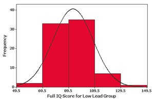
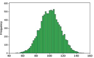
Critical Thinking: Frequency distributions help determine if data follow a normal (bell-shaped) distribution, which is symmetric and has frequencies that increase to a maximum and then decrease.
Gaps: Gaps in frequency distributions may indicate data from different populations.
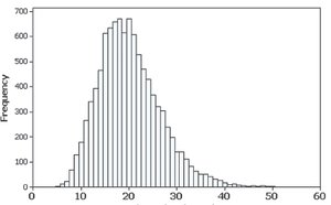
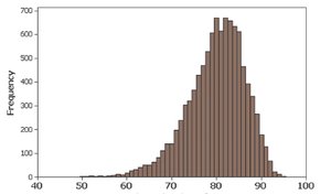
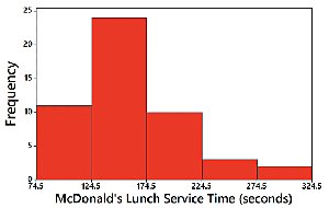
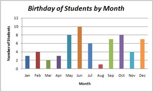
2-2 Histograms
Histograms are graphical representations of frequency distributions for quantitative data. They use adjacent bars of equal width to show the frequency of data values within each class.
Horizontal axis: Represents classes (class boundaries, limits, or midpoints).
Vertical axis: Represents frequencies.
Bar height: Corresponds to frequency value.
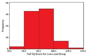
Histograms visually display the shape, center, spread, and outliers of the data.
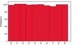
Skewness and Shape of Distributions
Distributions can be classified by their shape:
Symmetrical (Bell-Shaped/Normal): Frequencies are highest in the center and decrease symmetrically.
Skewed Right (Positively Skewed): Longer tail on the right side.
Skewed Left (Negatively Skewed): Longer tail on the left side.
Uniform: Frequencies are roughly equal across all classes.
Relative Frequency Histogram
Relative frequency histograms have the same shape as regular histograms, but the vertical axis shows relative frequencies (proportions) instead of counts.
2-3 Graphs that Enlighten and Graphs that Deceive
Various graphs are used to display quantitative and qualitative data. Some graphs can be misleading if not constructed properly.
Graphs of Quantitative Data
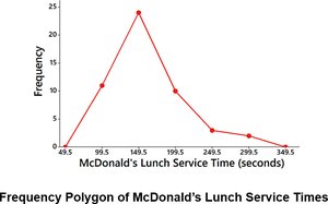
Frequency Polygon: Uses line segments connected to points above class midpoints to show frequency distribution.
Scatterplot: Plots paired (x, y) data to show relationships or correlations.
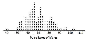
Dotplot: Each data value is plotted as a dot above a horizontal scale; dots stack for repeated values.
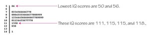
Stem-and-Leaf Plot: Separates each value into a stem and leaf, retaining original data values and showing distribution shape.
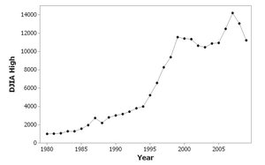
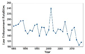
Time-Series Graph: Plots data collected over time to reveal trends.
Graphs of Qualitative Data
Bar Graph: Bars of equal width show frequencies of categories; may have gaps between bars.
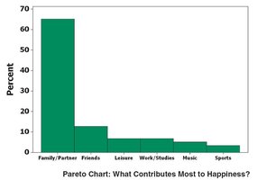
Pareto Chart: Bar graph with bars in descending order of frequency.
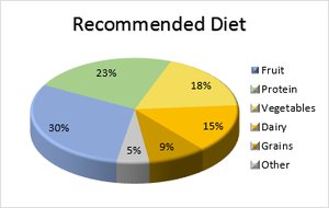
Pie Chart: Circle divided into slices proportional to category frequencies.
Graphs that Deceive
Nonzero Axis: Axes that do not start at zero can exaggerate differences.
Pictographs: Drawings that distort data by misrepresenting proportions.
2-4 Scatterplots and Correlation
Scatterplots are used to visualize the relationship between two quantitative variables. They help identify correlations, which can be positive, negative, or nonexistent. However, correlation does not imply causation.
Positive Correlation: As one variable increases, the other also increases.
Negative Correlation: As one variable increases, the other decreases.
No Correlation: No discernible pattern between variables.
Example 1: Scatter plot showing amount of sleep needed per day by age (negative correlation).
Example 2: Scatter plots showing average income by years of education (positive correlation).
Additional info: Scatterplots are foundational for regression analysis and further statistical modeling.
