 Back
BackExploring Data with Tables and Graphs: Frequency Distributions, Histograms, and Graphical Summaries
Study Guide - Smart Notes
 Tailored notes based on your materials, expanded with key definitions, examples, and context.
Chapter 2: Exploring Data with Tables and Graphs
Section 2-1: Frequency Distributions for Organizing and Summarizing Data
Frequency distributions are essential tools in statistics for organizing large data sets. They allow us to summarize data by grouping values into classes and counting the number of observations in each class.
Frequency Distribution (Frequency Table): A table that lists data values (either individually or by groups of intervals), along with their corresponding frequencies (counts).
Purpose: Summarizes large data sets, provides insight into the nature of the data, and forms the basis for constructing important graphs.
Key Terms:
Lower Class Limits: The smallest values that can belong to each class.
Upper Class Limits: The largest values that can belong to each class.
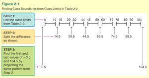
Class Boundaries: Numbers used to separate classes without gaps (midpoints between class limits).
Class Midpoints: The value in the middle of each class, calculated as .
Class Width: The difference between two consecutive lower class limits (or boundaries or midpoints).
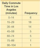
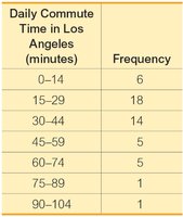
Example: Frequency Distribution of Daily Commute Time in Los Angeles
Daily Commute Time in Los Angeles (minutes) | Frequency |
|---|---|
0–14 | 6 |
15–29 | 18 |
30–44 | 14 |
45–59 | 5 |
60–74 | 5 |
75–89 | 1 |
90–104 | 1 |
Finding Class Boundaries: Class boundaries are calculated as the midpoints between upper and lower class limits, ensuring no gaps between classes.
Relative and Cumulative Frequency Distributions
Relative and cumulative frequency distributions provide additional perspectives on the data.
Relative Frequency: The proportion or percentage of data values in each class. Calculated as:
Cumulative Frequency: The sum of the frequencies for that class and all previous classes. It shows the total number of observations less than or equal to the upper class limit of a class.
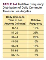
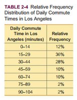
Example: Relative Frequency Distribution
Daily Commute Time in Los Angeles (minutes) | Relative Frequency |
|---|---|
0–14 | 12% |
15–29 | 36% |
30–44 | 28% |
45–59 | 10% |
60–74 | 10% |
75–89 | 2% |
90–104 | 2% |
Example: Cumulative Frequency Distribution
Daily Commute Time in Los Angeles (minutes) | Cumulative Frequency |
|---|---|
Less than 15 | 6 |
Less than 30 | 24 |
Less than 45 | 38 |
Less than 60 | 43 |
Less than 75 | 48 |
Less than 90 | 49 |
Less than 105 | 50 |
Section 2-2: Histograms
A histogram is a graphical representation of a frequency distribution. It consists of adjacent bars whose heights correspond to the frequencies of the classes.
Horizontal Axis: Represents class boundaries or midpoints.
Vertical Axis: Represents frequencies or relative frequencies.
Purpose: Visually displays the shape, center, and spread of the data, and helps identify outliers.
Example: Histogram of Commute Times in Los Angeles
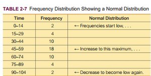
Relative Frequency Histogram: Similar to a histogram, but the vertical axis shows relative frequencies (percentages) instead of counts.
Distribution Shapes
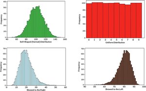
The shape of a distribution is crucial for selecting appropriate statistical methods. Common shapes include:
Bell-shaped (Normal) Distribution: Frequencies increase to a maximum and then decrease symmetrically.
Uniform Distribution: All values occur with approximately the same frequency.
Skewed Right (Positively Skewed): Longer right tail.
Skewed Left (Negatively Skewed): Longer left tail.
Section 2-3: Graphs That Enlighten and Graphs That Deceive
Besides histograms, other graphs are used to summarize and compare data. It is important to use graphs that accurately represent the data and to recognize misleading graphs.
Frequency Polygon: Uses line segments connected to points above class midpoints to show frequency distribution.
Relative Frequency Polygon: Similar to a frequency polygon but uses relative frequencies.
Ogive: A line graph that depicts cumulative frequencies, useful for determining how many values are below a certain boundary.
Dot Plot: Each data value is plotted as a dot along a scale; dots are stacked for repeated values.
Stemplot (Stem-and-Leaf Plot): Data values are split into a "stem" (all but the final digit) and a "leaf" (the final digit), retaining the original data.
Time-Series Graph: Plots data collected over time to reveal trends.
Bar Graph: Used for qualitative data; bars represent frequencies or relative frequencies of categories.
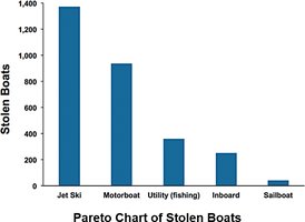
Pareto Chart: Bar graph with bars in descending order of frequency, highlighting the most significant categories.
Pie Chart: Circle divided into sectors, each representing a category's proportion of the total.
Section 2-4: Scatterplots, Correlation, and Regression
Scatterplots are used to analyze paired quantitative data and to visually assess the relationship (correlation) between two variables.
Scatterplot: A plot of paired (x, y) data, with each point representing a pair of values.
Correlation: Exists when values of one variable are associated with values of another variable.
Linear Correlation: When the pattern of points can be approximated by a straight line.
Example: A scatterplot showing a clear upward or downward trend indicates correlation; a random scatter suggests no correlation.
Summary Table: Types of Frequency Distributions
Type | Description | Purpose |
|---|---|---|
Frequency Distribution | Counts of data values in each class | Summarize data, identify patterns |
Relative Frequency Distribution | Proportion or percentage in each class | Compare distributions of different sizes |
Cumulative Frequency Distribution | Running total of frequencies up to each class | Determine how many values fall below a threshold |
Key Takeaways:
Frequency tables and graphs are foundational tools for exploring and summarizing data.
Histograms and related graphs reveal the shape, center, and spread of distributions.
Relative and cumulative frequencies provide additional insights, especially for comparing groups.
Graphical summaries must be constructed carefully to avoid misleading interpretations.
