 Back
BackExploring Data with Tables and Graphs: Frequency Distributions, Graphical Summaries, and Correlation
Study Guide - Smart Notes
 Tailored notes based on your materials, expanded with key definitions, examples, and context.
Chapter 2: Exploring Data with Tables and Graphs
2.1 Frequency Distributions for Organizing and Summarizing Data
Frequency distributions are essential tools in statistics for organizing and summarizing large data sets. They help reveal the underlying structure of the data by grouping values into classes and displaying the frequency of each class.
Frequency Distribution (or Frequency Table): Shows how data are partitioned among several categories (or classes) by listing the categories along with the number (frequency) of data values in each of them.
Purpose: To organize raw data into a more interpretable form, making patterns and trends easier to identify.
Key Definitions
Lower class limits: The smallest numbers that can belong to each of the different classes.
Upper class limits: The largest numbers that can belong to each of the different classes.
Class boundaries: The numbers used to separate the classes, but without the gaps created by class limits.
Class midpoints: The values in the middle of the classes. Calculated as:
Class width: The difference between two consecutive lower class limits (or two consecutive lower class boundaries) in a frequency distribution.
Constructing a Grouped Frequency Distribution
Determine the highest and lowest data values.
Calculate the range:
Select the number of classes (commonly between 5 and 20).
Calculate class width: (round up to a convenient number).
Choose a suitable starting point (often the lowest value or a convenient number below it).
List lower class limits, then determine upper class limits.
Tally data into classes and count frequencies.
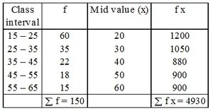
Example: Frequency Table Construction
Suppose we have the following grouped data:
Class interval | f | Mid value (x) | f x |
|---|---|---|---|
15 – 25 | 60 | 20 | 1200 |
25 – 35 | 35 | 30 | 1050 |
35 – 45 | 22 | 40 | 880 |
45 – 55 | 18 | 50 | 900 |
55 – 65 | 15 | 60 | 900 |
Σ f = 150 | Σ f x = 4930 |
Relative Frequency Distribution
Relative frequency distributions replace class frequencies with proportions or percentages, making it easier to compare different data sets.
Relative Frequency:
Percentage Frequency:
The sum of the percentages should be close to 100% (allowing for rounding errors).
Cumulative Frequency Distribution
The cumulative frequency for a class is the sum of the frequencies for that class and all previous classes. This helps in understanding how many data values fall below a particular upper class boundary.
Categorical Frequency Distribution
Used when data are divided into specific categories (e.g., gender, blood type, handedness). Frequencies are counted for each category.
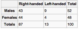
Example: Categorical Frequency Table
Right-handed | Left-handed | Total | |
|---|---|---|---|
Males | 43 | 9 | 52 |
Females | 44 | 4 | 48 |
Totals | 87 | 13 | 100 |
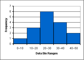
2.2 Histograms (Plotting Frequency Data)
Histograms are graphical representations of frequency distributions for quantitative data. They use adjacent bars to show the frequency of data within each class interval.
Horizontal axis: Represents class intervals (bins) of the data.
Vertical axis: Represents the frequency (or relative frequency) of each class.
Purpose: To visually display the shape, center, and spread of the data, and to identify outliers.
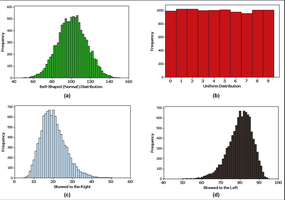
Shapes of Distributions
Bell-shaped (Normal): Frequencies increase to a maximum and then decrease symmetrically.
Uniform: All classes have roughly the same frequency.
Skewed Right: Most data are on the left, with a tail to the right.
Skewed Left: Most data are on the right, with a tail to the left.
2.3 Other Plots
Besides histograms, several other graphical methods are used to summarize and visualize data.
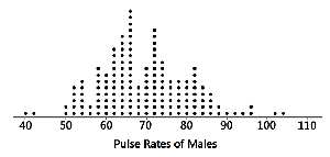
Dotplots
Dotplots display each data value as a dot above a horizontal scale. Dots are stacked for repeated values, making it easy to see clusters and gaps.
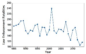
Time-Series Graphs
Time-series graphs plot data points collected or recorded at specific time intervals. They are useful for identifying trends, cycles, and patterns over time.
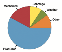
Pie Charts
Pie charts represent categorical data as slices of a circle, with each slice proportional to the frequency or percentage of the category.
Frequency Polygons and Pareto Charts
Frequency Polygon: Similar to a histogram, but uses points connected by lines instead of bars. Useful for comparing distributions.
Pareto Chart: A bar graph for categorical data with bars arranged in descending order of frequency.
2.4 Scatterplot, Correlation, and Regression
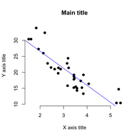
Scatterplots are used to display the relationship between two quantitative variables. Each point represents a pair of values (x, y).
Scatterplot: Graphs ordered pairs (x, y) to reveal patterns, trends, and possible relationships.
Linear Correlation: Exists when the points tend to cluster around a straight line.
Correlation and Causation
Correlation: Indicates that two variables change together, but does not imply that one causes the other.
Pearson Correlation Coefficient (r): Measures the strength and direction of a linear relationship between two variables.
Regression Analysis
Regression analysis finds the best-fitting straight line (regression line) through the data points. The regression equation is used to predict values of the dependent variable based on the independent variable.
Regression Equation:
P-value: Used in hypothesis testing to determine the statistical significance of the observed relationship.
Example: Handedness by Gender
Right-handed | Left-handed | Total | |
|---|---|---|---|
Males | 43 | 9 | 52 |
Females | 44 | 4 | 48 |
Totals | 87 | 13 | 100 |
Summary Table: Types of Graphical Summaries
Graph Type | Data Type | Main Purpose |
|---|---|---|
Histogram | Quantitative | Show distribution shape, center, spread |
Dotplot | Quantitative | Show individual values, clusters, gaps |
Pie Chart | Categorical | Show proportions of categories |
Time-Series | Quantitative (over time) | Show trends and patterns over time |
Scatterplot | Paired Quantitative | Show relationships between variables |
Additional info: For more advanced analysis, students will later learn about hypothesis testing, inferences from two samples, and analysis of variance, which build on the foundational concepts of data summarization and graphical analysis introduced in this chapter.
