 Back
BackExploring Data with Tables and Graphs: Essential Graphical Methods in Statistics
Study Guide - Smart Notes
 Tailored notes based on your materials, expanded with key definitions, examples, and context.
Exploring Data with Tables and Graphs
Introduction
Graphical methods are fundamental tools in statistics for organizing, summarizing, and interpreting data. This chapter introduces a variety of graphs that help reveal patterns, trends, and relationships in both quantitative and categorical data. It also discusses how some graphs can be misleading if not constructed properly.
Graphs That Enlighten
Dotplots
Dotplots are simple graphs for quantitative data where each value is represented by a dot above a horizontal scale. Dots for identical values are stacked, making it easy to see the distribution and frequency of data values.
Displays the shape of the data distribution.
Original data values can often be reconstructed from the plot.
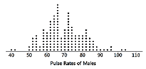
Example: The dotplot above shows the distribution of pulse rates for a group of males, with most values clustered around 70 beats per minute.
Stemplots (Stem-and-Leaf Plots)
A stemplot (or stem-and-leaf plot) separates each data value into a "stem" (typically the leading digit(s)) and a "leaf" (the last digit). This method retains the original data values and displays the distribution in a compact form.
Shows the shape of the distribution.
Retains original data values for reference.
Data are sorted in order.
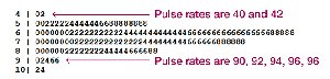
Example: The stemplot above organizes pulse rates, making it easy to see the frequency of each range and the actual values.
Time-Series Graphs
A time-series graph displays quantitative data collected at different points in time. It is especially useful for identifying trends, cycles, or patterns over time.
Reveals trends and changes over time.
Commonly used for economic, environmental, and social data.
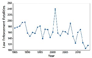
Example: The graph above shows annual law enforcement fatalities, highlighting fluctuations and trends over several decades.
Bar Graphs
Bar graphs use bars of equal width to represent the frequencies of categories in categorical (qualitative) data. Bars may be separated by gaps to emphasize the categorical nature of the data.
Compares frequencies across categories.
Relative distribution is easily visualized.
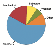
Pareto Charts
A Pareto chart is a special type of bar graph where categories are ordered by frequency, from highest to lowest. This format highlights the most significant categories.
Emphasizes important categories by ordering bars in descending frequency.
Helps identify the "vital few" categories that contribute most to the total.
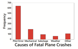
Example: The Pareto chart above shows that pilot error is the leading cause of fatal plane crashes, followed by mechanical issues.
Pie Charts
Pie charts display categorical data as slices of a circle, with each slice's size proportional to the category's frequency. They are commonly used for showing the composition of a whole.
Visualizes proportions of categories within a dataset.
Best for data with a limited number of categories.
Example: The pie chart above illustrates the proportion of fatal plane crashes attributed to different causes.
Frequency Polygons
A frequency polygon connects points placed above class midpoints with line segments, providing a visual alternative to histograms for quantitative data. A relative frequency polygon uses proportions or percentages on the vertical axis.
Shows distribution shape and allows comparison between datasets.
Relative frequency polygons are useful for comparing distributions with different sample sizes.
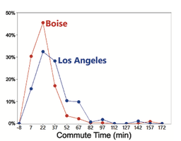
Example: The graph above compares the relative frequency of commute times in Los Angeles and Boise.
Graphs That Deceive
Nonzero Vertical Axis
Some graphs exaggerate differences by starting the vertical axis at a value other than zero. This can make small differences appear much larger than they are.
Always check axis scales to avoid being misled by exaggerated visual differences.
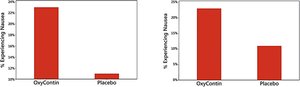
Example: The bar graphs above show how starting the vertical axis above zero can distort the perceived difference between groups.
Pictographs
Pictographs use images or icons to represent data values. While visually appealing, they can be misleading because the area or volume of the images may exaggerate differences.
Area and volume effects can distort the true magnitude of differences.
Doubling the side of a square increases its area by four times; doubling the side of a cube increases its volume by eight times.
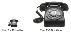
Example: The pictograph above shows phone usage, but the difference in image size exaggerates the actual increase in numbers.
Best Practices for Graphical Displays
For small datasets (20 values or fewer), use a table instead of a graph.
Graphs should focus on the data, not on distracting design elements.
Do not distort data; construct graphs to reveal the true nature of the data.
Most of the ink in a graph should represent data, not decorative features.
Additional info: These principles are adapted from Edward Tufte's guidelines for effective data visualization.
