 Back
BackExploring Data with Tables and Graphs: Foundations for Statistical Analysis
Study Guide - Smart Notes
 Tailored notes based on your materials, expanded with key definitions, examples, and context.
Exploring Data with Tables and Graphs
Introduction
Organizing and summarizing data are essential first steps in statistical analysis. This chapter introduces foundational tools for exploring data, including frequency distributions, histograms, and various graphical methods. These tools help reveal patterns, trends, and relationships within data sets, providing a basis for further statistical inference.
Frequency Distributions for Organizing and Summarizing Data
Frequency Distribution
A frequency distribution (or frequency table) partitions data into several categories (or classes) and lists the number (frequency) of data values in each class. This organization helps to understand the distribution and nature of the data set.
Lower class limits: The smallest numbers that can belong to each class.
Upper class limits: The largest numbers that can belong to each class.
Class boundaries: Numbers used to separate classes without gaps.
Class midpoints: The value in the middle of each class, calculated as (lower class limit + upper class limit) / 2.
Class width: The difference between two consecutive lower class limits.
Procedure for Constructing a Frequency Distribution:
Select the number of classes (usually between 5 and 20).
Calculate the class width using the formula:
Round up to a convenient number.
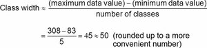
Choose the first lower class limit (often a value below the minimum data value).
List the lower class limits and determine the upper class limits.
Tally each data value into the appropriate class and sum the tallies for frequencies.
Relative and Cumulative Frequency Distributions
Relative Frequency Distribution: Each class frequency is replaced by a proportion or percentage. The sum of percentages should be close to 100%.
Cumulative Frequency Distribution: The frequency for each class is the sum of that class and all previous classes, useful for understanding data accumulation.
Comparisons and Gaps
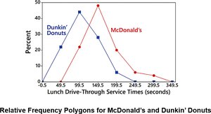
Combining two or more relative frequency distributions in one table facilitates comparison between groups. Gaps in frequency distributions may indicate the presence of different populations within the data set.
Histograms
Definition and Construction
A histogram is a bar graph representing the frequency distribution of quantitative data. Bars are adjacent (unless there are gaps in the data), with the horizontal axis showing class intervals and the vertical axis showing frequencies.
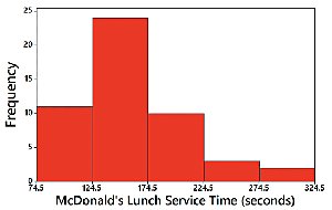
Visually displays the shape, center, and spread of the data.
Helps identify outliers.
A relative frequency histogram uses proportions or percentages on the vertical axis instead of raw frequencies.
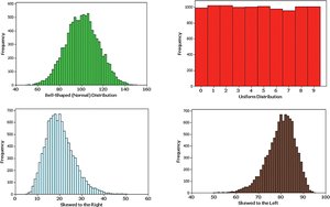
Distribution Shapes
Histograms reveal the shape of data distributions:
Normal (bell-shaped) distribution
Uniform distribution
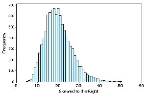
Skewed to the right (positively skewed): Longer right tail
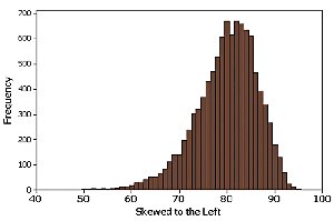
Skewed to the left (negatively skewed): Longer left tail
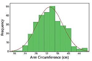
Assessing Normality with Normal Quantile Plots
A normal quantile plot helps assess whether data are approximately normally distributed. If the points lie close to a straight line, the distribution is likely normal. Systematic deviations from a straight line indicate non-normality.
Other Graphical Methods
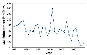
Time-Series Graphs
A time-series graph displays quantitative data collected over time, revealing trends and patterns.
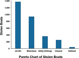
Bar Graphs and Pareto Charts
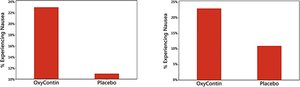
Bar Graph: Uses bars to show frequencies of categorical data, facilitating comparison between categories.
Pareto Chart: A bar graph with bars in descending order of frequency, highlighting the most significant categories.
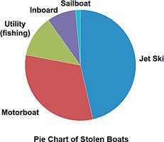
Pie Charts
A pie chart depicts categorical data as slices of a circle, with each slice proportional to the category's frequency.
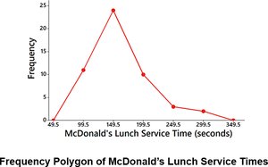
Frequency Polygons
A frequency polygon connects points above class midpoints with line segments, providing an alternative to histograms for visualizing distributions. Relative frequency polygons use proportions or percentages on the vertical axis.
Graphs That Deceive
Be cautious of deceptive graphs, such as those with a nonzero vertical axis, which can exaggerate differences between groups. Always check the scale and context of graphical displays.
Scatterplots, Correlation, and Regression
Scatterplots and Correlation
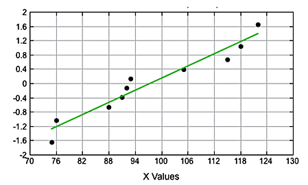
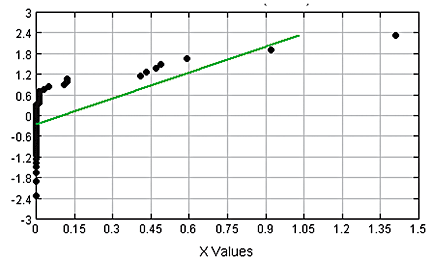
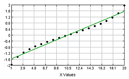
A scatterplot (or scatter diagram) plots paired quantitative data (x, y) to reveal relationships between two variables. Correlation exists when values of one variable are associated with values of another. Linear correlation is present if the pattern approximates a straight line.
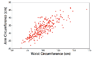
Linear Correlation Coefficient (r)
The linear correlation coefficient (denoted by r) measures the strength and direction of a linear relationship between two variables. Its value ranges from -1 to 1:
r close to 1: strong positive linear correlation
r close to -1: strong negative linear correlation
r close to 0: little or no linear correlation
Interpreting Scatterplots
Positive linear correlation: as x increases, y increases.
Negative linear correlation: as x increases, y decreases.
No correlation: no discernible pattern.
Nonlinear correlation: pattern exists but is not a straight line.
Regression and the Regression Line
Regression involves finding the equation of the straight line (regression line or least-squares line) that best fits the scatterplot of paired data. The regression equation is typically written as:
where is the y-intercept and is the slope.
The slope () represents the marginal change in y for a one-unit increase in x.
Making Predictions
Regression equations can be used to predict the value of one variable given the value of another, but only if the model fits well and the data are within the scope of the sample.
Residual Plots
A residual plot displays the differences (residuals) between observed and predicted values. A good model will have residuals randomly scattered without patterns. Patterns or changing spread in the residual plot suggest the regression model may not be appropriate.
Summary Table: Key Graphical Methods
Graph Type | Purpose | Data Type |
|---|---|---|
Frequency Distribution | Organize and summarize data | Quantitative |
Histogram | Visualize distribution shape, center, spread | Quantitative |
Bar Graph | Compare frequencies of categories | Categorical |
Pareto Chart | Highlight most important categories | Categorical |
Pie Chart | Show distribution of categories | Categorical |
Time-Series Graph | Show trends over time | Quantitative (over time) |
Scatterplot | Show relationship between two variables | Paired Quantitative |
Frequency Polygon | Visualize distribution using line segments | Quantitative |
Additional info: This summary integrates foundational concepts from Chapter 2, "Exploring Data with Tables and Graphs," and introduces basic elements of correlation and regression (with reference to Chapter 10). The notes are structured to provide a comprehensive, self-contained overview suitable for exam preparation in a college-level statistics course.
