 Back
BackExploring Data with Tables and Graphs: Structured Study Notes
Study Guide - Smart Notes
 Tailored notes based on your materials, expanded with key definitions, examples, and context.
Exploring Data with Tables and Graphs
Variables and Types of Data
Understanding the nature of variables and data is fundamental in statistics. Variables are characteristics that can vary among individuals or items, and data are the values these variables take.
Variables: Characteristics that vary from one person or thing to another.
Data: Values of variables; each individual value is called an observation.
Dataset: Collection of all observations for a particular variable.
Raw Data: Data collected in its original form.
Qualitative Variables: Non-numerical values (e.g., sex, eye color).
Quantitative Variables: Numerical values (e.g., weight, height).
Discrete Variables: Quantitative variables with countable values (e.g., number of siblings).
Continuous Variables: Quantitative variables with values forming an interval (e.g., weight).
Qualitative Data: Values of qualitative variables. Quantitative Data: Values of quantitative variables. Discrete Data: Values of discrete variables. Continuous Data: Values of continuous variables.
Frequency Distributions and Tables
Frequency distributions organize data by showing how values are partitioned among categories or classes. This is a key method for summarizing and visualizing data.
Frequency Distribution (Frequency Table): Lists distinct values or groups and their frequencies.
Frequency: Number of data values in each group.
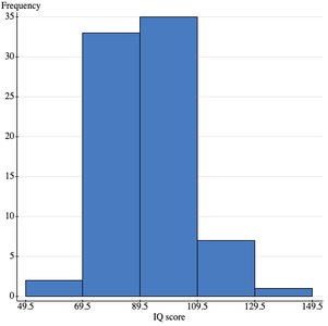
IQ Score | Frequency |
|---|---|
50-69 | 2 |
70-89 | 33 |
90-109 | 35 |
110-129 | 7 |
130-149 | 1 |
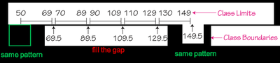
Class Limits, Boundaries, and Midpoints
Classes in frequency tables are defined by their limits, boundaries, and midpoints.
Lower Class Limits: Smallest numbers that can belong to a class.
Upper Class Limits: Largest numbers that can belong to a class.
Class Boundaries: Numbers that separate classes without gaps.
Class Midpoints: Average of lower and upper class limits.
Example: For IQ score classes, boundaries fill the gaps between class limits, and midpoints are calculated as .
Relative Frequency Distributions
Relative frequency distributions show the proportion of observations in each class, providing a standard for comparison between datasets.
Relative Frequency: Ratio of frequency to total number of observations.
Formula:
IQ Score | Frequency | Relative Frequency |
|---|---|---|
50-69 | 2 | 0.03 |
70-89 | 33 | 0.42 |
90-109 | 35 | 0.45 |
110-129 | 7 | 0.09 |
130-149 | 1 | 0.01 |
Cumulative Frequency Tables
Cumulative frequency tables show the running total of frequencies up to each class, useful for understanding data distribution.
Score | Frequency | Cumulative Frequency |
|---|---|---|
1 | 2 | 2 |
2 | 5 | 7 |
3 | 4 | 11 |
4 | 2 | 13 |
5 | 1 | 14 |
Graphs for Quantitative Data
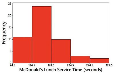
Histograms
Histograms are bar graphs representing the frequency of quantitative data classes. They visually display the shape, center, spread, and outliers of a dataset.
Height of bar: Frequency
Width of bar: Class width
Distribution Shapes
Unimodal: One peak
Bimodal: Two peaks
Multimodal: Multiple peaks
Symmetric: Mirror image on both sides
Skewed: Longer tail on one side
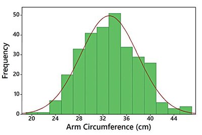
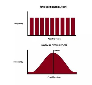
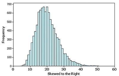
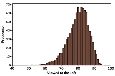
Normal Distribution: Symmetric, bell-shaped curve. Skewed Distribution: Skewed left (tail left), skewed right (tail right). Uniform Distribution: All classes have similar frequencies.
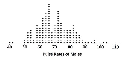
Dotplots
Dotplots display each data value as a dot above a horizontal scale, useful for small datasets and visualizing distribution shape.
Stem-and-Leaf Plots
Stem-and-leaf plots separate each value into a stem (all but the last digit) and a leaf (last digit), retaining original data and showing distribution shape.
Stem: All but the final right digit
Leaf: Rightmost digit
Time-Series Graphs
Time-series graphs plot quantitative data over time, with time on the x-axis and data values on the y-axis. Useful for identifying trends and patterns.
Graphs for Categorical Data
Bar Graphs
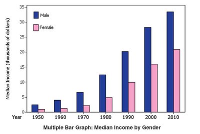
Bar graphs represent frequencies of categorical data, making it easier to compare categories. Multiple bar graphs can show two or more datasets.
Pareto Charts
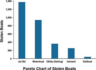
Pareto charts are bar graphs for categorical data, with bars arranged in descending order of frequency to highlight the most important categories.
Pie Charts
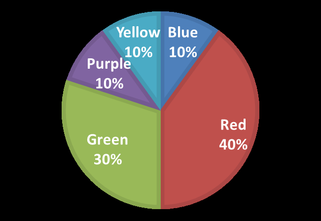
Pie charts show categorical data as slices of a circle, emphasizing high-percentage categories. Best used with fewer than 10 categories.
Graphs That Enlighten and Graphs That Deceive
Misleading Graphs
Graphs should be fair and objective. Common ways graphs misrepresent data include:
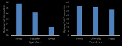
Nonzero Vertical Axis: Y-axis does not start at zero, exaggerating differences.
Pictographs: Using images to represent data, exaggerating differences due to area or volume.
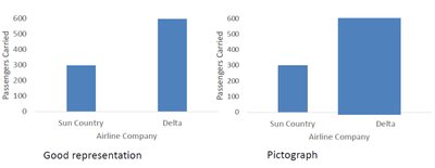
Choose graphs that best represent the data, avoid distortion, and provide a fair representation of results.
Scatterplots, Correlation, and Regression
Explanatory vs Response Variables
In studies, the explanatory variable (x) influences the response variable (y). Scatterplots visualize the relationship between two quantitative variables.
Explanatory Variable (x): Independent variable
Response Variable (y): Dependent variable
Correlation
Correlation measures the association between two variables. Linear correlation exists when the relationship forms a straight line.
Positive Correlation: As x increases, y increases.
Negative Correlation: As x increases, y decreases.
No Correlation: No association between x and y.
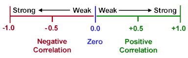
Linear Correlation Coefficient (r): Measures strength and direction of linear association.
r = 1: Perfect positive linear correlation
r = -1: Perfect negative linear correlation
r = 0: No linear correlation
Properties: Both variables must be quantitative, r is affected by outliers, and does not imply causality.
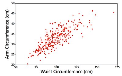
Example: High School GPA vs College GPA
Scatterplot and calculation of r show a strong positive correlation between high school GPA and college GPA. High school GPA is the explanatory variable (x), and college GPA is the response variable (y).
StatCrunch output: Correlation between High school GPA and College GPA is 0.88 (strong positive correlation).
*Additional info: Academic context and explanations have been expanded for clarity and completeness.*
