 Back
BackFoundations of Statistics: Data, Sampling, Graphs, and Measures of Center & Variation
Study Guide - Smart Notes
 Tailored notes based on your materials, expanded with key definitions, examples, and context.
Introduction to Statistics
Statistical Terminology
Statistics is the science of collecting, analyzing, interpreting, and presenting data. Understanding key terminology is essential for interpreting statistical results accurately.
Data: Collections of observations, such as measurements, genders, or survey responses.
Population: The complete collection of all measurements or data that are being considered.
Census: The collection of data from every member of a population.
Sample: A subcollection of members selected from a population.
Voluntary Response Sample: Respondents themselves decide whether to be included, often leading to bias.
Potential Pitfalls of Analyzing Data
Statistical analysis can be compromised by several pitfalls, which must be avoided to ensure valid conclusions.
Misleading Conclusions: Conclusions should be clear and understandable to all audiences.
Sample Data Reported Instead of Measured: Direct measurement is preferred over self-reported data.
Loaded Questions: Poorly worded survey questions can bias results.
Nonresponse: Occurs when individuals refuse or are unavailable to respond, potentially skewing results.
Low Response Rates: Decreases reliability and increases bias.
Percentages: Misleading percentages, especially those exceeding 100%, should be avoided.
Statistical and Practical Significance
Statistical significance means a result is unlikely to occur by chance, while practical significance means the result is meaningful in real-world terms.
Statistical Significance: Determined by probability and sample size.
Practical Significance: Assesses whether the result has real-world impact.
Example: Exam prep increases average test scores from 50% to 80% (practically significant), but may not be statistically significant if the sample size is too small.
Correlation and Causation
Correlation measures the relationship between two variables, but does not imply causation.
Example: Increase in pirates and cell phones over time does not mean one causes the other.
Bias
Bias occurs when a study's design or data collection favors certain outcomes.
Example: AAA surveys its members about driving preferences, likely favoring car use.
Describing, Exploring, and Comparing Data
Parameter and Statistic
Parameters and statistics are numerical measurements describing characteristics of populations and samples, respectively.
Parameter: Describes a population characteristic.
Statistic: Describes a sample characteristic.
Example: 35% of sampled employees own a computer (statistic).
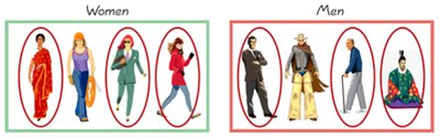
Quantitative and Categorical Data
Data can be classified as quantitative (numerical) or categorical (labels).
Quantitative Data: Numbers representing counts or measurements (e.g., salaries).
Categorical Data: Names or labels (e.g., favorite musicians).
Discrete and Continuous Data
Quantitative data can be discrete (countable) or continuous (uncountable).
Discrete Data: Countable values (e.g., number of murders).
Continuous Data: Uncountable, infinitely precise values (e.g., temperature).
Levels of Measurement
Data can be measured at four levels: nominal, ordinal, interval, and ratio.
Nominal: Categories only (e.g., favorite musicians).
Ordinal: Categories with order (e.g., survey responses).
Interval: Differences, no natural zero (e.g., room temperature).
Ratio: Differences and a natural zero (e.g., voltage measurements).
Collecting Sample Data
Observational Study vs. Experiment
Data can be collected through observational studies or experiments.
Observational Study: Observes individuals and measures variables without influencing responses.
Experiment: Imposes treatments to observe effects.
Example: Observing sleep patterns vs. depriving sleep to measure exam scores.
Design of Experiments
Proper experimental design includes replication, blinding, and randomization to reduce bias and confounding.
Replication: Repeating an experiment.
Blinding: Subjects (and sometimes administrators) do not know if treatment is real or placebo.
Randomization: Assigning individuals to groups randomly.
Sampling Methods
Sampling methods determine how subjects are selected from a population.
Random Sampling: Every individual has an equal chance of selection.
Systematic Sampling: Every kth element is selected.
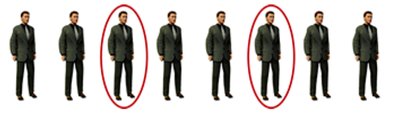
Convenience Sampling: Easy to obtain, but often biased.
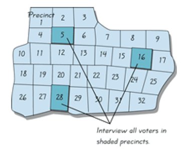
Stratified Sampling: Sample from subgroups, selecting individuals from each.
Cluster Sampling: Select entire groups (clusters) and sample all members within.
Example: Convenience sampling by asking Facebook friends does not represent the general population.
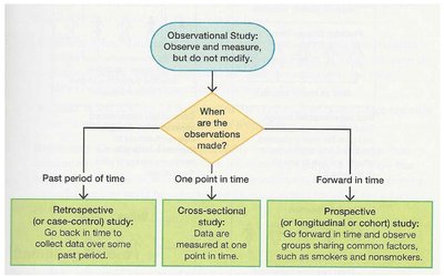
Types of Observational Studies
Observational studies can be retrospective, cross-sectional, or prospective, depending on when data is collected.
Retrospective: Data collected from past records.
Cross-sectional: Data measured at one point in time.
Prospective: Data collected going forward, observing groups sharing common factors.
Confounding and Experimental Design
Confounding occurs when the effect of one variable cannot be separated from another. Experimental designs address confounding through randomization and blocking.
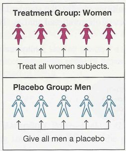
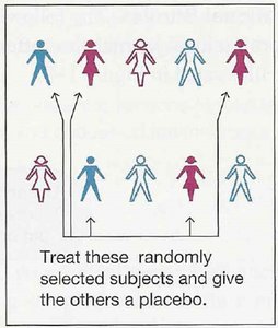
Completely Randomized Design: Subjects are randomly assigned to treatment or control groups.
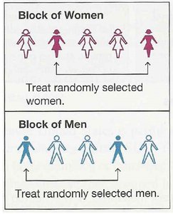
Randomized Block Design: Subjects are grouped (blocked) by a characteristic, then randomly assigned within blocks.
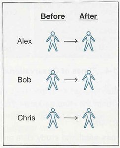
Matched Pairs Design: Subjects are paired (e.g., twins or before/after) and each pair receives different treatments.
Exploring Data with Tables and Graphs
Frequency Distributions
Frequency distributions summarize data by showing how often each value occurs.
Relative Frequency Distribution: Shows the percentage of each frequency.
Cumulative Distribution: Accumulates frequencies as values increase.
Normal Distribution: Bell-shaped, symmetric distribution.
Other Distributions: Uniform (all values equal), V-shaped, skewed.
Histograms
Histograms are graphical representations of frequency distributions, using bins or classes to group data.
Bin Width: The distance between numbers in a histogram.
Class Width: Difference between consecutive lower class limits.
Lower/Upper Class Limits: Smallest/largest values in each bin.
Too Few Bins: Over-smoothed, hard to see patterns.
Too Many Bins: Under-smoothed, noisy representation.
Histograms Show: Center, variation, shape, outliers.
Skewness: Right-skewed (long right tail), left-skewed (long left tail).
Graphs
Various graphs are used to visualize data, each serving a specific purpose.
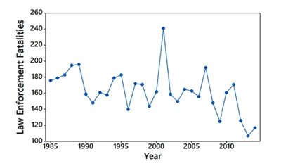
Time-Series Graph: Plots quantitative data over time to identify trends.
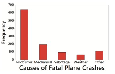
Pareto Chart: Bar graph for categorical data, bars in descending order of frequency.
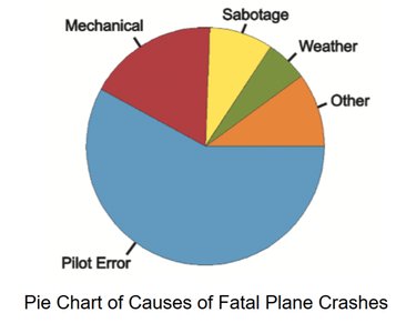
Pie Chart: Shows proportions of categories as slices of a circle.
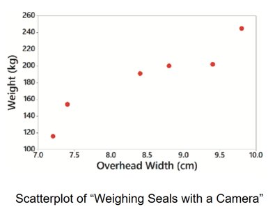
Scatterplot: Plots two quantitative variables to show relationships.
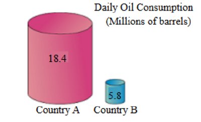
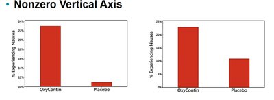
Graphs That Deceive
Graphs can be misleading if not constructed carefully. Always check for nonzero vertical axes and pictographs that exaggerate differences.
Nonzero Vertical Axis: Can exaggerate differences between groups.
Pictographs: Use images to represent data, often distorting proportions.
Describing, Exploring, and Comparing Data
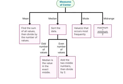
Measures of Center
Measures of center describe the central tendency of a dataset.
Mean: Arithmetic average, sensitive to outliers.
Median: Middle value, robust to outliers.
Mode: Most frequent value, useful for categorical data.
Midrange: Average of maximum and minimum values, rarely used.
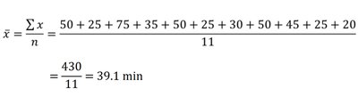
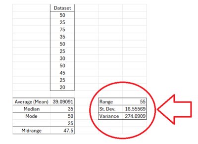
Example: For the dataset 20, 25, 25, 25, 30, 35, 45, 50, 50, 50, 75:
Mean:
Median: 35
Mode: 25 and 50 (both occur three times)
Midrange:

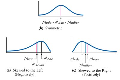
Measures of Center and Skewness
The relationship between mean, median, and mode indicates the skewness of a distribution.
Symmetric: Mean = Median = Mode.
Skewed Left (Negative): Mean < Median < Mode.
Skewed Right (Positive): Mode < Median < Mean.
Measures of Variation
Range, Standard Deviation, and Variance
Measures of variation describe the spread of data values.
Range: Difference between maximum and minimum values.
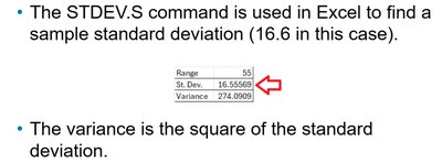
Standard Deviation: Measures variation about the mean. Outliers increase standard deviation.
Variance: Square of the standard deviation.
Notation: s = sample standard deviation, s² = sample variance, σ = population standard deviation, σ² = population variance.
Example: For the "Space Mountain" dataset:
Range: 75 - 20 = 55
Standard Deviation: 16.56
Variance: 274.09
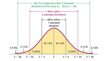
The Empirical Rule for Bell-Shaped Distributions
For data sets with a normal (bell-shaped) distribution, the Empirical Rule states:
About 68% of data values fall within one standard deviation of the mean.
About 95% fall within two standard deviations.
About 99.7% fall within three standard deviations.
Range Rule of Thumb:
