 Back
BackGathering and Exploring Data: Foundations of Statistical Analysis
Study Guide - Smart Notes
 Tailored notes based on your materials, expanded with key definitions, examples, and context.
Gathering & Exploring Data
1.1 Data and Statistical Questions
Statistics is the art and science of designing studies and analyzing data. It involves collecting, organizing, analyzing, and presenting data to answer questions. The process of data analysis includes several key steps:
Step 1: Pose a question that can be answered by data.
Step 2: Determine a plan to collect the data.
Step 3: Summarize the data with graphs and numerical summaries.
Step 4: Answer the question posed in Step 1 using the data and summaries.
Data is information gathered from experiments and surveys, always with context. The practice of statistics includes both the analysis of existing data and the design of studies to obtain new data.
1.1.2 Components of Statistics
Planning: How to obtain data to answer questions of interest (defining research question, population, variables, data collection, and sampling method).
Analysis: Summarizing and analyzing data using numbers or graphs.
Inference: Making decisions, conclusions, or predictions based on data.
The investigative process involves formulating a statistical question, collecting data, analyzing data, and interpreting results.
1.2 Basic Terms/Definitions
Individuals: Objects (people, animals, things) described by a set of data.
Variable: Any characteristic of an individual. Variables can be:
Categorical variable: Places individuals into groups or categories.
Quantitative variable: Takes numerical values for which arithmetic operations make sense.
Population: The entire group of objects or people we wish to study.
Sample: A subset of the population, selected for study.
Census: A survey measuring every member of a population.
Parameter: A numerical value that describes some aspect of the population.
Statistic: A numerical value that describes some aspect of the sample.
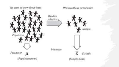
Why use a sample? It is often impractical to collect data from the entire population, so a sample is used to estimate population values.
1.2.1 Descriptive vs Inferential Statistics
Descriptive statistics: Methods for organizing, picturing, and summarizing information from samples or populations (e.g., graphs, averages, percentages).
Inferential statistics: Methods for making decisions or predictions about a population based on sample data. Precision of predictions should be reported.
Randomness refers to the inherent uncertainty in outcomes, while variability describes how much data values differ from one another. Randomness leads to variability in observed data.
Exploring Data With Graphs & Numerical Summaries
2.1 Types of Data
Variables (data) are classified as either categorical or quantitative:
Categorical variable: Places an individual into one or more categories.
Quantitative variable: Takes numerical values for which arithmetic operations make sense.
To determine if a variable is categorical or quantitative, check if the values are numbers and if averaging them is meaningful.
2.1.2 Quantitative Variables
Discrete: Values form a set of separate numbers (counts, e.g., number of pets).
Continuous: Values form an interval (measurements, e.g., height, weight).
2.1.3 Categorical Variables
Nominal: Categories with no intrinsic order (e.g., hair color, gender).
Ordinal: Categories with a clear ordering (e.g., economic status, education level).
2.1.4 Distribution of a Variable
The distribution of a variable describes what values it takes and how often. For categorical variables, the distribution lists categories and their counts or percentages. For quantitative variables, examine clustering, center, and spread.
Summarizing and Displaying Categorical Variables
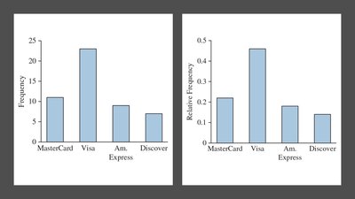
Frequency Table: Lists counts or percentages for each category.
Bar Chart: Displays a vertical bar for each category, with height representing frequency or percentage.
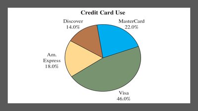
Pie Chart: Shows each category as a slice proportional to its percentage.
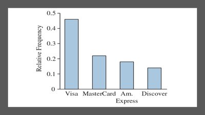
Pareto Chart: Bar chart with categories ordered by frequency.
2.1.5 Displaying Quantitative Data
Quantitative variables can be summarized graphically using:
Dot Plot: Each observation is a dot above its value on a number line.
Stem-and-Leaf Plot: Organizes data by separating each value into a stem and a leaf.
Histogram: Uses bars to represent frequencies or relative frequencies of outcomes.
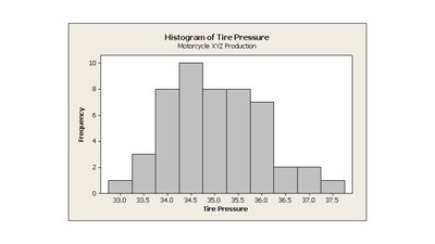
Examining Histograms
Describe the overall pattern by its shape, center, and variability/spread:
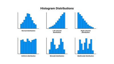
Shape: Symmetric, skewed right, skewed left, unimodal, bimodal, uniform, or multimodal.
Center: Typical value (mean or median).
Variability: How tightly data cluster around the center.
2.2 Measuring the Center of Quantitative Data
Measures of center describe a typical value in a distribution:
Mean (\bar{x}): The arithmetic average. Calculated as
Median (M): The middle value when data are ordered. Resistant to outliers.
Mode: The value that occurs most frequently.
For skewed distributions, the median is preferred as it is resistant to outliers. For symmetric distributions, the mean is preferred as it uses all data values.
2.3 Measuring the Variability of Quantitative Data
Measures of variability describe how spread out the data are:
Range: Difference between maximum and minimum values.
Standard Deviation (s): Measures average distance from the mean.
The standard deviation is not resistant to outliers, while the range only uses two values and is also not resistant.
2.4 Describing Variability: Measures of Position
Z-score: Number of standard deviations an observation is from the mean.
Percentiles: The pth percentile is the value below which p% of observations fall.
Quartiles: Divide data into four equal parts: Q1 (25th percentile), Q2 (median, 50th percentile), Q3 (75th percentile).
Interquartile Range (IQR): Range of the middle 50% of data.
Detecting Outliers: 1.5 x IQR Rule
Lower fence:
Upper fence:
Values outside these fences are considered outliers.
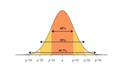
Empirical Rule (68-95-99.7% Rule)
For normal (bell-shaped) distributions:
68% of data within 1 standard deviation of the mean
95% within 2 standard deviations
99.7% within 3 standard deviations
2.4.6 The Box Plot and Five-Number Summary
The five-number summary consists of the minimum, Q1, median (Q2), Q3, and maximum. A boxplot visually displays this summary, showing the spread and center of the data, as well as potential outliers.
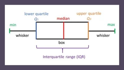
Additional info: Boxplots are especially useful for comparing distributions across groups. Modified boxplots can indicate outliers using the 1.5 x IQR rule.
