 Back
BackGraphical Methods for Describing Quantitative Data
Study Guide - Smart Notes
 Tailored notes based on your materials, expanded with key definitions, examples, and context.
Graphical Methods for Describing Quantitative Data
Introduction to Quantitative Data Visualization
Quantitative data consists of measurements recorded on a meaningful numerical scale. To effectively describe, summarize, and detect patterns in such data, statisticians use graphical methods. The three primary graphical techniques are dot plots, stem-and-leaf plots, and histograms. Each method provides unique insights into the distribution and characteristics of the data set.
Dot Plots
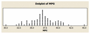
Dot plots are simple visualizations where each data value is represented by a dot on a horizontal axis. When values repeat, dots are stacked vertically above one another. Dot plots are especially useful for small to moderate-sized data sets and allow for easy identification of clusters, gaps, and outliers.
Definition: Each quantitative measurement is shown as a dot along a number line.
Interpretation: The vertical stacking of dots indicates frequency of repeated values.
Application: Useful for visualizing distributions and spotting patterns in data.
Example: Dot plot of miles per gallon (MPG) ratings for 100 cars.
Stem-and-Leaf Plots
Stem-and-leaf plots partition each data value into a "stem" (typically the leading digit(s)) and a "leaf" (usually the last digit). Stems are listed in a column, and leaves are placed in rows corresponding to their stem. This method preserves the original data values while providing a visual summary of the distribution.
Definition: Data values are split into stems and leaves; stems form the rows, leaves are listed horizontally.
Interpretation: Allows for quick identification of the shape, center, and spread of the data.
Modification: The choice of stem and leaf units can be adjusted for clarity (e.g., using tens digit as stem).
Example: Stem-and-leaf display of MPG ratings for 100 cars.
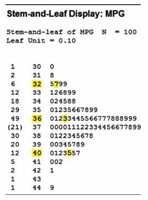
Modification Example: Using tens digit as stem for values 36.3 and 32.7.

Histograms
Histograms group data into class intervals of equal width and display the frequency or relative frequency of observations in each interval using vertical bars. The horizontal axis represents the intervals, while the height of each bar corresponds to the number of observations (or proportion) in that interval.
Definition: Data is divided into intervals; bars show frequency or relative frequency for each interval.
Interpretation: The area above each interval is proportional to the relative frequency of measurements in that interval.
Application: Useful for visualizing the overall shape, center, and spread of large data sets.
Example: Histogram of MPG ratings for 100 cars.
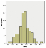
Relative Frequency: For example, if the relative frequency for the interval 37-38 is 0.20, then 20% of the data falls within this interval.
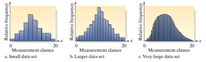
Large Data Sets: As the number of measurements increases and interval width decreases, the histogram approaches a smooth curve, representing the population distribution.
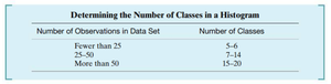
Choosing the Number of Intervals in a Histogram
Selecting the appropriate number of intervals (classes) is crucial for accurately representing the data distribution. The following table provides recommendations based on the size of the data set:
Number of Observations in Data Set | Number of Classes |
|---|---|
Fewer than 25 | 5–6 |
25–50 | 7–14 |
More than 50 | 15–20 |
Examples of Graphical Methods
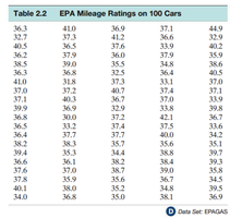
Example 1: EPA Mileage Ratings
The following table presents EPA mileage ratings (in miles per gallon) for 100 cars. This data set is used to illustrate dot plots, stem-and-leaf plots, and histograms.
EPA Mileage Ratings on 100 Cars |
|---|
36.3, 41.0, 36.9, 37.1, 44.9, ... (see image for full data) |
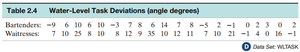
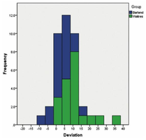
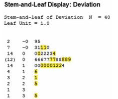
Example 2: Water-Level Task Deviations
In a psychological study, deviations (in angle degrees) from the true water level were measured for two groups: bartenders and waitresses. The data is summarized in the following table and visualized using histograms and stem-and-leaf plots.
Group | Deviations (angle degrees) |
|---|---|
Bartenders | 9, 6, 10, 6, 10, 3, 7, 8, 6, 14, 7, 8, 5, 2, -1, 0, 2, 3, 0, 2 |
Waitresses | 7, 10, 25, 8, 10, 12, 9, 35, 10, 12, 11, 4, 0, 16, -1 |
Histogram: Shows the frequency distribution of deviations for both groups.
Stem-and-Leaf Display: Provides a detailed breakdown of deviation values.
Summary Table: Comparison of Graphical Methods
Method | Best For | Advantages | Limitations |
|---|---|---|---|
Dot Plot | Small to moderate data sets | Shows individual values, easy to spot clusters/outliers | Not practical for large data sets |
Stem-and-Leaf Plot | Moderate data sets | Retains original data, shows distribution shape | Less effective for very large or highly variable data |
Histogram | Large data sets | Shows overall distribution, easy to interpret | Does not retain individual data values |
Key Takeaways
Graphical methods are essential for summarizing and interpreting quantitative data.
Choice of method depends on data size and the level of detail required.
Histograms are preferred for large data sets, while dot plots and stem-and-leaf plots are useful for smaller sets.
Proper selection of class intervals in histograms is crucial for accurate representation.
