 Back
BackLesson 3.2
Study Guide - Smart Notes
 Tailored notes based on your materials, expanded with key definitions, examples, and context.
Chapter 2: Exploring Data with Graphs and Numerical Summaries
Section 2.2: Describing Data Using Graphical Summaries
This section introduces graphical methods for summarizing and interpreting data, focusing on both categorical and quantitative variables. Understanding these visual tools is essential for identifying patterns, distributions, and anomalies in statistical data.
Distribution
Definition and Purpose
Distribution: A distribution describes the possible values a variable can take and the frequency or relative frequency of those values.
Graphical summaries and frequency tables are used to visually organize collected data.
Example: Recording the number of push-ups each of five friends can do yields a frequency table showing how often each value occurs.
Graphs for Categorical Data
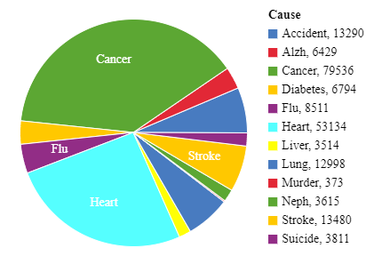
Pie Charts
Pie charts are used to summarize categorical variables by representing each category as a proportional slice of a circle.
Pie Chart: Each slice's size is proportional to the percentage of observations in that category.
Useful for visualizing the composition of a dataset by category.
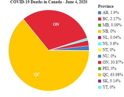
Example: COVID-19 deaths in Canada by province, where each province's share is shown as a slice.
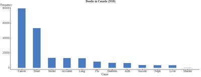
Bar Graphs
Bar graphs display a vertical bar for each category, with the height representing counts (frequencies) or percentages (relative frequencies).
Bar Graph: Easier to compare categories than pie charts.
When categories are ordered by frequency, the bar graph is called a Pareto Chart.
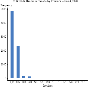
Example: COVID-19 deaths in Canada by province, shown as bars for each province.
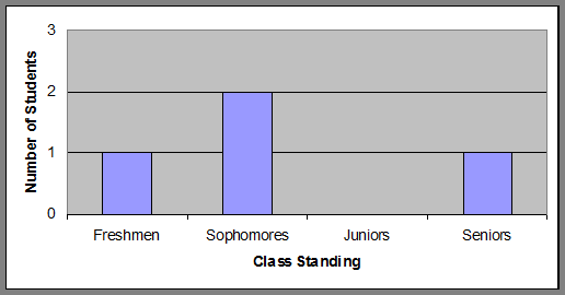
Class Exercise Example
Bar graphs can be used to summarize class standing data, such as the number of students in each year.
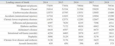
Real-World Applications
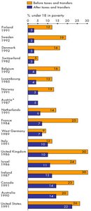
Bar graphs and pie charts are commonly used to display real-world data, such as leading causes of death or poverty rates before and after government intervention.
Graphs for Quantitative Data
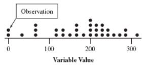
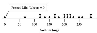
Dot Plots
Dot plots are used for small datasets, showing a dot for each observation placed above its value on a number line.
Retains individual data values.
Useful for visualizing the distribution of a quantitative variable.
Example: Sodium content in cereals.
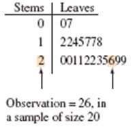
Stem-and-Leaf Plots
Stem-and-leaf plots separate each observation into a stem (first part of the number) and a leaf (last digit), retaining individual values and showing distribution shape.
Stems are listed vertically, leaves are placed horizontally.
Useful for small to moderate datasets.
Example: Sodium content in cereals.
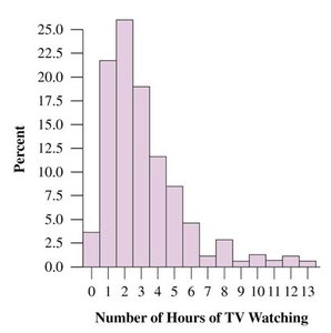
Histograms
Histograms use bars to portray the frequencies or relative frequencies of outcomes for a quantitative variable. They are most useful for large datasets.
Data range is divided into intervals of equal width.
Bars are drawn over each interval, with height equal to frequency or percentage.
Example: Sodium content in cereals.
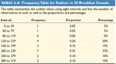
Frequency Table Example
Frequency tables summarize quantitative data by intervals, showing frequency, proportion, and percentage for each interval.
Interval | Frequency | Proportion | Percentage |
|---|---|---|---|
0 to 39 | 1 | 0.05 | 5% |
40 to 79 | 1 | 0.05 | 5% |
80 to 119 | 0 | 0.00 | 0% |
120 to 159 | 4 | 0.20 | 20% |
160 to 199 | 3 | 0.15 | 15% |
200 to 239 | 7 | 0.35 | 35% |
240 to 279 | 2 | 0.10 | 10% |
280 to 319 | 2 | 0.10 | 10% |
Interpreting Histograms
Key Features: Center, Spread, and Shape
Center: Often measured by the median, where 50% of data lies below and 50% above.
Spread: Indicates how much the data varies.
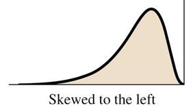
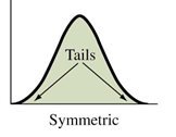
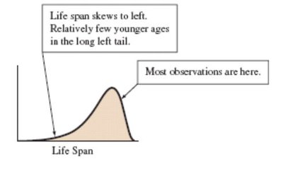
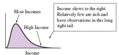
Shape: Can be symmetric, skewed to the left, or skewed to the right.
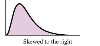
Skewness
Skewed to the left: Left tail is longer than the right tail.
Skewed to the right: Right tail is longer than the left tail.
Symmetric: Both sides are mirror images.
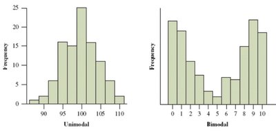
Types of Mounds
Unimodal: One peak in the distribution.
Bimodal: Two peaks in the distribution.
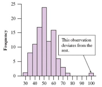
Outliers
An outlier is an observation that falls far from the rest of the data. Outliers should be investigated to determine their cause.
Time Plots
Definition and Use
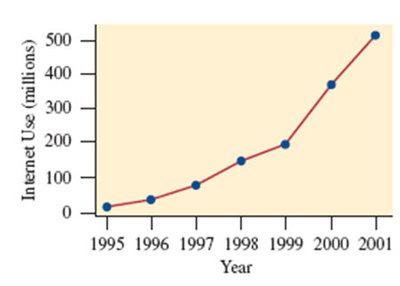
Time Plot: Used for displaying a time series, plotting each observation against the time it was measured.
Points are usually connected to show trends over time.
Example: Number of people worldwide using the Internet from 1995 to 2001.
Lesson Summary
Descriptive statistics summarize data using graphical and numerical methods.
Categorical variables: Use pie charts and bar charts.
Quantitative variables: Use histograms, stem-and-leaf plots, dot plots, and box plots.
Key features to identify: shape (symmetrical or skewed), center, spread, and outliers.
Outliers: Extreme values that deviate from the bulk of observations.
