 Back
BackGraphing Quantitative Data: Shape, Center, and Spread
Study Guide - Smart Notes
 Tailored notes based on your materials, expanded with key definitions, examples, and context.
Graphing Quantitative Data
Types of Graphs for Quantitative Data
Quantitative data can be visualized using several types of graphs, each with unique advantages for statistical analysis:
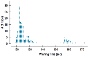
Dot Plot: Retains individual data points, making it easy to identify outliers and modes.
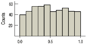
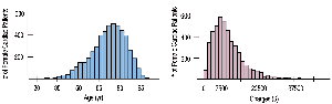
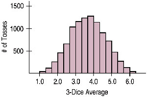
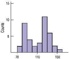
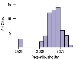
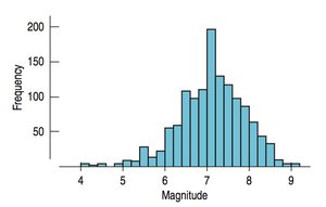
Histogram: Groups data into bins, displays the shape of the distribution, and highlights modes and outliers.
Box Plot: Summarizes data using five-number summary, shows center (median), spread (interquartile range), and potential outliers.
Shape of Distributions
The shape of a distribution is a fundamental characteristic that influences the choice of summary statistics and interpretation:
Symmetric: Data is evenly distributed around the center.
Uniform: All values occur with similar frequency.
Right Skewed: Tail extends to the right; most values are concentrated on the left.
Left Skewed: Tail extends to the left; most values are concentrated on the right.
Other Attributes for Shape
Additional features of distributions include:
Outliers: Unusual data points that differ significantly from the rest.
Modes: Number of peaks or humps in the data (unimodal, bimodal, multimodal).
Center and Spread Depend on Shape
The choice of summary statistics for center and spread depends on the shape of the distribution:
If Symmetric: Use the mean for center and standard deviation for spread.
If Skewed: Use the median for center and interquartile range (IQR) for spread.
Median: The value with half the data below and half above.
Interquartile Range (IQR): Measures the spread of the middle 50% of data. Formula:
Dot Plot
Dot plots are useful for displaying individual data points, modes, and outliers. They require labeling and scaling both axes and providing a title.
Histogram
Histograms group data into bins and are effective for showing the shape, modes, and outliers of a distribution. Axes should be labeled and scaled, and a title provided.
Box Plot
Box plots summarize data using the five-number summary (minimum, Q1, median, Q3, maximum) and highlight the center and spread. Outliers are often marked as individual points.
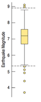
Box Plot Components
Center: Median
Spread: Interquartile Range (IQR)
Fences: Used to identify outliers
Left Fence:
Right Fence:
Graphing and Calculating Statistics Using a Calculator
Statistical calculators can be used to enter data, calculate statistics, and graph histograms and box plots. The process typically involves:
Entering data into lists (e.g., L1, L2).
Using STAT CALC to compute statistics (mean, median, standard deviation, etc.).
Using STAT PLOT to graph histograms and box plots, setting appropriate window and scaling parameters.
Example: Penalty Minutes in Hockey
Given the penalty minutes for nine players: 4, 6, 6, 10, 10, 12, 22, 41, 122.
Shape: Right Skewed, Unimodal
Outlier: 122 minutes
Center: Median = 10
Spread: IQR = Q3 – Q1 = 31.5 - 6 = 25.5
To identify outliers, calculate the left and right fences:
Left Fence:
Right Fence:
Summary Table: Comparison of Graph Types
Graph Type | Retains Individual Data | Displays Shape | Displays Center & Spread |
|---|---|---|---|
Dot Plot | Yes | Yes | No |
Histogram | No | Yes | No |
Box Plot | No | No | Yes |
Big Picture: Always graph using the same scale to compare shape, center, and spread across datasets.
