 Back
BackIntroduction to Statistics: Understanding and Displaying Categorical Data
Study Guide - Smart Notes
 Tailored notes based on your materials, expanded with key definitions, examples, and context.
Chapter 1: Stats Starts Here
What is Statistics?
Statistics is the science of reasoning with data. It provides a framework, language, and set of tools for understanding and interpreting information collected about the world. The discipline helps us recognize patterns, account for variation, and make informed decisions based on data.
Way of Thinking: Statistics helps us uncover and interpret the often unseen but predictable patterns in our world.
Language: Statistics has its own grammar and definitions, allowing us to communicate findings and predictions clearly.
Toolkit: Statistical methods provide practical tools for solving real-world problems by analyzing data efficiently.
Example: Urban planners use statistics to analyze survey data and make evidence-based decisions about city development.
What Are Data?
Data are pieces of information collected about individuals or objects. They can be numbers, names, or labels, but their meaning depends on context. Not all numbers are quantitative; for example, codes like 1=male, 2=female are categorical.
Context is essential—data are meaningless without knowing the circumstances of their collection.
Five W’s and One H: To understand data, always ask: Who, What (and in what units), When, Where, Why, and How.
Example: In a census, 'Who' might be households, and 'What' could be household income measured in dollars.
Data Tables and Units of Analysis
Data tables organize information, showing the 'What' (variables/columns) and 'Who' (cases/rows). The unit of analysis is the entity about which data are collected (e.g., person, household, country).
Respondents: Individuals answering surveys.
Subjects/Participants: People in experiments.
Experimental Units: Non-human subjects in experiments.
Example: In a study of student eye color, the 'Who' is the student, and the 'What' is eye color.
How Data Are Collected
The method of data collection greatly affects the validity of conclusions. Proper sampling and experimental design are crucial for meaningful results. Biases can arise from non-random sampling or poorly designed surveys.
Randomness is more important than sample size for representativeness.
Invalid data (e.g., from voluntary internet surveys) can lead to misleading conclusions.
Example: Interviewing only people nearby (convenience sampling) introduces bias.
Types of Variables
Variables are characteristics recorded about each individual. They should be clearly named and defined.
Categorical (Qualitative) Variables: Place individuals into categories (e.g., gender, race, disease status).
Quantitative Variables: Measured on a numerical scale with meaningful units (e.g., income, height, weight).
Ordinal Variables: Categorical variables with a meaningful order but no consistent difference between categories (e.g., rating scales).
Identifier Variables: Unique codes for each individual (e.g., student ID, ISBN); not for analysis.
Example: Survey responses on a 1–5 scale (strongly disagree to strongly agree) are ordinal.
Chapter 2: Displaying and Describing Categorical Data
Summarizing and Displaying a Single Categorical Variable
Visualizing data is essential for revealing patterns and communicating findings. The three rules of data analysis are: make a picture, make a picture, make a picture.
Data visualization helps identify trends and anomalies not obvious in raw data.
Pictures (charts/graphs) are the best way to share data insights with others.
The Area Principle
In data graphics, the area representing a value should be proportional to the value itself. Misleading visuals can distort interpretation.

Frequency and Relative Frequency Tables
Tables are used to organize counts or proportions for each category of a categorical variable.
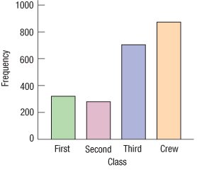
Frequency Table: Shows the count of cases in each category.
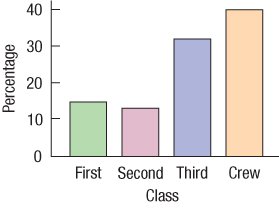
Relative Frequency Table: Shows the proportion or percentage in each category.
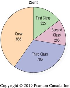
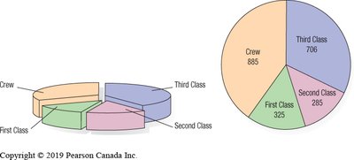
Class | Count |
|---|---|
First | 325 |
Second | 285 |
Third | 706 |
Crew | 885 |
Class | % |
|---|---|
First | 14.77 |
Second | 12.95 |
Third | 32.08 |
Crew | 40.21 |
Bar Charts and Pie Charts
Bar charts and pie charts are common ways to display categorical data.
Bar Chart: Displays counts for each category as bars. Follows the area principle.
Relative Frequency Bar Chart: Bars represent percentages instead of counts.
Pie Chart: Shows parts of a whole as slices of a circle. Useful when categories are mutually exclusive and exhaustive.
Contingency Tables
Contingency tables (two-way tables) summarize the relationship between two categorical variables. Each cell shows the count for a combination of categories.
Survival | First Class | Second Class | Third Class | Crew | Total |
|---|---|---|---|---|---|
Alive | 203 | 118 | 178 | 212 | 711 |
Dead | 122 | 167 | 528 | 673 | 1490 |
Total | 325 | 285 | 706 | 885 | 2201 |
Marginal Distribution: The totals in the margins (right and bottom) show the distribution for each variable separately.
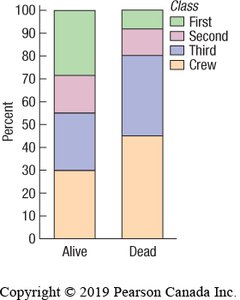
Conditional Distributions
A conditional distribution shows the distribution of one variable for individuals who satisfy a condition on another variable. For example, the distribution of ticket class among survivors versus non-survivors on the Titanic.
Survival | First Class | Second Class | Third Class | Crew | Total |
|---|---|---|---|---|---|
Alive | 28.6% | 16.6% | 25.0% | 29.8% | 100% |
Dead | 8.2% | 11.2% | 35.4% | 45.2% | 100% |
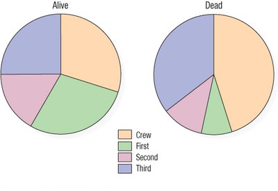
If the conditional distributions differ, the variables are associated (not independent).
Segmented Bar Charts
Segmented bar charts display the same information as pie charts but use bars divided into segments proportional to the percentage in each group. They are useful for comparing conditional distributions across categories.
What Can Go Wrong?
Violating the Area Principle: Misleading visuals (e.g., 3D or slanted pie charts) distort interpretation.
Honesty in Display: Ensure that charts accurately represent the data.
Confusing Percentages: Pay attention to context and wording to avoid misinterpretation.
Sample Size: Use enough cases to make reliable conclusions.
Summary
Categorical data can be summarized using counts or percentages.
Bar charts and pie charts are effective for displaying distributions of categorical variables.
Contingency tables and conditional distributions help explore relationships between two categorical variables.
Variables are independent if conditional distributions are the same across categories; otherwise, they are associated.
