 Back
BackIntroductory Statistics Study Guide: Correlation, Regression, and Data Analysis
Study Guide - Smart Notes
 Tailored notes based on your materials, expanded with key definitions, examples, and context.
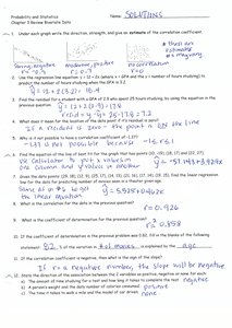
Q1. For each graph, write the direction, strength, and give an estimate of the correlation coefficient.
Background
Topic: Correlation and Scatterplots
This question tests your ability to interpret scatterplots and describe the relationship between two variables using direction (positive/negative), strength (strong/weak), and the correlation coefficient ().
Key Terms:
Direction: Indicates whether the relationship is positive (both variables increase together) or negative (one increases as the other decreases).
Strength: Describes how closely the data points follow a straight line (strong, moderate, weak).
Correlation coefficient (): A value between -1 and 1 that quantifies the direction and strength of a linear relationship.
Step-by-Step Guidance
Examine each scatterplot and look for the general trend: do the points go upward (positive) or downward (negative)?
Assess how tightly the points cluster around a straight line. If they are very close, the relationship is strong; if they are spread out, it is weak.
Estimate the correlation coefficient based on direction and strength. Strong positive relationships have close to 1, strong negative close to -1, and weak relationships near 0.
Write your descriptions for each graph, including direction, strength, and estimated .
Try solving on your own before revealing the answer!
Final Answer:
Graph 1: Strong negative, Graph 2: Moderate positive, Graph 3: No correlation,
These estimates are based on the direction and clustering of points in each scatterplot.
Q2. Find the mean number of hours spent studying for the exam.
Background
Topic: Measures of Central Tendency
This question tests your ability to calculate the mean (average) from a set of data values.
Key Formula:
= each individual value
= number of values
Step-by-Step Guidance
List all the values for hours spent studying.
Add up all the values to find the total sum.
Count the number of values in the data set.
Set up the formula for the mean using the sum and the count.
Try solving on your own before revealing the answer!
Final Answer: Mean = 17.3 hours
The mean is calculated by dividing the total sum of hours by the number of students.
Q3. Find the median number of hours spent studying for the exam.
Background
Topic: Measures of Central Tendency
This question tests your ability to find the median, which is the middle value when the data is ordered.
Key Formula:
If is odd: Median = middle value If $n$ is even: Median = average of two middle values
Step-by-Step Guidance
Order the data values from smallest to largest.
Determine if the number of values () is odd or even.
Identify the middle value (or average the two middle values if is even).
Try solving on your own before revealing the answer!
Final Answer: Median = 16 hours
The median is the value in the center of the ordered data set.
Q4. Find the mean and median for the number of hours spent studying for the exam if the highest value is removed.
Background
Topic: Effects of Outliers
This question tests your understanding of how removing an outlier affects the mean and median.
Key Concepts:
Mean is sensitive to extreme values (outliers).
Median is less affected by outliers.
Step-by-Step Guidance
Remove the highest value from the data set.
Recalculate the mean using the new sum and count.
Reorder the data and find the new median.
Try solving on your own before revealing the answer!
Final Answer: Mean = 15.7 hours, Median = 15 hours
Removing the highest value lowers the mean more than the median.
Q5. What is the correlation coefficient for the process described?
Background
Topic: Correlation Coefficient
This question tests your ability to calculate or interpret the correlation coefficient () for a data set.
Key Formula:
= individual data values
= means of and
Step-by-Step Guidance
Calculate the mean of and .
Compute the deviations and for each pair.
Multiply the deviations for each pair and sum them.
Calculate the denominator by finding the sum of squared deviations for and .
Try solving on your own before revealing the answer!
Final Answer:
This value indicates a strong positive linear relationship between the variables.
Q6. What is the coefficient of determination for the process described?
Background
Topic: Coefficient of Determination ()
This question tests your ability to interpret , which measures the proportion of variance explained by the model.
Key Formula:
= correlation coefficient
Step-by-Step Guidance
Take the value of from the previous question.
Square the value of to find .
Interpret as the proportion of variance in the dependent variable explained by the independent variable.
Try solving on your own before revealing the answer!
Final Answer:
This means about 85.8% of the variance is explained by the linear model.
Q7. If the correlation is negative, what will the slope of the regression line be?
Background
Topic: Linear Regression
This question tests your understanding of how the sign of the correlation affects the slope of the regression line.
Key Concept:
If is negative, the slope of the regression line will also be negative.
Step-by-Step Guidance
Recall that the slope of the regression line is determined by the correlation coefficient.
If is negative, the regression line will slope downward from left to right.
Think about what this means for the relationship between the variables.
Try solving on your own before revealing the answer!
Final Answer: The slope will be negative.
A negative correlation means that as one variable increases, the other decreases.
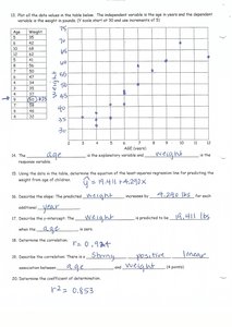
Q8. Plot all the data values as in the table below. The independent variable is age and the dependent variable is weight.
Background
Topic: Scatterplots and Data Visualization
This question tests your ability to plot data points and identify the variables in a scatterplot.
Key Terms:
Independent variable: Plotted on the x-axis (age)
Dependent variable: Plotted on the y-axis (weight)
Step-by-Step Guidance
Identify the independent variable (age) and dependent variable (weight).
Plot each pair of values as a point on the scatterplot.
Label the axes appropriately.
Try solving on your own before revealing the answer!
Final Answer:
The scatterplot shows age on the x-axis and weight on the y-axis, with each data point representing a child.
Q9. Use the regression equation to predict the weight for a child aged 15 years.
Background
Topic: Linear Regression Prediction
This question tests your ability to use a regression equation to make predictions.
Key Formula:
= intercept
= slope
= value of independent variable (age)
Step-by-Step Guidance
Write down the regression equation provided.
Substitute into the equation.
Calculate the predicted weight by performing the arithmetic.
Try solving on your own before revealing the answer!
Final Answer: Predicted weight = 50.02 lbs
Substituting age 15 into the regression equation gives the predicted weight.
Q10. Calculate the residual for the child aged 15 years.
Background
Topic: Residuals in Regression
This question tests your ability to calculate the residual, which is the difference between the observed and predicted value.
Key Formula:
Step-by-Step Guidance
Find the observed weight for the child aged 15 years.
Use the regression equation to find the predicted weight for age 15.
Subtract the predicted value from the observed value to find the residual.
Try solving on your own before revealing the answer!
Final Answer: Residual = 1.979 lbs
The residual is the difference between the actual weight and the predicted weight for age 15.
Q11. Why is predicting outside the range of x values called extrapolation?
Background
Topic: Extrapolation in Regression
This question tests your understanding of extrapolation, which is making predictions outside the observed data range.
Key Concept:
Extrapolation involves using a model to predict values for outside the range of the data used to build the model.
Step-by-Step Guidance
Recall the definition of extrapolation.
Think about why predictions outside the data range may be unreliable.
Consider the risks of extrapolation compared to interpolation (predicting within the data range).
Try solving on your own before revealing the answer!
Final Answer:
Extrapolation is predicting values for outside the observed range, which can be unreliable because the model may not hold beyond the data.
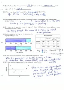
Q12. Interpret the bar graph showing the proportion of adults owning a home.
Background
Topic: Data Interpretation
This question tests your ability to interpret categorical data presented in a bar graph.
Key Terms:
Proportion: The fraction of the total represented by a category.
Bar graph: Visual representation of categorical data.
Step-by-Step Guidance
Examine the heights of the bars for each category.
Compare the proportions for different groups.
Describe any patterns or differences you observe.
Try solving on your own before revealing the answer!
Final Answer:
The bar graph shows that the proportion of adults owning a home is higher for married individuals than for singles.
Q13. Interpret the residual plot for the linear regression model.
Background
Topic: Residual Plots and Model Fit
This question tests your ability to interpret a residual plot to assess the appropriateness of a linear model.
Key Concepts:
Residual plot: Shows the residuals (errors) for each data point.
A random scatter of points suggests a good linear fit; a pattern suggests the model may not be appropriate.
Step-by-Step Guidance
Examine the residual plot for any clear patterns or trends.
Determine if the residuals are randomly scattered or show a systematic pattern.
Assess whether the linear model is appropriate based on the plot.
Try solving on your own before revealing the answer!
Final Answer:
The residual plot shows a clear curved pattern, indicating that a linear model may not be appropriate for the data.
