 Back
Introductory Statistics Test 1 Review – Step-by-Step Study Guidance
Study Guide - Smart Notes
 Tailored notes based on your materials, expanded with key definitions, examples, and context.
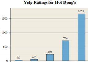
Q13. The following graph shows the ratings (1-5 stars) on Yelp for Hot Doug’s Restaurant. Label the x and y axis.
Background
Topic: Frequency Distributions & Data Visualization
This question tests your ability to interpret and label axes on a bar graph (histogram) that displays frequency data. Understanding how to label axes is fundamental for correctly reading and presenting statistical graphs.
Key Terms:
Frequency: The count of occurrences for each rating.
Histogram/Bar Graph: A visual representation of data where the height of each bar shows the frequency for each category.
Axis Labels: The x-axis typically shows the categories (here, star ratings), and the y-axis shows the frequency (number of ratings).
Step-by-Step Guidance
Examine the graph and identify what each bar represents. In this case, each bar corresponds to a Yelp star rating (1, 2, 3, 4, 5 stars).
Determine what the horizontal axis (x-axis) should be labeled. It represents the categories of ratings (star values).
Determine what the vertical axis (y-axis) should be labeled. It represents the frequency, or the number of reviews for each rating.
Think about how to write these labels clearly and concisely, using proper statistical terminology.
Try labeling the axes on your own before revealing the answer!
Final Answer:
X-axis label: "Yelp Star Rating" (or "Number of Stars")
Y-axis label: "Frequency" (or "Number of Reviews")
The x-axis shows the star ratings (1–5), and the y-axis shows how many reviews each rating received. This labeling helps viewers understand what the graph is displaying.
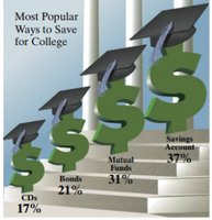
Q14. The following is a USA Today-type graph. Do you think the graph is misleading? Why? If you think it is misleading, what might be done to improve the graph?
Background
Topic: Data Visualization & Graphical Misrepresentation
This question tests your ability to critically evaluate graphs for potential misleading features and suggest improvements. Recognizing misleading graphs is important for interpreting data accurately and avoiding bias.
Key Terms:
Misleading Graph: A graph that visually exaggerates or distorts the data, often through inappropriate scaling, sizing, or design choices.
Proportionality: The visual elements (such as the size of symbols) should accurately reflect the underlying data values.
Improvement: Adjusting the graph to more accurately represent the data, such as using consistent scales or avoiding unnecessary embellishments.
Step-by-Step Guidance
Examine the graph and note how the visual elements (dollar signs, graduation caps) are used to represent the data.
Compare the sizes of the symbols to the actual percentages shown. Are the sizes proportional to the data values?
Consider whether the graph could mislead viewers by exaggerating differences or making some categories appear more important than they are.
Think about ways to improve the graph, such as using a bar chart or ensuring that symbol sizes are proportional to the data.
Try evaluating the graph and suggesting improvements before revealing the answer!
Final Answer:
Yes, the graph is misleading. The dollar signs are not proportional to the percentages, so the visual impact exaggerates the differences between categories. For example, the largest dollar sign is much bigger than the others, even though the difference in percentages is not as dramatic.
To improve the graph, use a bar chart with bars proportional to the actual percentages, or ensure that the size of the symbols accurately reflects the data values. Avoid unnecessary embellishments that distort the data.
