 Back
BackMeasures of Central Tendency and Spread: Median, IQR, and Boxplots
Study Guide - Smart Notes
 Tailored notes based on your materials, expanded with key definitions, examples, and context.
Measures of the Center: Median
Definition and Calculation of the Median
The median is a measure of central tendency that identifies the middle value in a data set when the values are arranged in order from smallest to largest. It divides the data into two equal halves, with 50% of the observations above and 50% below the median.
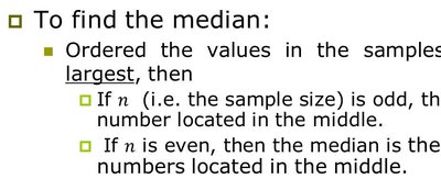
To find the median:
Order the values in the sample from smallest to largest.
If n (the sample size) is odd, the median is the value located in the middle.
If n is even, the median is the average of the two numbers located in the middle.
The median is a robust measure of center, meaning it is not strongly affected by outliers.
Measures of Spread: Interquartile Range (IQR)
Definition and Calculation of IQR
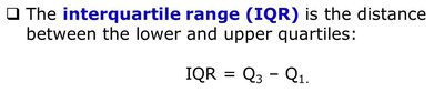
The interquartile range (IQR) is a measure of statistical dispersion, or spread, that describes the range within which the central 50% of the data lie. It is calculated as the difference between the upper quartile (Q3) and the lower quartile (Q1):
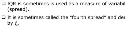
IQR is sometimes used as a measure of variability (spread).
It is sometimes called the "fourth spread" and denoted by fs.
IQR is the range of 50% of the observations.

Boxplots: Construction and Interpretation
How to Construct a Boxplot
A boxplot is a graphical summary of a data set based on the five-number summary: minimum, Q1, median, Q3, and maximum. It visually displays the center, spread, and potential outliers in the data.
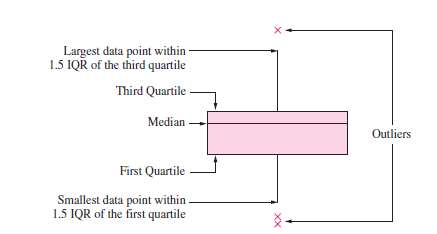
Draw a box extending from Q1 to Q3.
Draw a horizontal line at the median.
Draw whiskers from each end of the box:
The lower whisker is a line from Q1 to the smallest data point within 1.5 IQR below Q1.
The upper whisker is a line from Q3 to the largest data point within 1.5 IQR above Q3.
Points more than 1.5 IQR above Q3 or more than 1.5 IQR below Q1 are designated as outliers. Plot each outlier individually as an asterisk (*).


Examples of Boxplots
Boxplots can be used to compare distributions and identify outliers visually. The length of the box represents the IQR, and the whiskers show the range of the bulk of the data. Outliers are plotted as individual points beyond the whiskers.

Summary Table: Boxplot Components
Component | Description |
|---|---|
Box | Extends from Q1 to Q3 (IQR) |
Median Line | Drawn inside the box at the median value |
Whiskers | Extend to the smallest/largest data points within 1.5 IQR of Q1 and Q3 |
Outliers | Points beyond 1.5 IQR from the quartiles, plotted individually |
Additional info: Boxplots are especially useful for comparing distributions between groups and for detecting skewness and outliers in the data.
