 Back
BackMeasures of Position and Outliers: Study Notes for Statistics Students
Study Guide - Smart Notes
 Tailored notes based on your materials, expanded with key definitions, examples, and context.
Measures of Position and Outliers
Overview
This section covers statistical measures that describe the position of data values within a dataset, methods for identifying outliers, and graphical summaries such as boxplots. These concepts are essential for understanding data distribution and variability.
Determining and Interpreting Z-Scores
Z-Score Definition and Calculation
A z-score measures how many standard deviations a data value is from the mean. It is used to compare values from different distributions.
Formula:
Interpretation: A positive z-score indicates the value is above the mean; a negative z-score indicates it is below the mean.
Example: Comparing the run production of two baseball teams using their z-scores allows for a fair comparison across leagues with different averages and standard deviations.
Interpreting Percentiles
Percentile Definition and Application
A percentile indicates the percentage of data values below a particular value in a dataset.
Interpretation: If a score is in the 74th percentile, it means 74% of the scores are below that value.
Example: Jennifer's SAT Mathematics score of 600 in the 74th percentile means she scored higher than 74% of test-takers.
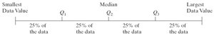
Determining and Interpreting Quartiles
Quartile Definition
Quartiles divide a dataset into four equal parts. Each quartile represents 25% of the data.
Q1 (First Quartile): Separates the lowest 25% of data from the rest; equivalent to the 25th percentile.
Q2 (Second Quartile): The median; divides the data into two equal halves; equivalent to the 50th percentile.
Q3 (Third Quartile): Separates the lowest 75% from the highest 25%; equivalent to the 75th percentile.
Finding Quartiles:
Step 1: Arrange the data in ascending order.
Step 2: Find the median (Q2).
Step 3: Divide the data into halves. Q1 is the median of the lower half; Q3 is the median of the upper half.
Example: For a sample of collision coverage claims, quartiles can be used to summarize the distribution of claim amounts.
Determining and Interpreting Interquartile Range (IQR)
IQR Definition and Calculation
The interquartile range (IQR) measures the spread of the middle 50% of data values. It is less sensitive to outliers than the range.
Formula:
Interpretation: A larger IQR indicates greater variability in the central portion of the data.
Example: Calculating the IQR for collision claim data helps identify the typical spread of claim amounts.
Checking a Set of Data for Outliers
Outlier Detection Using Quartiles
Outliers are extreme values that differ significantly from other observations. The quartile method uses fences to identify outliers.
Step 1: Find Q1 and Q3.
Step 2: Compute the IQR.
Step 3: Calculate the fences:
Lower Fence:
Upper Fence:
Step 4: Any value outside these fences is considered an outlier.
Example: Checking collision claim data for outliers helps identify unusually high or low claims.
Computing the Five-Number Summary
Five-Number Summary Definition
The five-number summary provides a concise description of a dataset's distribution.
Minimum
Q1 (First Quartile)
Median (Q2)
Q3 (Third Quartile)
Maximum
Example: For collision claim data: Minimum = 180, Q1 = 735, Median = 1805, Q3 = 4668, Maximum = 21,147.
Drawing and Interpreting Boxplots
Boxplot Construction and Interpretation
A boxplot is a graphical summary of the five-number summary and outliers.
Step 1: Calculate lower and upper fences using quartiles and IQR.
Step 2: Draw a number line covering the data range. Mark Q1, Median, and Q3, and enclose them in a box.
Step 3: Label the fences.
Step 4: Draw whiskers from Q1 to the smallest value above the lower fence and from Q3 to the largest value below the upper fence.
Step 5: Mark outliers with an asterisk (*).
Example: Constructing a boxplot for collision claim data visually displays the distribution, central tendency, and outliers.
Note on Software Methods
Quartile Calculation Methods
Different statistical software may use varying methods to calculate quartiles. For homework and exams, use the method illustrated in the textbook and slides, not JMP's method.
Additional info: The textbook method ensures consistency in quartile and boxplot calculations for academic purposes.
