 Back
BackOrganizing and Displaying Data in Statistics
Study Guide - Smart Notes
 Tailored notes based on your materials, expanded with key definitions, examples, and context.
Organizing Data
Qualitative vs. Quantitative Variables
In statistics, variables are classified as either qualitative (categorical) or quantitative (numerical). Understanding the type of variable is essential for selecting appropriate methods of data organization and analysis.
Qualitative Variables: Allow for classification of individuals based on attributes or characteristics (e.g., color, type, category).
Quantitative Variables: Provide numerical measures of individuals. Their values can be added or subtracted to yield meaningful results (e.g., height, weight, number of cars).
Organizing Qualitative Data
Tabular and Graphical Methods
Qualitative data can be organized and summarized using tables and various types of graphs. This process transforms raw data into a more interpretable format.
Frequency Distribution Table: Lists each category and the number of occurrences (frequency) for each category.
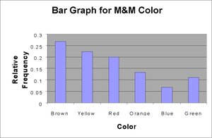
Relative Frequency: The proportion (or percent) of observations within a category, calculated as:

Relative Frequency Distribution: Lists each category with its relative frequency.
Visualizing Qualitative Data
Visual representations help reveal patterns and trends in categorical data.
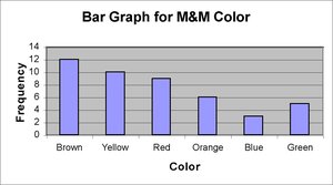
Bar Graphs: Each category is represented by a rectangle; the height shows frequency or relative frequency.
Pareto Chart: A bar graph with bars in decreasing order of frequency or relative frequency.
Side-by-Side Bar Graphs: Used to compare two data sets, typically using relative frequencies.
Pie Charts: A circle divided into sectors, each proportional to the category's frequency.
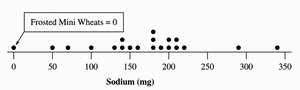
Dot Plots: Each observation is represented by a dot above its category.
Example: M&M Color Data
Suppose we have the following raw data representing the color of M&Ms in a bag:
Colors: brown, brown, yellow, red, red, red, brown, orange, blue, green, blue, brown, yellow, yellow, brown, red, red, brown, brown, brown, green, blue, green, orange, orange, yellow, yellow, yellow, red, brown, red, brown, orange, green, red, brown, yellow, orange, red, green, yellow, yellow, brown, yellow, orange
We can organize this data into a frequency distribution table and visualize it using bar graphs and pie charts.

Organizing Quantitative Data
Tabular and Graphical Methods
Quantitative data can be summarized using frequency tables, dot plots, stem-and-leaf plots, and histograms. The choice of method depends on the size and nature of the data set.
Dot Plot: Shows a dot for each observation placed above its value on a number line. Useful for small data sets.
Stem-and-Leaf Plot: Portrays individual observations while grouping data. The stem consists of all but the rightmost digit; the leaf is the rightmost digit.
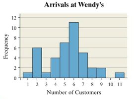
Histogram: Uses bars to portray the frequency or relative frequency of data grouped into intervals (classes). Useful for large data sets.
Frequency, Relative Frequency, and Cumulative Frequency
Frequency: The number of times a value occurs in the data set.
Relative Frequency: The ratio of the frequency of a value to the total number of observations.
Cumulative Relative Frequency: The accumulation of previous relative frequencies up to the current value.
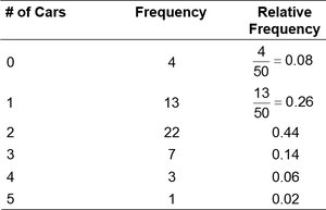
Example: Number of Cars in Households
Consider the following data for the number of cars in 50 households:
# of Cars | Frequency | Relative Frequency |
|---|---|---|
0 | 4 | 0.08 |
1 | 13 | 0.26 |
2 | 22 | 0.44 |
3 | 7 | 0.14 |
4 | 3 | 0.06 |
5 | 1 | 0.02 |
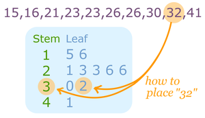
Stem-and-Leaf Plots
Construction and Interpretation
A stem-and-leaf plot displays quantitative data in a way that retains the original data values. The stem is formed from all but the rightmost digit, and the leaf is the rightmost digit. This plot is especially useful for small to moderate-sized data sets.
Example: For the value 32, the stem is 3 and the leaf is 2.

Histograms
Construction and Use
A histogram is constructed by drawing rectangles for each class of data. The height of each rectangle represents the frequency or relative frequency, and the width is the same for all rectangles. Histograms are used for quantitative data, while bar charts are used for qualitative data.
Discrete Data: If the range of values is small, each bar represents one data value.
Continuous Data: Data are grouped into intervals (classes), and each bar represents a range of values.
Grouped Frequency Distributions
Definitions and Construction
When data have a large range, grouped frequency distributions are used. Data are grouped into classes, each defined by lower and upper class limits. The class width is the difference between successive lower class limits, and the class midpoint (class mark) is the average of successive lower class limits.
Steps to Construct:
Determine the number of classes (usually 5–20).
Calculate the class width (always round up).
Choose the first lower class limit (often the minimum value or a convenient value below it).
List the lower and upper class limits for each class.
Tally the data and determine frequencies.
Frequency Polygons and Density Plots
Frequency Polygon
A frequency polygon is a graph that displays data by connecting points plotted for the frequencies at the class midpoints. It provides a visual representation of the distribution's shape.
Density Plot
Density plots smooth the classes in a histogram, providing a continuous curve that approximates the distribution of the data.
Shapes of Distributions
Common Distribution Shapes
Uniform: Frequency is evenly spread across values (nonmodal and symmetric).
Bell-Shaped (Normal): Highest frequency in the middle, tails are symmetric (unimodal and symmetric).
Skewed Right: Peak on the left, longer tail to the right.
Skewed Left: Peak on the right, longer tail to the left.
Time Series Graphs
Definition and Construction
Time series data are values measured at different points in time. A time-series plot is created by plotting time on the horizontal axis and the variable's value on the vertical axis, connecting the points with line segments. This allows for the identification of trends and patterns over time.
Summary Table: Graphical Methods for Data Organization
Graph Type | Data Type | Main Use |
|---|---|---|
Bar Graph | Qualitative | Compare frequencies or relative frequencies of categories |
Pareto Chart | Qualitative | Highlight most frequent categories |
Pie Chart | Qualitative | Show proportion of each category |
Dot Plot | Quantitative (small data sets) | Display individual data points |
Stem-and-Leaf Plot | Quantitative (small/moderate data sets) | Retain original data values |
Histogram | Quantitative (large data sets) | Show distribution of data |
Frequency Polygon | Quantitative | Show shape of distribution |
Density Plot | Quantitative | Smooth distribution curve |
Time Series Plot | Quantitative (over time) | Show trends over time |
