 Back
BackOrganizing and Summarizing Data: Essential Graphical and Tabular Methods in Statistics
Study Guide - Smart Notes
 Tailored notes based on your materials, expanded with key definitions, examples, and context.
Chapter 2: Organizing and Summarizing Data
2.1 Organizing Qualitative Data
Qualitative data, also known as categorical data, must be organized to facilitate analysis and interpretation. Common methods include tables and graphical displays.
Frequency Distribution: Lists each category and the number of occurrences (frequency) for each category.
Relative Frequency: The proportion or percentage of observations within a category, calculated as:
Relative Frequency Distribution: Lists each category with its relative frequency.
Example: Survey responses about the best day of the week can be organized into a frequency and relative frequency table to summarize preferences.
Bar Graphs
A bar graph displays categories on one axis and frequencies or relative frequencies on the other. Bars are of equal width, and their heights represent the data values.
Pareto Chart: A bar graph with bars ordered from highest to lowest frequency.
Side-by-Side Bar Graphs: Used to compare two groups across categories, typically using relative frequencies for fair comparison.
Pie Charts
A pie chart divides a circle into sectors, each representing a category. The area of each sector is proportional to the category's frequency.
Graph Comparisons
Bar graphs are preferred when comparing categories, especially when there are many categories or when categories do not sum to a meaningful whole.
Pie charts are best when showing parts of a whole, but cannot be used if categories overlap or do not sum to a meaningful total.
2.2 Organizing Quantitative Data: The Popular Displays
Quantitative data can be discrete (countable values) or continuous (measurable values). The method of organization depends on the type and range of data.
Organizing Discrete Data in Tables
Discrete data with few values can be organized into frequency and relative frequency tables, similar to qualitative data.
Histograms
A histogram is a graphical representation of the distribution of quantitative data. Rectangles (bars) are drawn for each class interval, with heights representing frequencies or relative frequencies. Bars touch each other to indicate continuous data.
Organizing Continuous Data in Tables
Classes: Intervals into which data are grouped. Each class has a lower and upper class limit.
Class Width: The difference between consecutive lower class limits.
Example: Unemployment rates by state can be grouped into classes (e.g., 1.5–2.4%, 2.5–3.4%, etc.) to create a frequency distribution.
Dot Plots
A dot plot places each observation as a dot above its value on a number line, useful for small data sets to show distribution and clusters.
Identifying the Shape of a Distribution
The shape of a distribution provides insight into the nature of the data:
Uniform: Frequencies are evenly spread across values.
Bell-shaped (Symmetric): Highest frequency in the middle, tails off on both sides.
Skewed Right: Tail on the right is longer; most data are on the left.
Skewed Left: Tail on the left is longer; most data are on the right.
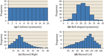
Additional info: Qualitative data should not be described as skewed or uniform.
2.3 Additional Displays of Quantitative Data
Stem-and-Leaf Plots
A stem-and-leaf plot displays quantitative data by splitting each value into a "stem" (all but the final digit) and a "leaf" (the final digit). This method preserves the original data values and shows distribution shape.
Stems are listed in order, and leaves are arranged beside their stems.
Leaves within each stem are ordered.
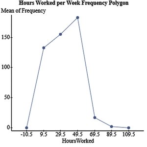
Frequency Polygons
A frequency polygon uses points connected by line segments to represent class frequencies. Points are plotted at class midpoints and connected, with endpoints joined to the horizontal axis.
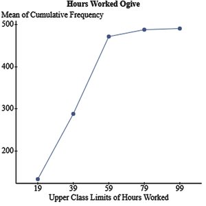
Cumulative Frequency and Relative Frequency Tables
Cumulative frequency tables show the total number of observations less than or equal to each class. Cumulative relative frequency tables show the proportion or percentage of observations less than or equal to each class.
Ogives
An ogive is a graph of cumulative frequency or cumulative relative frequency. Points are plotted at the upper class limits and connected by line segments.
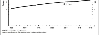
Time-Series Graphs
A time-series plot displays data points at successive time intervals, connected by line segments. It is useful for identifying trends over time.
2.4 Graphical Misrepresentations of Data
Graphs can be misleading if not constructed carefully. Common issues include:
Inconsistent scales: Tick mark increments should be constant.
Misplaced origin: Starting the axis at a value other than zero can exaggerate or minimize differences.
Comparative graphs: Scales should be the same for fair comparison.
Example: A bar graph with a truncated y-axis can make small differences appear large. To improve, always start axes at zero unless there is a compelling reason not to, and clearly indicate any breaks in the axis.
