 Back
BackOrganizing and Summarizing Data: Graphical and Tabular Methods in Statistics
Study Guide - Smart Notes
 Tailored notes based on your materials, expanded with key definitions, examples, and context.
Organizing and Summarizing Data
Introduction
Organizing and summarizing data are foundational skills in statistics, enabling researchers to extract meaningful information from raw data. This chapter covers methods for organizing qualitative and quantitative data, constructing various graphical displays, and recognizing potential misrepresentations in statistical graphics.
Organizing Qualitative Data
Frequency and Relative Frequency Distributions
Frequency Distribution: A table that lists each category of qualitative data and the number of occurrences for each category.
Relative Frequency: The proportion (or percent) of observations within a category, calculated as:
Relative Frequency Distribution: A table listing each category with its relative frequency.
Bar Graphs and Pareto Charts
Bar Graph: Displays categories on one axis and frequencies or relative frequencies on the other. Bars are of equal width and do not touch.
Pareto Chart: A bar graph with bars ordered from highest to lowest frequency or relative frequency.
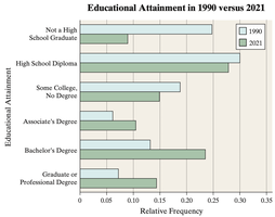
Side-by-Side Bar Graphs: Used to compare two data sets, typically using relative frequencies for fair comparison.
Example: The side-by-side bar graph below compares educational attainment in 1990 and 2021, illustrating changes in the proportion of adults with various education levels.
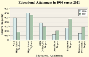
Horizontal bar graphs are preferable when category names are lengthy.
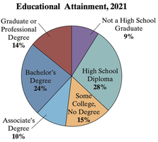
Pie Charts
Pie Chart: A circular graph divided into sectors, each representing a category. The area of each sector is proportional to the category's frequency.
To determine the angle for each sector:
Example: The pie chart below shows the distribution of educational attainment among U.S. adults in 2021.
Organizing Quantitative Data
Discrete vs. Continuous Data
Discrete Data: Consists of countable values (e.g., number of arrivals).
Continuous Data: Can take any value within a range (e.g., heights, weights).
Frequency Distributions for Quantitative Data
For discrete data with few values, each value forms a class.
For continuous data or discrete data with many values, group data into intervals (classes).
Class Limits: The smallest and largest values in a class interval.
Class Width: The difference between consecutive lower class limits.
Histograms
Histogram: A graphical display of data using adjacent rectangles to show the frequency or relative frequency of classes. Rectangles touch each other, unlike bar graphs.
Dot Plots
Dot Plot: Each observation is represented by a dot above its value on a number line. Useful for small data sets.
Identifying the Shape of a Distribution
Uniform Distribution: Frequencies are evenly spread.
Bell-Shaped Distribution: Highest frequency in the middle, tails off symmetrically.
Skewed Right: Tail extends to the right.
Skewed Left: Tail extends to the left.
Additional Displays of Quantitative Data
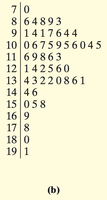
Stem-and-Leaf Plots
Stem-and-Leaf Plot: Displays data by splitting each value into a "stem" (all but the rightmost digit) and a "leaf" (the rightmost digit).
Allows retrieval of raw data from the plot.
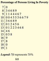
Example: The following stem-and-leaf plot shows the percentage of persons living in poverty by state in 2021.
After arranging leaves in ascending order and adding a legend, the plot becomes:
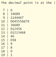
Technology can also be used to generate stem-and-leaf plots:
Frequency Polygons
Frequency Polygon: A graph using points connected by line segments to represent class frequencies. Points are plotted at class midpoints.
Class Midpoint:
Cumulative Frequency and Relative Frequency Tables
Cumulative Frequency Distribution: Shows the total number of observations less than or equal to each class boundary.
Cumulative Relative Frequency Distribution: Shows the proportion (or percent) of observations less than or equal to each class boundary.
Ogives
Ogive: A graph of cumulative frequency or cumulative relative frequency versus the upper class limits, connected by line segments.
Time-Series Graphs
Time-Series Data: Values measured at different points in time.
Time-Series Plot: Plots time on the horizontal axis and the variable's value on the vertical axis, connecting points with line segments.
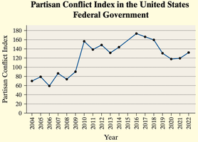
Example: The time-series plot below shows the Partisan Conflict Index in the U.S. federal government from 2004 to 2022.
Graphical Misrepresentations of Data
Common Ways Graphs Can Mislead
Improper Category Definitions: Combining or splitting categories inappropriately can mislead viewers about the distribution of data.
Manipulating Vertical Scale: Not starting the vertical axis at zero can exaggerate differences between groups.
Using Area or Volume Incorrectly: Representing data with areas or volumes (e.g., pictograms) can distort perceived differences.
Three-Dimensional Effects: 3D graphs can make some categories appear larger than they are due to perspective.
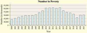
Example: The following bar graph shows the number of people in poverty over time. If the vertical axis does not start at zero, the decrease may appear more dramatic than it is.
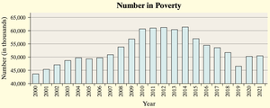
To avoid misleading, the graph should clearly indicate any truncation of the axis:
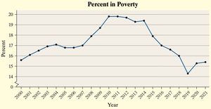
Alternatively, a time-series plot of the percent in poverty focuses on trends rather than absolute numbers:
Guidelines for Constructing Good Graphics
Title and label axes clearly, including units and data sources.
Avoid distortion and minimize white space.
Indicate any truncation of scales.
Avoid clutter and unnecessary design elements.
Prefer two-dimensional graphs over three-dimensional ones.
Do not use relative graphs without data or scales.
Additional info: This summary covers the main methods for organizing and summarizing data, including frequency tables, bar graphs, pie charts, histograms, dot plots, stem-and-leaf plots, frequency polygons, ogives, and time-series plots, as well as guidelines for avoiding misleading graphics. These concepts are essential for effective data analysis and interpretation in statistics.
