 Back
BackOrganizing and Summarizing Data: Qualitative and Quantitative Displays
Study Guide - Smart Notes
 Tailored notes based on your materials, expanded with key definitions, examples, and context.
Section 2.1: Organizing Qualitative Data
Organizing Qualitative Data in Tables
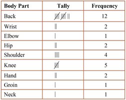
Qualitative data can be organized using frequency distributions, which list each category and the number of occurrences for each category. This is essential for summarizing and understanding categorical data.
Frequency Distribution: A table that displays the frequency (count) of each category.
Relative Frequency: The proportion or percentage of observations within a category, calculated as:
Relative Frequency Distribution: Lists each category with its relative frequency, showing the proportion of observations in each category.
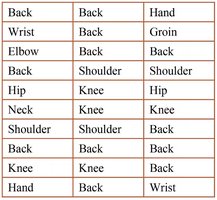
Example: A physical therapist records the body part requiring rehabilitation for 30 patients. The data is organized into a frequency distribution table.
Constructing Bar Graphs
Bar graphs are used to visually display the frequency or relative frequency of qualitative data. Each category is represented by a rectangle, with the height corresponding to the frequency or relative frequency.
Categories are labeled on one axis, and frequencies on the other.
Bars are of equal width and do not touch.
Pareto Chart: A bar graph with bars in decreasing order of frequency or relative frequency.
Relative frequencies are preferred for comparing data sets of different sizes.
Constructing Pie Charts
A pie chart is a circular graph divided into sectors, where each sector represents a category. The area of each sector is proportional to the frequency or relative frequency of the category. Pie charts are best for showing the part-to-whole relationship.
Pie charts are typically used for nominal data, but can also display ordinal data.
Section 2.2: Organizing Quantitative Data: The Popular Displays
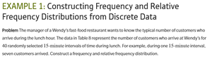
Organizing Discrete Data in Tables
Discrete quantitative data can be organized into frequency and relative frequency tables, especially when the number of distinct values is small.
Constructing Histograms of Discrete Data
A histogram is a graphical display of data using bars of equal width. For discrete data, each bar represents a value or class, and the height shows the frequency or relative frequency. Bars touch each other to indicate the data is quantitative.
Organizing Continuous Data in Tables
Continuous data is grouped into intervals (classes) to create frequency distributions. Key terms include:
Lower Class Limit: Smallest value in the class.
Upper Class Limit: Largest value in the class.
Class Width: Difference between consecutive lower class limits.
Classes must not overlap, and open-ended tables may be used when the first or last class is unbounded.
Constructing Histograms of Continuous Data
Histograms for continuous data use intervals as classes. The choice of class width and number of classes affects the appearance and interpretability of the histogram. Typically, the number of classes is between 5 and 20.
As bin width increases, the number of classes decreases.
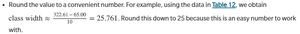
Choose the lower class limit as the smallest observation or a convenient number below it.
Class width is calculated as:
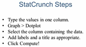
Drawing Dot Plots
A dot plot displays each observation as a dot above its value on a number line. It is useful for small data sets and shows the distribution and possible clusters or gaps.
Identifying the Shape of a Distribution
The shape of a distribution can be described as:
Uniform (Symmetric): Frequencies are evenly spread.
Bell-shaped (Symmetric): Highest frequency in the middle, tails off on both sides.
Skewed Right: Tail on the right is longer.
Skewed Left: Tail on the left is longer.
Section 2.3: Additional Displays of Quantitative Data
Drawing Stem-and-Leaf Plots
Stem-and-leaf plots display quantitative data by splitting each value into a "stem" (all but the rightmost digit) and a "leaf" (the rightmost digit). This plot retains the original data values and shows the distribution.
Steps: (1) Identify stems and leaves, (2) List stems, (3) Add leaves, (4) Order leaves and add title/legend.
Advantage: Raw data can be retrieved.
Limitation: Not useful for large or wide-ranging data sets.
Constructing Frequency Polygons
A frequency polygon is a line graph that uses points connected by line segments to represent class frequencies. Points are plotted at class midpoints at heights equal to class frequencies.
Cumulative Frequency and Relative Frequency Distributions
Cumulative frequency distributions show the total number of observations less than or equal to the upper class limit. Cumulative relative frequency distributions show the proportion or percentage of observations less than or equal to the upper class limit.
Drawing Time-Series Graphs
Time-series graphs plot data points in chronological order, with time on the horizontal axis and the variable of interest on the vertical axis. They are useful for identifying trends over time.
Section 2.4: Graphical Misrepresentations of Data
What Can Make a Graph Misleading or Deceptive
Graphs can be misleading (unintentionally) or deceptive (intentionally) if they create incorrect impressions. Common issues include:
Inconsistent or manipulated scales
Misplaced origin (not starting at zero)
Inconsistent increments between tick marks
Comparative graphs with different scales
Guidelines for Good Graphs:
Label axes clearly, include units and data sources
Include a meaningful title
Avoid distortion and minimize white space
Avoid clutter and unnecessary 3D effects
Use consistent design and scales
Be cautious with graphs lacking data or scales
When interpreting graphs, always consider the data source and potential biases.
