 Back
BackOrganizing and Summarizing Data: Tables and Graphs in Statistics
Study Guide - Smart Notes
 Tailored notes based on your materials, expanded with key definitions, examples, and context.
Organizing Qualitative Data
Frequency and Relative Frequency Tables
Qualitative data, such as categories or labels, must be organized to facilitate analysis. A frequency distribution lists each category and the number of occurrences. A relative frequency distribution shows the proportion or percentage of observations in each category, calculated as:
Relative Frequency Formula:
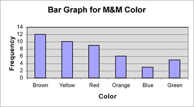
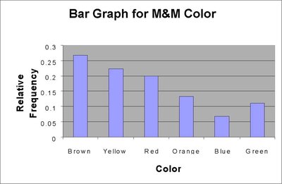
Example: The color of M&Ms in a bag can be summarized in a frequency table:
Color | Frequency | Relative Frequency |
|---|---|---|
Brown | 12 | 0.2667 |
Yellow | 10 | 0.2222 |
Red | 9 | 0.2 |
Orange | 6 | 0.1333 |
Blue | 3 | 0.0667 |
Green | 5 | 0.1111 |
Bar Graphs
A bar graph visually represents categorical data. Each bar's height corresponds to the frequency or relative frequency of a category. Bars are of equal width and separated for clarity.
Frequency Bar Graph: Shows counts for each category.
Relative Frequency Bar Graph: Shows proportions for each category.
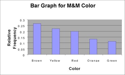
Pareto Charts
A Pareto chart is a bar graph with bars arranged in decreasing order of frequency or relative frequency. It highlights the most common categories.
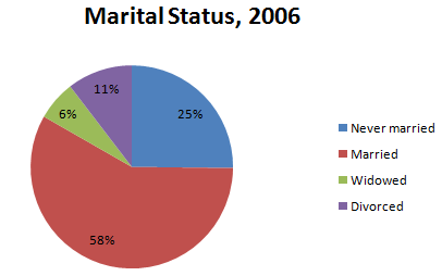
Pie Charts
A pie chart divides a circle into sectors, each representing a category. The area of each sector is proportional to the frequency or relative frequency of the category.
Application: Useful for showing the composition of a whole, such as marital status distribution.
Organizing Quantitative Data: Popular Displays
Frequency and Relative Frequency Tables for Discrete Data
Quantitative data can be discrete (countable values) or continuous (measured values). For discrete data with few values, each value forms a class. For many values or continuous data, classes are intervals.
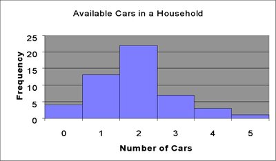
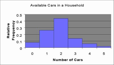
Number of Cars | Frequency | Relative Frequency |
|---|---|---|
0 | 4 | 0.08 |
1 | 13 | 0.26 |
2 | 22 | 0.44 |
3 | 7 | 0.14 |
4 | 3 | 0.06 |
5 | 1 | 0.02 |
Histograms for Discrete Data
A histogram displays frequencies or relative frequencies for quantitative data. Bars touch each other, indicating the continuity of the data.
Organizing Continuous Data in Tables
Continuous data are grouped into classes (intervals). Each class has a lower and upper class limit, and a class width:
Class Width Formula:
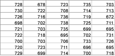
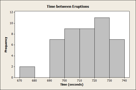
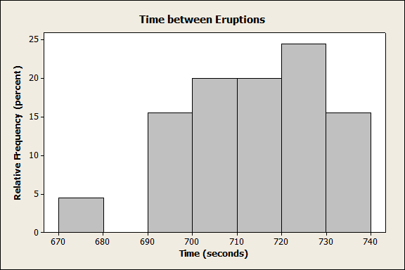
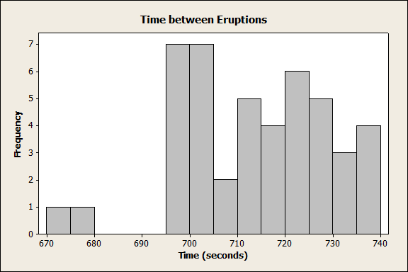
Example: Time between eruptions (in seconds) for Old Faithful Geyser:
Histograms for Continuous Data
Histograms for continuous data use intervals as classes. The choice of class width affects the appearance and interpretability of the histogram.
Stem-and-Leaf Plots
A stem-and-leaf plot displays quantitative data by splitting each value into a "stem" (all but the last digit) and a "leaf" (the last digit). This plot preserves the original data and shows distribution shape.
Advantage: Raw data can be retrieved, unlike histograms.
Example: Unemployment rates by state, with stems representing integer parts and leaves representing decimal parts.
Dot Plots
A dot plot places dots above each value on a number line, with multiple dots for repeated values. It is useful for small data sets and shows distribution shape.
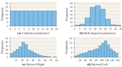
Identifying the Shape of a Distribution
Distribution shapes describe how data are spread:
Uniform: Frequencies are evenly spread.
Bell-shaped: Highest frequency in the middle, tails off at both ends.
Skewed Right: Tail extends to the right.
Skewed Left: Tail extends to the left.
Additional Displays of Quantitative Data
Frequency Polygons
A frequency polygon connects the midpoints of each class in a histogram with straight lines, showing the shape of the distribution.
Cumulative Frequency and Relative Frequency Tables
Cumulative tables show the running total of frequencies or relative frequencies up to each class.
Class Interval | Frequency | Relative Frequency | Cumulative Frequency | Cumulative Relative Frequency |
|---|---|---|---|---|
670–679 | 2 | 0.0444 | 2 | 0.0444 |
680–689 | 0 | 0 | 2 | 0.0444 |
690–699 | 7 | 0.1556 | 9 | 0.2 |
700–709 | 9 | 0.2 | 18 | 0.4 |
710–719 | 9 | 0.2 | 27 | 0.6 |
720–729 | 11 | 0.2444 | 38 | 0.8444 |
730–739 | 7 | 0.1556 | 45 | 1 |
Ogives
An ogive is a graph of cumulative frequency or cumulative relative frequency versus class boundary. It shows how many data points fall below a certain value.
Time-Series Graphs
Time-series data are values measured at different points in time. A time-series plot shows trends by plotting time on the horizontal axis and the variable on the vertical axis, connecting points with lines.
Graphical Misrepresentations of Data
Common Pitfalls and Guidelines
Graphs can mislead if not constructed properly. Common issues include:
Distorted scales or axes
Excessive white space or clutter
Unclear labels or missing units
Use of unnecessary three-dimensional effects
Guidelines:
Title and label axes clearly, including units and data sources
Avoid distortion and minimize white space
Indicate truncated scales
Minimize clutter and avoid distracting backgrounds
Prefer two-dimensional charts for clarity
