 Back
BackOrganizing Data Visually: Frequency Distributions and Histograms
Study Guide - Smart Notes
 Tailored notes based on your materials, expanded with key definitions, examples, and context.
Organizing Data Visually
Frequency Distribution
A frequency distribution (or frequency table) is a fundamental tool in statistics for organizing data. It partitions data into several categories (or classes) and lists the number (frequency) of data values in each class. This helps to summarize large datasets and reveal patterns.
Lower class limits: Smallest values that can belong to each class.
Upper class limits: Largest values that can belong to each class.
Class boundaries: Values used to separate classes, eliminating gaps between class limits.
Class midpoints: Values in the middle of each class, calculated as the average of the lower and upper class limits.
Class width: Difference between two consecutive lower class limits (or boundaries).
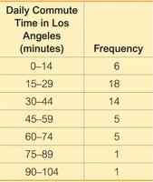
Example: The table below shows a frequency distribution for daily commute times in Los Angeles.
Daily Commute Time in Los Angeles (minutes) | Frequency |
|---|---|
0–14 | 6 |
15–29 | 18 |
30–44 | 14 |
45–59 | 5 |
60–74 | 5 |
75–89 | 1 |
90–104 | 1 |
Constructing a Frequency Distribution
To construct a frequency distribution, follow these steps:
Select the number of classes, often based on convenience or round numbers.
Calculate the class width:
Choose the first lower class limit, typically the minimum value or a convenient value below it.
List other lower class limits using the class width.
Determine upper class limits for each class.
Assign each data value to a class and tally the frequencies.
Additional info: Frequency distributions can also be used for qualitative or categorical data, not just quantitative data.
Cumulative Frequency Distribution
A cumulative frequency distribution shows the sum of frequencies for each class and all previous classes. This is useful for understanding how data accumulates across classes.
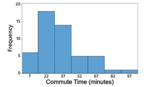
Visualizing Data: Histograms
Histograms
A histogram is a graphical representation of a frequency distribution. It consists of adjacent bars of equal width, where the horizontal axis represents classes of quantitative data and the vertical axis represents frequencies. Histograms are useful for:
Displaying the shape of the data distribution
Showing the center and spread of the data
Identifying outliers
Example: The histogram below visualizes the frequency distribution of daily commute times.
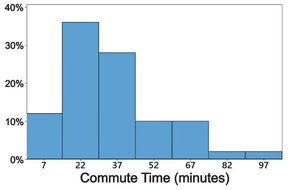
Relative Frequency Histogram
A relative frequency histogram is similar to a standard histogram, but the vertical axis shows relative frequencies (percentages or proportions) instead of absolute frequencies. This allows for comparison between datasets of different sizes.
Example: The relative frequency histogram below shows the proportion of commuters in each time interval.
Shapes of Distributions
Types of Distribution Shapes
The shape of a histogram reveals important characteristics about the data:
Normal distribution: Frequencies start low, increase to a peak, then decrease, forming a symmetric "bell" shape.
Uniform distribution: All values occur with approximately the same frequency; histogram bars are of similar height.
Skewed distribution: Not symmetric; extends more to one side. Right-skewed (positively skewed) distributions have a longer right tail, while left-skewed (negatively skewed) distributions have a longer left tail.
Additional info: Recognizing the shape of a distribution is essential for selecting appropriate statistical methods and interpreting data.
