 Back
BackOrganizing Quantitative Data: Frequency Tables and Histograms
Study Guide - Smart Notes
 Tailored notes based on your materials, expanded with key definitions, examples, and context.
Organizing Quantitative Data
Frequency and Relative Frequency Tables
Quantitative data can be organized into frequency and relative frequency tables to summarize and analyze patterns within the data. This process involves grouping data into classes and counting the number of observations in each class.
Frequency Table: Lists each class (interval) and the number of data values (frequency) in each class.
Relative Frequency Table: Shows the proportion or percentage of data values in each class, calculated as
Classes: Categories or intervals into which data are grouped, especially useful for large or continuous data sets.
Class Limits: The smallest (lower class limit) and largest (upper class limit) values within each class.
Class Width: The difference between consecutive lower class limits. For example, if the lower class limits are 15 and 20, then
Example: The table below shows the number of mothers in the United States, ages 15–54, who had their fourth child in 2016. This data can be organized into a frequency table:
Age | Number |
|---|---|
15-19 | 443 |
20-24 | 25,328 |
25-29 | 84,217 |
30-34 | 101,070 |
35-39 | 63,461 |
40-44 | 14,558 |
45-49 | 867 |
50-54 | 84 |
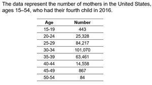
Additional info: This table is an example of a frequency table for quantitative data grouped by age intervals.
Constructing Frequency and Relative Frequency Histograms
Histograms are graphical representations of frequency or relative frequency tables. They help visualize the distribution of data across different classes.
Frequency Histogram: Uses bars to show the frequency of data values in each class.
Relative Frequency Histogram: Uses bars to show the proportion of data values in each class.
Construction Steps:
Choose appropriate class intervals.
Count the frequency or calculate the relative frequency for each class.
Draw bars for each class, with height representing frequency or relative frequency.
Example: Using the age data above, a histogram can be constructed to show the distribution of mothers by age group.
Identifying the Shape of a Distribution
The shape of a distribution describes how data values are spread across classes. Common shapes include:
Uniform Distribution: Frequencies are evenly spread across all classes.
Bell-Shaped Distribution: Highest frequency occurs in the middle, with frequencies tapering off toward the ends.
Skewed Right: The right tail (higher values) is longer than the left tail.
Skewed Left: The left tail (lower values) is longer than the right tail.
Example: The age distribution of mothers having their fourth child may be bell-shaped or skewed, depending on the frequencies in each age group.
Additional info: Identifying the shape helps in understanding the central tendency and variability of the data.
Summary and Best Practices
Constructing frequency distributions is somewhat of an art form. The choice of class limits and class width can affect how well the distribution illustrates patterns in the data. Use the distribution that provides the best overall summary.
There is not one correct frequency distribution for a particular set of data.
Choose class intervals that make the data easy to interpret and analyze.
