 Back
BackPicturing Distributions of Data: Visualizing and Interpreting Data in Statistics
Study Guide - Smart Notes
 Tailored notes based on your materials, expanded with key definitions, examples, and context.
Section 3.2: Picturing Distributions of Data
Introduction to Data Visualization
Visualizing data is a fundamental aspect of descriptive statistics, allowing us to summarize and interpret the distribution of variables. Graphs and tables provide intuitive insights into how data values are spread across categories or numerical ranges. This section covers the most common graphical methods used to represent data distributions.
Frequency Tables
A frequency table displays how a variable is distributed over chosen categories, summarizing the distribution of data. It lists each category alongside its frequency (the number of times it occurs).
Frequency: The count of occurrences for each category.
Relative frequency: The proportion of the total represented by each category, often expressed as a percentage.
Example: Frequency table for essay grades.
Essay grade | Frequency |
|---|---|
A | 4 |
B | 7 |
C | 9 |
D | 3 |
F | 2 |
Total | 25 |
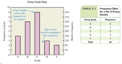
Bar Graphs
A bar graph uses bars to represent frequencies or relative frequencies for particular categories. The length of each bar is proportional to the frequency, and bars can be vertical or horizontal. Bar graphs are used for qualitative (categorical) data, and bars do not touch.
Important labels: Title/caption, vertical scale and title, horizontal scale and title, legend (if multiple datasets).
Example: Bar graph for essay grades.
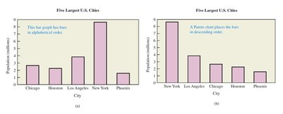
Pareto Charts
A Pareto chart is a bar graph with bars arranged from highest to lowest frequency. This arrangement highlights the most important categories and makes it easier to identify the largest contributors.
Comparison: Standard bar graphs may use alphabetical order, while Pareto charts use descending order.
Example: Population of five largest U.S. cities.
City | Population (millions) |
|---|---|
New York | 9 |
Los Angeles | 6 |
Chicago | 3 |
Houston | 2 |
Phoenix | 1 |
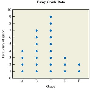
Dotplots
A dotplot is similar to a bar graph, but each individual data value is represented with a dot. Dotplots are useful for visualizing the distribution and frequency of small datasets.
Each dot: Represents one data value.
Example: Dotplot for essay grades.
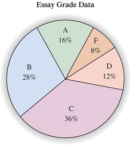
Pie Charts
A pie chart is a circle divided into wedges, each representing the relative frequency of a category. The size of each wedge is proportional to the relative frequency, and the entire pie represents 100% of the data.
Used for: Qualitative data, showing proportions of categories.
Example: Pie chart for essay grades.
Histograms
A histogram is a bar graph for quantitative data, where bars have a natural order and specific widths. Bars touch each other, indicating continuous intervals. Histograms are used to show the distribution of numerical data.
Class width: The range covered by each bar.
Example: Histogram for exam scores.
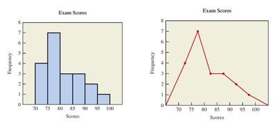
Line Charts
A line chart shows data values for each category as points, connected by lines. The horizontal position is the center of the bin, and the vertical position is the data value. Line charts are useful for visualizing trends and changes over intervals.
Example: Line chart for exam scores.
Time-Series Graphs
A time-series graph is a histogram or line chart where the horizontal axis represents time. These graphs are used to show how data changes over time.
Application: Tracking variables such as stock prices, temperatures, or population over time.
Stemplots (Stem-and-Leaf Plots)
A stemplot is a graphical method similar to a histogram, but turned sideways. It lists data values, with stems representing groups (such as tens) and leaves representing individual values.
Steps to draw:
Treat the rightmost digit as the leaf, remaining digits as the stem.
Write stems vertically in ascending order, draw a vertical line to the right.
Write leaves corresponding to each stem.
Arrange leaves in ascending order and create a legend.
Example: Summarizing ages of Academy Award-winning actresses.
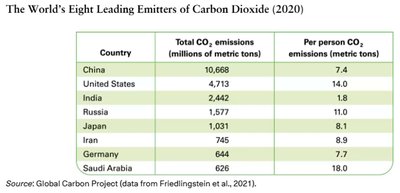
Worked Example: CO2 Emissions
Comparing total and per person CO2 emissions across countries illustrates how different visualizations can highlight different aspects of the data. Pareto charts for these two measures may look very different, emphasizing the importance of choosing the right visualization.
Country | Total CO2 emissions (millions of metric tons) | Per person CO2 emissions (metric tons) |
|---|---|---|
China | 10,668 | 7.4 |
United States | 4,713 | 14.0 |
India | 2,442 | 1.8 |
Russia | 1,577 | 11.0 |
Japan | 1,031 | 8.1 |
Iran | 745 | 8.9 |
Germany | 644 | 7.7 |
Saudi Arabia | 626 | 18.0 |
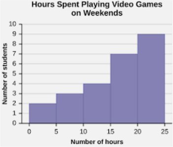
Worked Example: Hours Spent Playing Video Games
Histograms can be used to answer questions about the distribution of a variable, such as hours spent playing video games. Key questions include the total number of students sampled, class width, lowest frequency class, and percentage of students in a given range.
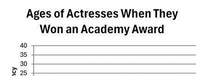
Worked Example: Ages of Academy Award-Winning Actresses
Displaying the ages of award-winning actresses using a histogram, line chart, and stemplot allows for comparison of the distribution and identification of patterns or outliers.
Summary Table: Types of Graphs and Their Uses
Graph Type | Data Type | Main Purpose |
|---|---|---|
Bar Graph | Qualitative | Compare frequencies across categories |
Pareto Chart | Qualitative | Highlight most important categories |
Dotplot | Qualitative/Quantitative | Show individual data values |
Pie Chart | Qualitative | Show proportions of categories |
Histogram | Quantitative | Show distribution of numerical data |
Line Chart | Quantitative | Show trends or changes over intervals |
Time-Series Graph | Quantitative (over time) | Show changes over time |
Stemplot | Quantitative | List and group data values |
Key Formulas:
Relative frequency:
Percent of students in a class:
Additional info: Visualizations are essential for identifying patterns, outliers, and trends in data, and for communicating statistical findings effectively.
