 Back
BackPractice Problems: Frequency Distributions, Graphs, and Measures of Center
Study Guide - Smart Notes
 Tailored notes based on your materials, expanded with key definitions, examples, and context.
Q1. Constructing Frequency and Relative Frequency Distributions
Background
Topic: Frequency Distributions and Histograms
This question tests your ability to organize raw quantitative data into frequency and relative frequency tables, and to construct and interpret histograms. It also asks you to determine the shape of a distribution and calculate class width for a specified number of classes.
Key Terms and Formulas:
Frequency Distribution: A table that shows the number of data points falling within specified ranges (classes).
Relative Frequency: The proportion of data points in each class, calculated as .
Class Width: (rounded appropriately).
Step-by-Step Guidance
List the minimum and maximum values in the data set to determine the range.
For part (a), start the first class at 0.5 and use a class width of 0.5. Create class intervals (e.g., 0.5–0.9, 1.0–1.4, etc.) and tally the number of data points in each class to fill out the frequency table.
Calculate the relative frequency for each class by dividing the class frequency by the total number of data points.
For part (b), use the frequency table to construct a histogram, labeling the x-axis with class intervals and the y-axis with frequencies.
For part (c), examine the histogram to describe the shape (e.g., symmetric, skewed left, skewed right, uniform, bimodal).
For part (d), if you want 10 classes, use the class width formula above, rounding to one decimal place as instructed.
Try solving on your own before revealing the answer!
Q2. Choosing Appropriate Graphs for Categorical Data
Background
Topic: Graphical Representation of Categorical Data
This question tests your understanding of which types of graphs are suitable for displaying categorical (qualitative) data, such as zip codes.
Key Terms:
Pie Chart: Used for displaying proportions of categorical data.
Pareto Chart: A bar graph where categories are ordered by frequency.
Histogram: Used for quantitative data, showing frequency within intervals.
Step-by-Step Guidance
Recall that zip codes are categorical (they represent regions, not quantities).
Consider which graphs are designed for categorical data (pie and Pareto charts) and which are for quantitative data (histograms).
Identify which graph would not be appropriate for zip code data.
Try solving on your own before revealing the answer!
Q3. Interpreting a Histogram: Percent of Plants in a Range
Background
Topic: Interpreting Histograms and Calculating Percentages
This question asks you to use a histogram to determine the percentage of observations (plants) that fall within a specified range (140cm to 145cm).
Key Terms and Formulas:
Histogram: A graphical representation of the distribution of numerical data.
Percent in a Range:
Step-by-Step Guidance
Identify the bar(s) on the histogram that correspond to the range 140cm to 145cm.
Read the frequency (height) of the bar for this range.
Find the total number of plants by summing the frequencies of all bars in the histogram.
Set up the formula to calculate the percentage:
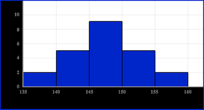
Try solving on your own before revealing the answer!
Q4. Calculating Mean, Median, and Mode
Background
Topic: Measures of Center
This question tests your ability to compute the mean, median, and mode for a small data set, and to interpret what the mean and median tell you about the distribution's shape.
Key Terms and Formulas:
Mean:
Median: The middle value when data are ordered from least to greatest (or the average of the two middle values if is even).
Mode: The value(s) that appear most frequently in the data set.
Step-by-Step Guidance
Order the data from smallest to largest.
Calculate the mean by summing all values and dividing by the number of values.
Find the median by locating the middle value(s).
Identify the mode by finding the value(s) that occur most often.
Compare the mean and median to infer the distribution's shape (e.g., symmetric, skewed).
Try solving on your own before revealing the answer!
Q5. Best Measure of Center for Precipitation Data
Background
Topic: Choosing the Best Measure of Center
This question asks you to use your calculator to find the mean and median for the precipitation data from Q1, and to decide which measure (mean, median, or mode) best represents the center of the data.
Key Terms:
Mean, Median, Mode: Measures of center as defined above.
Best Measure of Center: Depends on the data's distribution (e.g., mean is sensitive to outliers, median is robust to skewness).
Step-by-Step Guidance
Enter the precipitation data into your calculator or statistical software.
Calculate the mean and median using the appropriate functions.
Compare the values and consider the distribution's shape (from your histogram in Q1).
Decide which measure (mean, median, or mode) best represents the center, based on the data's characteristics (e.g., presence of outliers, skewness).
Try solving on your own before revealing the answer!
