 Back
BackSample Means and Data Visualization in Statistics
Study Guide - Smart Notes
 Tailored notes based on your materials, expanded with key definitions, examples, and context.
Sample Means and Data Visualization
Introduction to Sample Means
The concept of the sample mean is fundamental in statistics, serving as a measure of central tendency for a set of data values drawn from a larger population. The sample mean is used to estimate the population mean and is a key component in inferential statistics.
Sample Mean (\( \bar{x} \)): The arithmetic average of a set of sample values.
Formula:
n: Number of observations in the sample
xi: The i-th observation in the sample
Example: If a sample consists of the values 170, 180, 190, 200, and 210, the sample mean is calculated as:
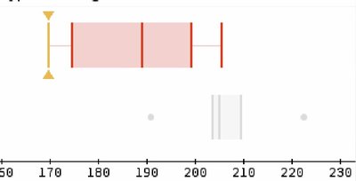
Describing Data with Boxplots
Boxplots (or box-and-whisker plots) are graphical representations that summarize the distribution of a dataset. They display the median, quartiles, and potential outliers, making it easier to compare distributions between groups.
Key Components:
Median: The middle value of the dataset
Quartiles: Q1 (25th percentile), Q3 (75th percentile)
Whiskers: Indicate variability outside the upper and lower quartiles
Outliers: Data points that fall outside 1.5 times the interquartile range (IQR) from the quartiles
Example: The boxplot below shows the distribution of a sample with values ranging from approximately 170 to 210, with the median near 190. Outliers are indicated as points outside the whiskers.
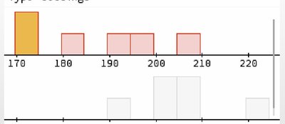
Describing Data with Histograms
Histograms are bar graphs that represent the frequency distribution of a dataset. Each bar shows the number of data points within a specific range (bin).
Key Features:
Bins: Intervals that group data values
Height of Bars: Indicates the frequency of data within each bin
Shape: Can reveal skewness, modality, and spread of the data
Example: The histogram below displays the frequency of sample values in bins (e.g., 170, 180, 190, etc.), showing how the data are distributed across the range.
Comparing Boxplots and Histograms
Both boxplots and histograms are useful for visualizing data distributions, but they serve different purposes:
Boxplots: Summarize data using five-number summary (minimum, Q1, median, Q3, maximum) and highlight outliers.
Histograms: Show the shape of the data distribution and frequency of values within intervals.
Application: Use boxplots for quick comparison of medians and spread between groups, and histograms for detailed analysis of distribution shape.
