 Back
BackSample Means and Data Visualization in Statistics
Study Guide - Smart Notes
 Tailored notes based on your materials, expanded with key definitions, examples, and context.
Sampling Distributions & Sample Means
Introduction to Sample Means
The concept of the sample mean is fundamental in statistics, especially when making inferences about a population based on a subset of data. The sample mean is the arithmetic average of a set of observations drawn from a population.
Sample Mean (\( \overline{x} \)): The sum of all sample values divided by the number of observations.
Population Mean (\( \mu \)): The average of all values in the population.
Sampling Distribution: The probability distribution of a given statistic (like the mean) based on a random sample.
Formula for the Sample Mean:
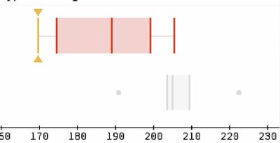
Example: If a sample of five students' heights (in cm) are 170, 180, 190, 200, and 210, the sample mean is:
Describing Data with Graphs
Boxplots
A boxplot (or box-and-whisker plot) is a graphical representation of the distribution of a dataset. It displays the median, quartiles, and possible outliers, providing a visual summary of the data's spread and central tendency.
Median: The middle value of the dataset.
Quartiles: Values that divide the data into four equal parts (Q1, Q2/median, Q3).
Whiskers: Lines extending from the box to the minimum and maximum values within 1.5 times the interquartile range (IQR).
Outliers: Data points outside the whiskers, often shown as dots.
Purpose: Boxplots are useful for comparing distributions and identifying skewness or outliers.
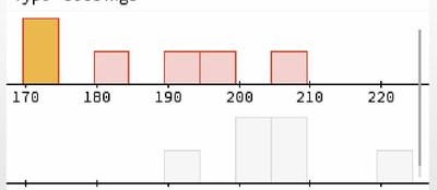
Histograms
A histogram is a graphical display of data using bars of different heights. Each bar groups numbers into ranges (bins), showing the frequency of data within each range.
Bins: Intervals that group the data values.
Frequency: The number of data points within each bin.
Shape: Histograms help visualize the shape of the data distribution (e.g., symmetric, skewed, bimodal).
Example: A histogram of sample means can show how sample averages are distributed, which is important for understanding the Central Limit Theorem.
Comparing Boxplots and Histograms
Purpose and Interpretation
Both boxplots and histograms are used to describe and compare data distributions, but they emphasize different aspects:
Boxplots: Summarize data using five-number summary (minimum, Q1, median, Q3, maximum) and highlight outliers.
Histograms: Show the frequency distribution and reveal the shape of the data (e.g., normal, skewed).
Application: When analyzing sample means, boxplots can quickly show the spread and central tendency, while histograms provide more detail about the distribution's shape.
Key Formulas
Sample Mean:
Sample Variance:
Standard Error of the Mean:
Summary Table: Boxplot vs. Histogram
Feature | Boxplot | Histogram |
|---|---|---|
Shows Median & Quartiles | Yes | No |
Shows Distribution Shape | Limited | Yes |
Identifies Outliers | Yes | No |
Compares Multiple Groups | Easy | Possible but less clear |
Additional info: The QR code in the materials is not directly relevant to the statistical concepts discussed and is therefore omitted from the study notes.
