 Back
BackScatter Diagrams and Correlation: Understanding Relationships Between Two Variables
Study Guide - Smart Notes
 Tailored notes based on your materials, expanded with key definitions, examples, and context.
Chapter 4.1: Scatter Diagrams and Correlation
Scatter Diagrams: Visualizing Relationships Between Two Variables
Scatter diagrams are essential tools in statistics for visualizing the relationship between two quantitative variables measured on the same individual. Each point in the diagram represents an individual, with the explanatory variable (predictor) plotted on the horizontal axis and the response variable plotted on the vertical axis.
Explanatory Variable: The variable that explains or predicts changes in another variable (often denoted as x).
Response Variable: The variable whose value is explained or predicted (often denoted as y).
Scatter Diagram: A graph showing the relationship between two quantitative variables.
Example: In a study of club-head speed (mph) and golf ball distance (yards), club-head speed is the explanatory variable, and distance is the response variable.
Scatter diagrams help distinguish between linear, nonlinear, and no relationship between variables.
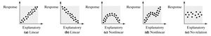
Types of Relationships in Scatter Diagrams
Scatter diagrams can reveal different types of associations:
Linear Positive Association: As one variable increases, the other also increases. Example: Club-head speed and distance.
Linear Negative Association: As one variable increases, the other decreases. Example: Smoking rate and lung capacity.
Nonlinear Association: The relationship is not a straight line; it may curve or follow another pattern.
No Association: No discernible pattern between the variables.
Properties of the Linear Correlation Coefficient
The linear correlation coefficient (Pearson product moment correlation coefficient) measures the strength and direction of the linear relationship between two quantitative variables. The population correlation coefficient is denoted by , and the sample correlation coefficient by .
Range:
Perfect Positive Linear Relation:
Perfect Negative Linear Relation:
Strength: The closer is to or , the stronger the linear association.
No Linear Relation: close to $0$ indicates little or no linear relation (but possibly a nonlinear relation).
Unitless: The correlation coefficient does not depend on the units of measurement.
Not Resistant: Outliers can significantly affect the value of .
Computing the Linear Correlation Coefficient
The formula for the sample linear correlation coefficient is:
Interpretation: The sign of indicates the direction of the relationship; the magnitude indicates the strength.
Calculation: Can be performed by hand or using statistical software such as JMP.
Example: Given the following data set:
x | 2 | 6 | 6 | 7 | 9 |
|---|---|---|---|---|---|
y | 8 | 7 | 6 | 9 | 5 |
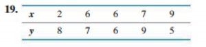
Calculate using the formula or JMP. For this data, $r$ was found to be -0.946, indicating a strong negative linear relationship.
Determining Whether a Linear Relation Exists Between Two Variables
To test for a linear relation, follow these steps:
Determine the absolute value of the correlation coefficient ().
Find the critical value for the given sample size from a reference table.
If is greater than the critical value, a linear relation exists; otherwise, it does not.
Critical Values Table: Used to compare the calculated with the threshold for statistical significance.
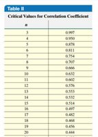
Example: For a sample size of 6, the critical value is 0.811. If , a linear relation exists. If , no linear relation exists.
Application: In the club-head speed and distance example, use JMP to find and compare to the critical value to determine if a linear relationship exists.
Summary Table: Types of Relationships and Their Interpretation
Type of Relationship | Correlation Coefficient () | Interpretation |
|---|---|---|
Perfect Positive Linear | +1 | All points lie on a line sloping upward |
Perfect Negative Linear | -1 | All points lie on a line sloping downward |
Strong Positive Linear | Close to +1 | Points cluster around a line sloping upward |
Strong Negative Linear | Close to -1 | Points cluster around a line sloping downward |
No Linear Relation | Close to 0 | No clear pattern; points scattered |
Additional info: The notes also reference the use of JMP software for graphical displays and calculation of correlation coefficients, which is a common practice in statistics courses for data analysis.
