 Back
BackScatter Diagrams, Correlation, and Least-Squares Regression: Study Guide
Study Guide - Smart Notes
 Tailored notes based on your materials, expanded with key definitions, examples, and context.
Scatter Diagrams and Correlation
Drawing and Interpreting Scatter Diagrams
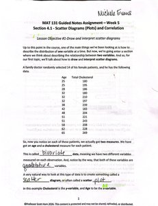
Scatter diagrams (or scatter plots) are graphical tools used to visualize the relationship between two quantitative variables. Each point on the plot represents an observation, with one variable plotted on the x-axis and the other on the y-axis.
Key Point 1: Scatter diagrams help identify patterns, trends, and possible relationships between variables.
Key Point 2: Variables are often classified as explanatory (independent) and response (dependent).
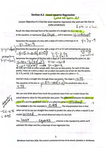
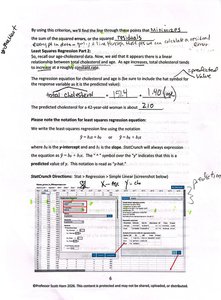
Example: A doctor records the ages and cholesterol levels of 14 female patients to study the relationship between age and cholesterol.
Identifying Explanatory and Response Variables
In statistical studies, the response variable is the outcome of interest, while the explanatory variable is used to explain or predict changes in the response.
Key Point 1: The response variable is often called the dependent variable.
Key Point 2: The explanatory variable is often called the independent variable.
Example: In the cholesterol study, age is the explanatory variable and cholesterol is the response variable.
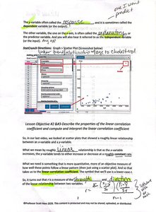
Properties of the Linear Correlation Coefficient
Understanding the Correlation Coefficient (r)
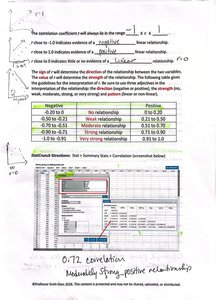
The correlation coefficient (r) measures the strength and direction of the linear relationship between two variables. It ranges from -1 to 1.
Key Point 1:
Key Point 2: r < 0 indicates a negative linear relationship; r > 0 indicates a positive linear relationship.
Key Point 3: The closer r is to -1 or 1, the stronger the linear relationship.
Example: A correlation of 0.72 indicates a moderately strong positive relationship.
Interpreting the Strength and Direction of Correlation
The sign of r indicates the direction (positive or negative), while the magnitude indicates the strength of the relationship.
Key Point 1: Values near 0 indicate weak or no linear relationship.
Key Point 2: Values near 1 or -1 indicate strong linear relationships.
Example: See the table below for interpretation:
r Value | Strength | Direction |
|---|---|---|
0.90 to 1.00 | Very strong | Positive |
0.70 to 0.89 | Strong | Positive |
0.40 to 0.69 | Moderate | Positive |
0.10 to 0.39 | Weak | Positive |
0.00 to 0.09 | No relationship | None |
-0.10 to -0.39 | Weak | Negative |
-0.40 to -0.69 | Moderate | Negative |
-0.70 to -0.89 | Strong | Negative |
-0.90 to -1.00 | Very strong | Negative |
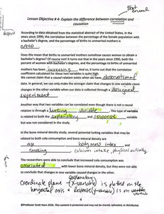
Correlation vs. Causation
Distinguishing Correlation from Causation
Correlation measures the association between two variables, but does not imply that one variable causes the other.
Key Point 1: Correlation can exist without causation due to confounding or lurking variables.
Key Point 2: Causation requires evidence that changes in one variable directly result in changes in another.
Example: Body mass index and cholesterol may be correlated, but other factors (diet, activity) may influence both.
Least-Squares Regression
Finding the Least-Squares Regression Line
The least-squares regression line is the line that best fits the data, minimizing the sum of squared differences between observed and predicted values.
Key Point 1: The equation of the regression line is , where m is the slope and b is the y-intercept.
Key Point 2: The slope represents the change in the response variable for each unit increase in the explanatory variable.
Example: For cholesterol data, the regression line might be .
Using the Regression Line for Prediction
The regression line can be used to predict the response variable for given values of the explanatory variable.
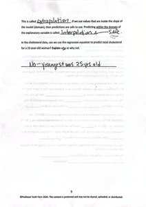
Key Point 1: Predictions are valid only within the range of observed data (interpolation).
Key Point 2: Extrapolation (predicting outside the observed range) is risky and often unreliable.
Example: Predicting cholesterol for a 40-year-old woman using the regression equation.
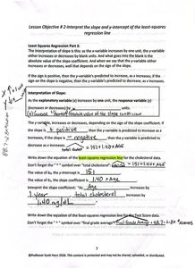
Interpreting Slope and Y-Intercept
The slope and y-intercept of the regression line have specific interpretations in context.
Key Point 1: The slope indicates the expected change in the response variable per unit change in the explanatory variable.
Key Point 2: The y-intercept represents the predicted value of the response variable when the explanatory variable is zero (may not always be meaningful).
Example: In cholesterol data, a slope of 2.8 means cholesterol increases by 2.8 points per year of age.
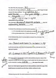
Interpolation and Extrapolation
Interpolation refers to making predictions within the range of observed data, while extrapolation refers to predictions outside this range.
Key Point 1: Interpolation is generally safe; extrapolation can be unreliable.
Example: Using the regression equation to predict cholesterol for ages within the sample is interpolation; for ages outside the sample, it is extrapolation.
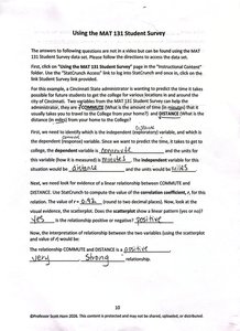
Using Student Survey Data
Applying Regression and Correlation to Survey Data
Survey data can be used to explore relationships between variables, such as predicting one variable from another using regression and assessing the strength of association with correlation.
Key Point 1: Identify explanatory and response variables in the context of the survey.
Key Point 2: Use regression and correlation to analyze the relationship and make predictions.
Example: Predicting distance from campus based on commute time, and interpreting the strength of the relationship.
Additional info: These notes cover Section 4.1 (Scatter Diagrams and Correlation) and Section 4.2 (Least-Squares Regression), directly relevant to Chapter 4 and Chapter 14 of a college statistics course.
