 Back
BackScatterplots, Correlation, and Linear Regression: Study Guide for Statistics Students
Study Guide - Smart Notes
 Tailored notes based on your materials, expanded with key definitions, examples, and context.
Scatterplots, Association & Correlation
Comparing Variables
When analyzing relationships between variables, the method depends on the variable type. For two categorical variables, contingency tables and segmented bar charts are used. For two quantitative variables, scatterplots and correlation coefficients are appropriate.
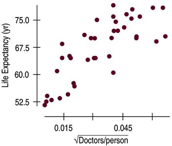
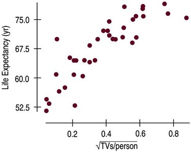
Scatterplots show the relationship between two quantitative variables.
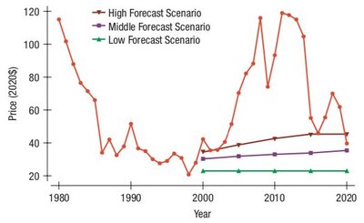
Timeplot is a special scatterplot where the independent variable is time.
Scatterplots help identify patterns, trends, unusual features, and associations between variables.
Guidelines for Analyzing Scatterplots (DFSU)
To interpret scatterplots, consider:
Direction: Is the association positive, negative, or neither?
Form: Is the relationship linear, curved, or something else?
Strength: How tightly do the points cluster around the form?
Unusual Features: Are there outliers or subgroups?
Direction
Positive association: As one variable increases, the other increases (bottom left to upper right).
Negative association: As one variable increases, the other decreases (upper left to lower right).
Form
Linear form: Points follow a straight-ish line.
Other forms (curved, etc.) are less useful for linear analysis.
Strength
Strong: Points tightly cluster around the form.
Weak: Points are scattered with no discernible pattern.
Moderate: Intermediate clustering.
Strength for linear forms is measured by correlation.
Unusual Features
Outliers: Points far from the rest.
Subgroups: Small clusters outside the general form.
Roles for Variables
Explanatory variable (x): Independent variable, plotted on the x-axis (time is always x).
Response variable (y): Dependent variable, plotted on the y-axis.
Assignment of roles depends on context, but does not imply prediction or causation.
Correlation
Definition and Conditions
Correlation measures the direction and strength of linear relationships between two quantitative variables. It is only valid when:
Quantitative Variables Condition: Both variables must be quantitative.
Straight Enough Condition: The scatterplot should show a linear form.
No Outliers Condition: Outliers can drastically affect correlation.
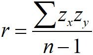
Correlation Coefficient (r)
The sign (+/-) indicates direction.
Range:
Correlation of x vs y is the same as y vs x.
No units; calculated using z-scores.
Not affected by changes of center or scale.
Measures strength of linear relationship; strong curved relationships have small r.
Very sensitive to outliers.
Formula:
Guidelines for Strength
There are general guidelines for interpreting the strength of correlation:
Bounds | Category |
|---|---|
r = 0 | None |
-0.25 < r < 0 or 0 < r < 0.25 | Weak |
-0.5 < r < -0.25 or 0.25 < r < 0.5 | Moderately Weak |
-0.85 < r < -0.5 or 0.5 < r < 0.85 | Moderately Strong |
-1 < r < -0.85 or 0.85 < r < 1 | Strong |
r = 1 | Perfect |
Correlation ≠ Causation
Correlation indicates association, not causation.
Lurking variables may affect the relationship.
Scatterplots and r do not tell the whole story.
Common Pitfalls
Do not use correlation for categorical variables.
Do not confuse correlation with causation.
Only use correlation for linear relationships.
Beware of outliers.
Linear Regression
Linear Models
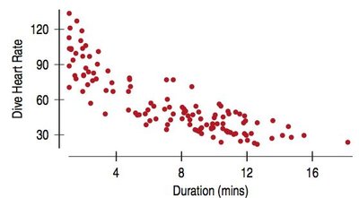
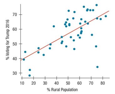
Linear regression estimates the response variable based on its relationship to the explanatory variable. The goal is to create the line of best fit (least squares line).
The line of best fit minimizes the sum of squared residuals.
Regression models are written in context, with units specified.
Regression Equation
Formula:
: Predicted y value
: y-intercept
: Slope
Slope
Formula:
Interpretation: On average, for every 1 unit increase in x, y increases (or decreases) by the slope value.
Example: For every 1 kg increase in car weight, fuel efficiency decreases by 2.3 mpg.
Y-Intercept
Formula:
Represents the predicted y when x = 0.
May not always be meaningful in context.
Residuals
Residuals measure the difference between observed and predicted values.
Formula:
Negative residual: Overestimated
Positive residual: Underestimated
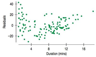
Residual Plots
Residual plots help assess the accuracy of the model. A good model will have a residual plot with no direction, form, strength, or unusual features.
Least Squares
The best model minimizes the sum of squared residuals.
If all residuals are added, they should cancel out.
Standard Error (se)
Standard deviation of the residuals.
Summarizes the typical error size.
Interpretation: Estimates will typically be off by about se (y units).
Computer Outputs
Regression output tables summarize key statistics: coefficients, standard errors, t-ratios, p-values, R squared, and standard error of residuals.
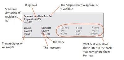
Variability and R Squared
R squared () measures the proportion of variability in the response variable accounted for by the model.
Formula:
Properties: , is the square of the correlation coefficient.
Interpretation: R squared indicates the percentage of variability in y explained by x.
Regression Wisdom
Checking Residuals
Residual plots are essential for verifying the linearity assumption. Patterns in residuals may indicate violations of regression conditions.
Getting the "Bends"
Curved relationships may not be apparent in scatterplots but are visible in residual plots.
Always check residuals for bends after fitting regression.
Extrapolation
Extrapolation is predicting values outside the range of the data.
Predictions far from the mean in x are less reliable.
Extrapolation is risky and can lead to inaccurate predictions.
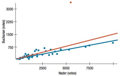
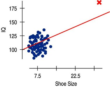
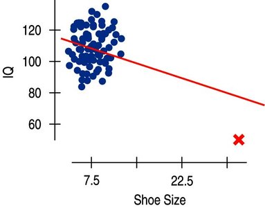
Outliers, Leverage, and Influence
Outliers can strongly influence regression results.
High leverage points have x-values far from the mean and can change the regression line.
Influential points are those whose removal significantly alters the model.
Lurking Variables and Causation
Regression cannot prove causation.
Lurking variables may drive observed associations.
Observational data cannot rule out lurking variables.
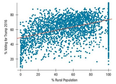
Working With Summary Values
Scatterplots of summary statistics (e.g., averages) show less variability than individual data.
Summary data can inflate the impression of relationship strength.
There is no simple correction for this phenomenon.
What Can Go Wrong?
Do not fit a straight line to a nonlinear relationship.
Do not ignore outliers.
Do not infer causation from strong linear relationships.
Do not choose a model based on R squared alone.
Do not invert regression (switching x and y changes the model).
Check for different groups and fit separate models if needed.
Beware of extrapolation, especially into the future.
Look for unusual points and compare regressions with and without them.
Treat unusual points honestly; do not remove them just to improve fit.
Watch out for lurking variables and summary data.
Summary
Regression analysis requires careful checking of assumptions and conditions.
Residuals, outliers, leverage, and influential points must be considered.
Extrapolation and summary data can mislead interpretations.
Correlation and regression do not imply causation.
