 Back
BackScatterplots, Correlation, and Regression: Exploring Relationships in Data
Study Guide - Smart Notes
 Tailored notes based on your materials, expanded with key definitions, examples, and context.
Scatterplots, Correlation, and Regression
Introduction to Paired Data Analysis
In statistics, analyzing paired data helps us understand the relationship between two quantitative variables. This section introduces scatterplots, correlation, and regression, which are essential tools for visualizing and quantifying associations between variables.
Scatterplots
A scatterplot (or scatter diagram) is a graphical representation of paired quantitative data. Each point on the plot corresponds to one observation, with the horizontal axis (x-axis) representing the first variable and the vertical axis (y-axis) representing the second variable.
Purpose: To visually assess the relationship between two variables.
Interpretation: Patterns in the scatterplot can suggest the presence or absence of a relationship (correlation) between variables.
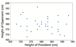
Example: A scatterplot of heights of presidents versus their main opponents shows no clear pattern, indicating no correlation.
Correlation
Correlation measures the strength and direction of a relationship between two variables. When the values of one variable are associated with the values of another, a correlation exists. If the relationship can be approximated by a straight line, it is called a linear correlation.
Positive Correlation: As one variable increases, the other tends to increase.
Negative Correlation: As one variable increases, the other tends to decrease.
No Correlation: No discernible pattern between the variables.
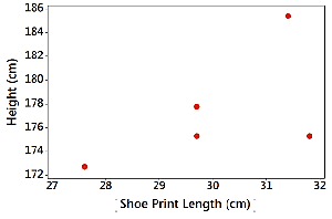
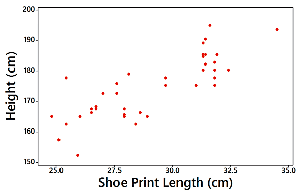
Example: A scatterplot of shoe print lengths and heights may show a pattern, suggesting correlation.
Linear Correlation Coefficient (r)
The linear correlation coefficient, denoted by r, quantifies the strength and direction of a linear relationship between two variables. The value of r ranges from -1 to 1:
r = 1: Perfect positive linear correlation
r = -1: Perfect negative linear correlation
r = 0: No linear correlation
Interpretation: Values of r close to -1 or 1 indicate strong correlation; values near 0 indicate weak or no linear correlation.
Formula for r:
Additional info: The formula above is for the Pearson correlation coefficient, where n is the number of paired data points.
P-Value in Correlation Analysis
The P-value in correlation analysis tests the null hypothesis that there is no linear correlation between the variables. It represents the probability of obtaining a correlation coefficient as extreme as the observed value, assuming no actual correlation exists.
Small P-value (≤ 0.05): Strong evidence against the null hypothesis; suggests a significant linear correlation.
Large P-value (> 0.05): Insufficient evidence to conclude a significant linear correlation.
Example: A P-value of 0.294 indicates a high probability that the observed correlation occurred by chance, so we do not conclude a significant correlation.
Interpreting Correlation and P-Value: Case Study
Consider a study examining the relationship between shoe print length and height:
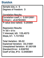
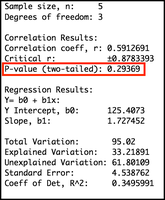
For a small sample (n = 5), r = 0.591 and P-value = 0.294. The high P-value means there is not enough evidence to conclude a linear correlation.
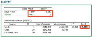
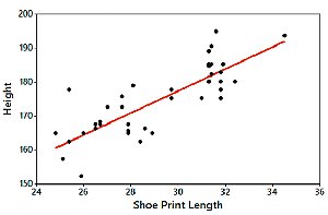
For a larger sample (n = 40), r = 0.813 and P-value < 0.0001. The very small P-value indicates strong evidence of a linear correlation.
Regression and the Regression Line
Regression analysis involves finding the equation of the line that best fits the scatterplot of paired data. This line is called the regression line or least-squares line. The regression equation predicts the value of the dependent variable (y) based on the independent variable (x).
General form of the regression equation:
b0: y-intercept (value of y when x = 0)
b1: Slope (change in y for a one-unit increase in x)
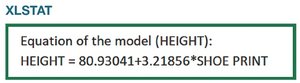
Example: For shoe print length and height, the regression equation is:
Summary Table: Correlation and Regression Interpretation
Statistic | Interpretation |
|---|---|
r close to 1 or -1 | Strong linear correlation (positive or negative) |
r close to 0 | No linear correlation |
P-value ≤ 0.05 | Significant evidence of linear correlation |
P-value > 0.05 | No significant evidence of linear correlation |
Regression equation | Predicts y from x using the best-fit line |
