 Back
BackScatterplots, Correlation, and Simple Linear Regression: Study Notes for Stat 250
Study Guide - Smart Notes
 Tailored notes based on your materials, expanded with key definitions, examples, and context.
Scatterplots and Relationships Between Quantitative Variables
Introduction to Scatterplots
Scatterplots are graphical representations used to visualize the relationship between two quantitative variables. Each point on the scatterplot corresponds to a pair of values from the dataset, allowing for the identification of patterns, trends, and associations.
Key Point 1: Scatterplots help determine the direction, form, and strength of relationships between variables.
Key Point 2: The axes represent the two variables being compared, typically with the explanatory variable on the x-axis and the response variable on the y-axis.
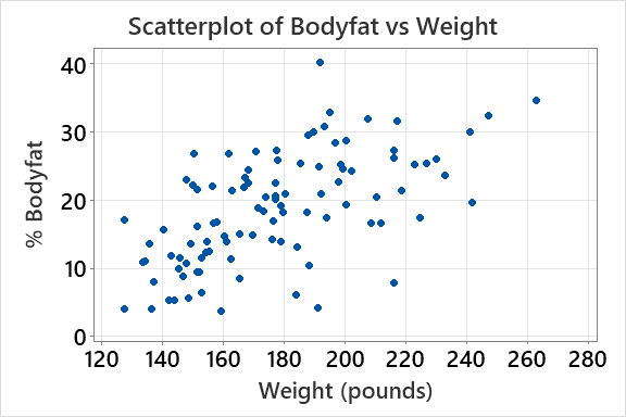
Example: The scatterplot of Bodyfat vs Weight shows how body fat percentage relates to weight in pounds for a sample of men.


Patterns of Association in Scatterplots
The pattern of points in a scatterplot reveals the type of association between variables. Associations can be positive, negative, or show no clear direction.
Positive Association: As one variable increases, the other also increases.
Negative Association: As one variable increases, the other decreases.
No Association: No discernible pattern between the variables.
Complex Association: Patterns that are not strictly linear or may involve curves.
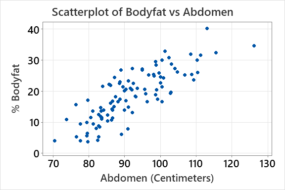
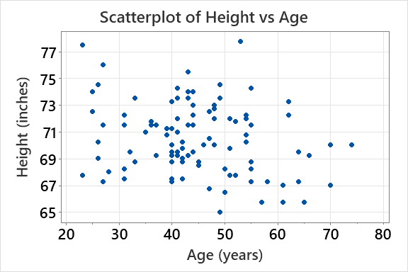
Example: The scatterplot of Bodyfat vs Abdomen shows a strong positive association, while Height vs Age shows a weak negative association.


Correlation: Measuring Linear Relationships
Definition and Features of Correlation
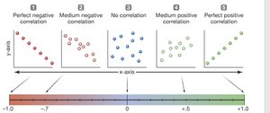
Correlation quantifies the strength and direction of a linear relationship between two quantitative variables. The most common measure is the Pearson correlation coefficient, denoted as r.
Key Point 1: r ranges from -1 (perfect negative) to +1 (perfect positive), with 0 indicating no linear relationship.
Key Point 2: Correlation is unitless and does not require identification of explanatory or response variables.
Key Point 3: Only linear relationships are measured; non-linear associations are not captured by r.
Formula: The Pearson correlation coefficient is calculated as:
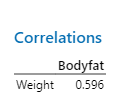
Example: The correlation between Bodyfat and Weight is 0.596, indicating a moderate positive relationship.

Interpreting Correlation Values
Correlation values are interpreted based on their magnitude and sign. The closer the value is to ±1, the stronger the linear relationship.
Perfect Positive Correlation: r = +1
Perfect Negative Correlation: r = -1
No Correlation: r = 0
Example: The correlation between Bodyfat and Abdomen is 0.812, which is considered strong and positive.
Correlation in Practice: Body Fat Data
Correlation analysis can be applied to real datasets to quantify relationships between variables.
Bodyfat vs Weight: r = 0.596 (moderate positive)
Bodyfat vs Abdomen: r = 0.812 (strong positive)
Height vs Age: r = -0.269 (weak negative)
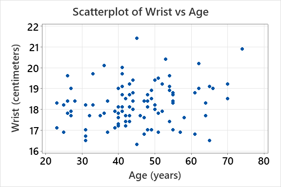
Wrist vs Age: r = 0.216 (weak positive)
Variable Pair | Correlation (r) |
|---|---|
Bodyfat vs Weight | 0.596 |
Bodyfat vs Abdomen | 0.812 |
Height vs Age | -0.269 |
Wrist vs Age | 0.216 |

Correlation Does Not Imply Causation
It is important to note that a strong correlation does not necessarily mean that one variable causes changes in the other. There may be lurking variables or coincidental relationships.
Key Point: Always consider the possibility of confounding factors or underlying mechanisms.
Example: The correlation between chocolate consumption and Nobel laureates is strong, but causality is not established.


Simple Linear Regression
The Linear Model
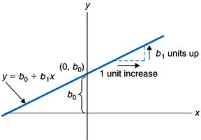
Simple linear regression models the relationship between two quantitative variables by fitting a straight line to the data. The equation of the line is:
Equation:
y-intercept (b0): The predicted value of y when x = 0.
Slope (b1): The predicted change in y for each one unit increase in x.
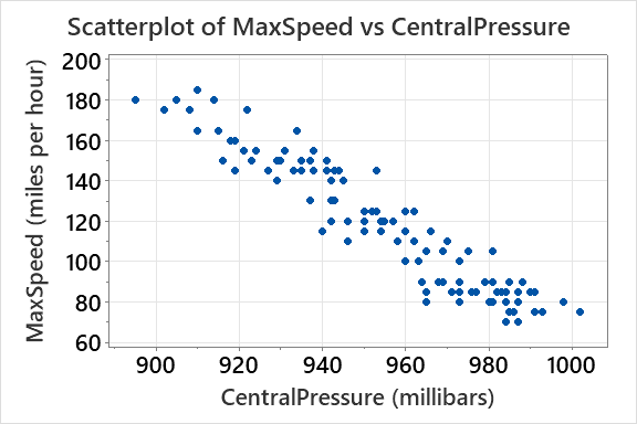
Example: In hurricane data, the regression equation predicts maximum wind speed from central pressure.
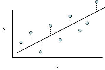
Finding the Least Squares Line
The least squares method determines the line of best fit by minimizing the sum of squared differences between observed and predicted values.
Key Point: The least squares line provides the most accurate linear prediction for the data.
Formula: The slope and intercept are calculated to minimize .
Example: Fitting a regression line to hurricane data to predict wind speed.
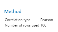
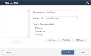
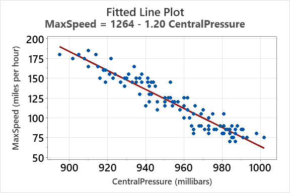
Regression Example: Hurricanes
Regression analysis can be used to predict hurricane wind speed based on central pressure. The fitted line plot shows the linear relationship and the regression equation.
Regression Equation:
Interpretation: For each increase of 1 millibar in central pressure, the predicted maximum speed decreases by 1.20 miles per hour.
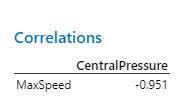
Correlation: r = -0.951 (strong negative relationship)
Trustworthy Prediction: Predictions are reliable when the x-value is within the observed range.


Summary Table: Correlation and Regression Results
Variable Pair | Correlation (r) | Regression Equation |
|---|---|---|
Bodyfat vs Weight | 0.596 | Not provided |
Bodyfat vs Abdomen | 0.812 | Not provided |
Height vs Age | -0.269 | Not provided |
Wrist vs Age | 0.216 | Not provided |
MaxSpeed vs CentralPressure | -0.951 | MaxSpeed = 1264 - 1.20 × CentralPressure |
Key Takeaways
Scatterplots are essential for visualizing relationships between quantitative variables.
Correlation measures the strength and direction of linear relationships, but does not imply causation.
Simple linear regression models the relationship and allows for prediction using the least squares method.
Interpret regression coefficients in context, and ensure predictions are made within the observed range of data.
