 Back
BackSTA2023 Statistical Methods I: Data Collection and Data Organization
Study Guide - Smart Notes
 Tailored notes based on your materials, expanded with key definitions, examples, and context.
Chapter 1: Data Collection
Introduction to the Practice of Statistics
Statistics is the science of collecting, organizing, summarizing, and analyzing information to draw conclusions and answer questions. It is essential for understanding variability in data and making informed decisions based on evidence rather than anecdotal claims.
Statistics: The science of collecting, organizing, summarizing, and analyzing information to draw conclusions.
Data: Facts or propositions used to draw conclusions or make decisions; characteristics of individuals.
Variability: The differences observed among individuals or measurements.
Example: Using statistics to determine if a new drug lowers blood pressure or to predict changes in house prices.
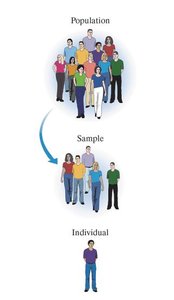
Populations, Samples, and Parameters
Statistical studies often focus on groups of individuals, and understanding the distinction between populations, samples, and related terms is fundamental.
Population: The entire group of individuals to be studied.
Sample: A subset of the population selected for study.
Individual: A single member of the population.
Parameter: A numerical description of a population characteristic.
Statistic: A numerical description of a sample characteristic.
Example: If the proportion of all students on campus who have a job is 0.849 (parameter), and a sample of 250 students yields a proportion of 0.864 (statistic).
The Process of Statistics
The statistical process involves several steps:
Identify the research objective.
Collect data needed to answer the question.
Describe the data using graphs, summaries, and calculations.
Perform inference to draw conclusions about the population based on the sample.
Descriptive statistics: Organizing and summarizing data.
Inferential statistics: Extending results from a sample to a population and assessing reliability.
Types of Variables
Variables are characteristics that vary among individuals. They are classified as qualitative or quantitative, and quantitative variables are further divided into discrete and continuous types.
Qualitative (Categorical) Variables: Non-numeric variables that classify individuals based on attributes (e.g., hair color).
Quantitative Variables: Numeric variables that can be meaningfully added or subtracted (e.g., age, GPA).
Discrete Variables: Quantitative variables with a finite or countable number of values (e.g., number of students).
Continuous Variables: Quantitative variables with infinite possible values, often measured (e.g., height, time).
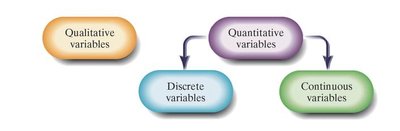
Example: Number of vending machines (discrete), daily intake of whole grains (continuous), education level (qualitative).
Levels of Measurement
Data can be classified by levels of measurement, which determine the types of statistical analyses that can be performed.
Nominal: Names, labels, or categories without order (e.g., phone type).
Ordinal: Categories with a specific order (e.g., education level).
Interval: Ordered categories with meaningful differences, but no true zero (e.g., temperature in Celsius).
Ratio: Ordered categories with meaningful differences and a true zero (e.g., number of students).
Example: Age in years (ratio), response to a question (ordinal), temperature (interval).
Observational Studies Versus Designed Experiments
Statistical studies are categorized as observational studies or designed experiments based on how data is collected and whether variables are manipulated.
Observational Study: Researchers observe behavior without influencing variables; can only claim association.
Designed Experiment: Researchers intentionally manipulate explanatory variables to observe effects on response variables; can claim causation.
Explanatory Variable: The variable manipulated in an experiment.
Response Variable: The variable measured as the outcome.
Example: Randomly assigning groups for music instruction (designed experiment) vs. surveying mothers about postpartum depression (observational study).
Other Types of Data Collection
Census: Collecting data from every individual in the population.
Web Scraping (Data Mining): Extracting and organizing data from the internet for analysis.
Simple Random Sampling
Random sampling ensures that every individual in the population has an equal chance of being selected, which is crucial for valid results.
Random Sampling: Using chance to select individuals from a population.
Simple Random Sample: Every possible sample of size n from population N has an equally likely chance of occurring.
Steps:
Obtain a frame listing all individuals in the population.
Number individuals and use a random number generator to select the sample.
Bias in Sampling
Bias occurs when a sample is not representative of the population, leading to invalid conclusions.
Sampling Bias: Method favors one part of the population.
Nonresponse Bias: Selected individuals do not respond, and their opinions differ from respondents.
Response Bias: Survey answers do not reflect true feelings due to interviewer error, misrepresentation, or question wording.
Errors:
Nonsampling Error: Errors not related to the act of sampling (e.g., data entry error).
Sampling Error: Errors due to using a sample instead of the entire population.
Chapter 2: Organizing and Summarizing Data
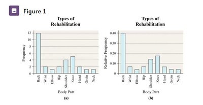
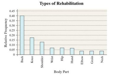
Organizing Qualitative Data
Qualitative data is organized using tables and graphs to summarize and visualize information.
Frequency Distribution: Lists each category and the number of occurrences.
Relative Frequency: Proportion of observations within a category.
Relative Frequency Distribution: Lists each category with its relative frequency.
Example: Types of rehabilitation required by patients.
Comparing Two Data Sets
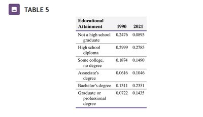
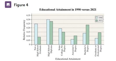
When comparing datasets, relative frequencies are used to account for differences in population sizes.
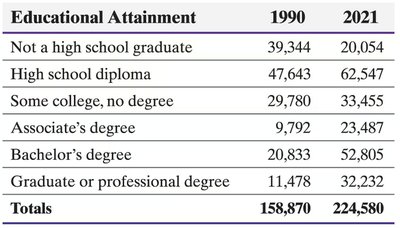
Educational Attainment | 1990 | 2021 |
|---|---|---|
Not a high school graduate | 39,344 | 20,054 |
High school diploma | 47,643 | 62,547 |
Some college, no degree | 29,780 | 33,455 |
Associate's degree | 9,792 | 23,487 |
Bachelor's degree | 20,833 | 52,805 |
Graduate or professional degree | 11,478 | 32,232 |
Totals | 158,870 | 224,580 |
Educational Attainment | 1990 | 2021 |
|---|---|---|
Not a high school graduate | 0.2476 | 0.0893 |
High school diploma | 0.2999 | 0.2785 |
Some college, no degree | 0.1874 | 0.1490 |
Associate's degree | 0.0616 | 0.1046 |
Bachelor's degree | 0.1311 | 0.2351 |
Graduate or professional degree | 0.0722 | 0.1435 |
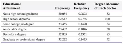
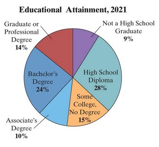
Pie Charts
Pie charts visually represent parts of a whole, with each sector proportional to the frequency or relative frequency of a category.
Educational Attainment | Frequency | Relative Frequency | Degree Measure |
|---|---|---|---|
Not a high school graduate | 20,054 | 0.0893 | 32 |
High school diploma | 62,547 | 0.2785 | 100 |
Some college, no degree | 33,455 | 0.1490 | 54 |
Associate's degree | 23,487 | 0.1046 | 38 |
Bachelor's degree | 52,805 | 0.2351 | 85 |
Graduate or professional degree | 32,232 | 0.1435 | 52 |
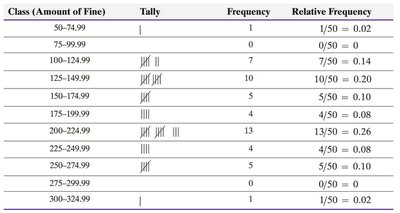
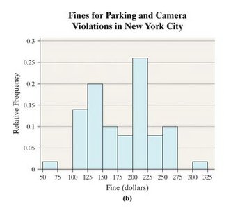
Organizing Quantitative Data: Histograms
Quantitative data is organized into classes, and histograms are used to visualize the distribution of data.
Classes: Categories created by intervals of numbers.
Lower class limits: Smallest values in each class.
Upper class limits: Largest values in each class.
Class width: Difference between consecutive lower class limits.
Class (Amount of Fine) | Tally | Frequency | Relative Frequency |
|---|---|---|---|
50-74.99 | | | 1 | 0.02 |
75-99.99 | 0 | 0.00 | |
100-124.99 | |||| ||| | 7 | 0.14 |
125-149.99 | |||| |||| | 10 | 0.20 |
150-174.99 | |||| | 4 | 0.08 |
175-199.99 | |||| |||| ||| | 13 | 0.26 |
200-224.99 | |||| | 4 | 0.08 |
225-249.99 | |||| | 4 | 0.08 |
250-274.99 | |||| | 4 | 0.08 |
275-299.99 | | | 1 | 0.02 |
300-324.99 | | | 1 | 0.02 |
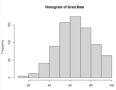
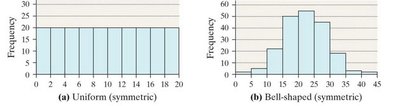
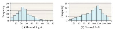
Describing the Shape of Distributions
Distributions can be described by their shape, which provides insight into the nature of the data.
Symmetric: Left and right sides are mirror images.
Uniform: All values are equally frequent.
Bell-shaped: Most values cluster around the center.
Skewed Right: Tail extends to the right.
Skewed Left: Tail extends to the left.
Additional Displays of Quantitative Data
Other graphical methods include stem-and-leaf plots and time-series plots.
Stem-and-leaf plot: Uses digits to form stems and leaves, showing the distribution of data.
Time-series plot: Plots values over time, connecting points with line segments.
Example: Partisan Conflict Index (PCI) from 2004 to 2022.
Year | PCI |
|---|---|
2004 | 69.95 |
2005 | 79.07 |
2006 | 59.19 |
2007 | 86.84 |
2008 | 73.85 |
2009 | 90.25 |
2010 | 156.44 |
2011 | 138.57 |
2012 | 148.5 |
2013 | 131.31 |
2014 | 143.79 |
2016 | 173.35 |
2017 | 166.25 |
2018 | 159.63 |
2019 | 130.82 |
2020 | 117.57 |
2021 | 119.92 |
2022 | 131.98 |
Graphical Misrepresentations of Data
Graphs can be misleading if not constructed properly. Common issues include manipulating the vertical axis (not starting at zero) and changing bar widths.
Vertical axis manipulation: Not starting at zero exaggerates differences.
Bar width manipulation: Unequal bar widths distort comparisons.
Other issues: 3D plots, inverted axes, unexpected colors.
Example: The 2017 vs. 2018 tax rate graph is misleading because the vertical axis does not start at zero, exaggerating the difference.
Example: Highway accident graphs: The graph with unequal bar widths is misleading.
