 Back
BackStatistics Exam Study Guide: Graphs, Data Types, Probability, and Descriptive Measures
Study Guide - Smart Notes
 Tailored notes based on your materials, expanded with key definitions, examples, and context.
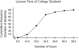
Q9. Use the ogive below to approximate the number in the sample.
Background
Topic: Ogive (Cumulative Frequency Graph)
This question tests your ability to interpret an ogive, which is a graph that shows cumulative frequencies for a data set. The cumulative frequency at the highest class boundary gives the total number of observations in the sample.
Key Terms and Concepts:
Ogive: A line graph that displays cumulative frequencies.
Cumulative Frequency: The sum of the frequencies for all classes up to and including the current class.
Step-by-Step Guidance
Locate the highest point on the ogive (the rightmost plotted point).
Read the cumulative frequency value corresponding to this point on the vertical axis.
This value represents the total number of students (or observations) in the sample.
Try solving on your own before revealing the answer!
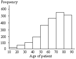
Q12. Determine whether the approximate shape of the distribution in the histogram is symmetric, uniform, skewed left, skewed right, or none of these.
Background
Topic: Shape of Distributions (Histograms)
This question tests your ability to interpret the shape of a distribution from a histogram. Recognizing the shape helps in understanding the data's central tendency and spread.
Key Terms:
Symmetric: Both sides of the histogram are approximately mirror images.
Uniform: All bars are roughly the same height.
Skewed Left: The tail on the left side is longer or fatter than the right side.
Skewed Right: The tail on the right side is longer or fatter than the left side.
Step-by-Step Guidance
Observe the heights of the bars from left to right.
Notice if the bars increase, decrease, or remain about the same.
Identify if one tail (left or right) is longer or if the distribution is balanced.
Try solving on your own before revealing the answer!
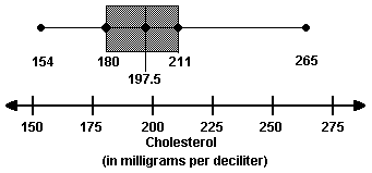
Q21. Use the box-and-whisker plot below to determine which statement is accurate.
Background
Topic: Box-and-Whisker Plots (Boxplots)
This question tests your ability to interpret a boxplot, which visually displays the distribution of a data set, including quartiles, median, and possible outliers.
Key Terms:
Quartiles (Q1, Q2, Q3): Values that divide the data into four equal parts.
Median (Q2): The middle value of the data set.
Interquartile Range (IQR): The range between Q1 and Q3.
Step-by-Step Guidance
Identify the values for Q1, median, and Q3 from the plot.
Note the minimum and maximum values (the ends of the whiskers).
Match these values to the statements provided in the question to determine which is accurate.
Try solving on your own before revealing the answer!
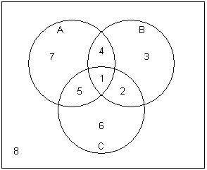
Q33. In the Venn diagram below, event A represents the adults who drink coffee, event B represents the adults who drink tea, and event C represents the adults who drink cola. List the region(s) which represent the adults who drink both coffee and tea.
Background
Topic: Venn Diagrams and Set Theory
This question tests your understanding of how to interpret Venn diagrams and identify intersections of sets (events).
Key Terms:
Intersection (A ∩ B): The set of elements that are in both A and B.
Region: The numbered areas in the Venn diagram represent different combinations of the three sets.
Step-by-Step Guidance
Identify the regions that are inside both circle A (coffee) and circle B (tea).
Remember that the intersection includes regions where both events occur, including where all three events overlap.
List the region numbers that satisfy this condition.
Try solving on your own before revealing the answer!
Q11. Construct a Pareto chart of the data from the job sources survey.
Background
Topic: Pareto Charts (Bar Graphs for Categorical Data)
This question tests your ability to construct and interpret a Pareto chart, which is a bar graph where categories are ordered by frequency from highest to lowest.
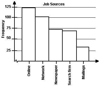
Key Terms:
Pareto Chart: A bar graph that displays frequencies in descending order.
Frequency: The number of occurrences for each category.
Step-by-Step Guidance
List the job sources and their frequencies.
Order the categories from highest to lowest frequency.
Draw bars for each category, with the tallest bar on the left.
Try solving on your own before revealing the answer!
